Designed by Nature

Vespers, Series 3, Mask 2

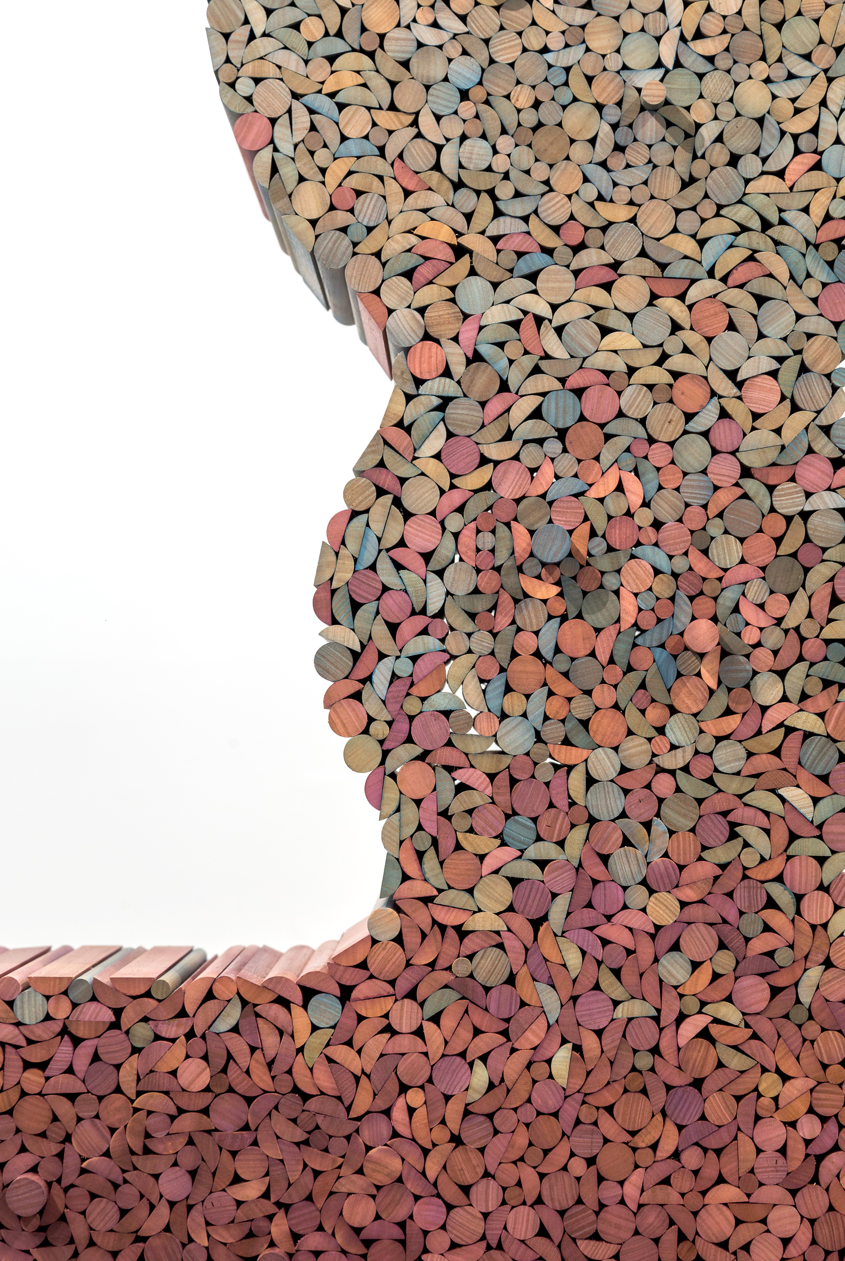
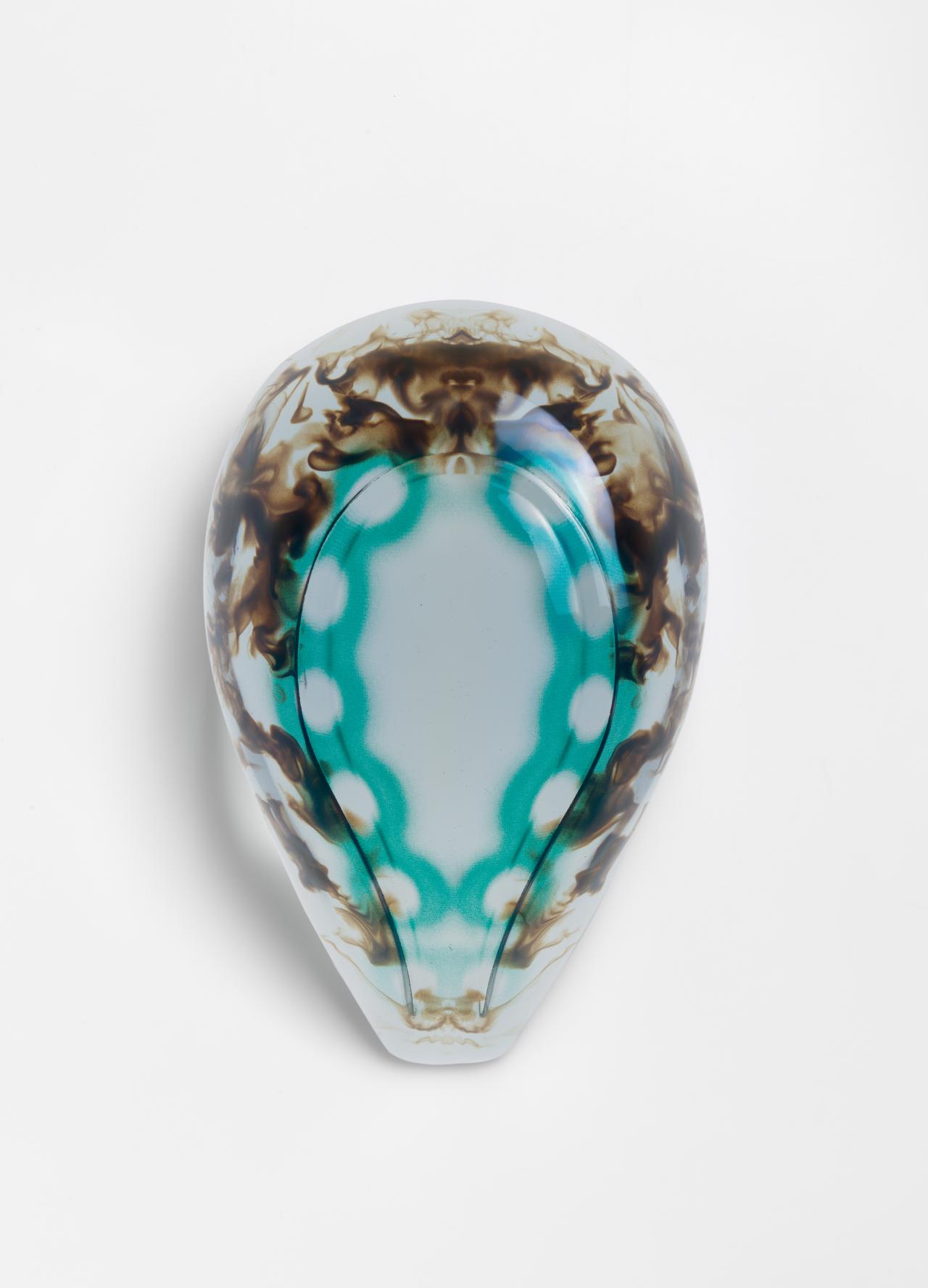
Vespers, Series 3, Mask 2 was designed and created by Neri Oxman and her Mediated Matter Group at MIT. There are 15 masks divided into 3 series and each series has 5 masks (3dprintersonlinestore.com, 2019). The image above is one of the series III called: Future (Morris, 2019), The Biological World which is exhibited at The National Gallery of Victoria (NGV) International.  ‘She designed Vespers to reveal “cultural heritage and speculate about the perpetuation of life, both cultural and biological (Buzzworthy, 2019).”’

More specifically, in a long time ago from gold mask of Tutankhamun to plaster death mask of the 19th century, People are creating death masks of their era and culture all over the world, In this way, people want to use death masks to preserve the memory of the dead and immortalize them. However, Neri Oxman’s death mask is intended to take advantage of modern technology to explore and represent the transition between life and death. “the masks are designed and built using 3D printing and spatial mapping algorithms, aiming to explore the transition between life and death in a modern, technologically focused light (Buzzworthy, 2019).” She seems to want to challenge other industrial design products and even architectures in a way that can only be born in the new era. What’s more, Vespers also brings to us a question that what if instead of being the final designer or the decider in the design process, we participate in the design as a guide and facilitator and let nature decide the design? In other words, since the industrial revolution, design has been restricted by the rigid standards of manufacturing and mass production, which limited greatly the imagination of designers. As a result, this keeps our design embedded in the environment as an industrial product. Oxman wants to create a new perspective to look at design. What is not only integrate nature into our design, but also guide nature to design something even beyond human imagination and combined nature with new era technology, a design that advocates the growth of nature in the products. Trying to make the world become a Better place. Like Liene Jakobsone said in the article:

“it is critically concerned with future and design’s potential in shaping it towards the preferable; and it is aware of the ideological constraints that limit the society and impede its progress (Jakobsone, 2017).”

What’s more, as the above image shown, the whole mask is 3d printed with a dark airflow-like shape inside and a series of pale blue-green rings in the middle. These colorful swirls are actually meant to represent the airflow created by the last breath of a dying person. To get this shape, designers use extremely sophisticated software to design and simulate it, which is then printed by 3d printing.

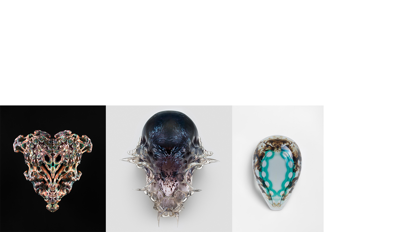
It is worth mentioning that each series has its own unique meaning. The three pictures above, from left to right, are series 1 “Past”, series 2 “Present” and series 3 “Future” (Morris, 2019). As can be seen from the figure, the shape of series 1 is more irregular than that of other series. Series 1 seems to express the moment when the “last breath” just exhales from the mouth. In the second series, the shape of the mask part begins to stabilize, some parts are still in the process of transformation and the top part begins to form the shape of the mask. By the third series, the whole mask had been reborn into a complete and stable shape.

The interesting point is that the third series compared with other series looks contains fewer cultural expression and less color, but this series is the three series of one of the most vivid series, because the last series Oxman by guiding alive microbes to part of the design, with color part of the image is actually made by boot after through the complex process of microbes formed after color. This design really creates a living work designed by nature. The Vespers realizes the product moving away from assembly closer to growth. Let the indispensable part of “growth” in life be combined with modern science and technology, let nature grow in products and let nature design products. We only guide and assist through modern science and technology. In addition, Neri Oxmans ‘design actually is very different from an ordinary industrial product. Not as a commodity or industrial product, but like the critical design to bring thinking to the public. Liene Jakobsone mentioned in the article:

‘Critical design indeed does not produce functional, industrially manufactured things Instead it creates non-functioning prototypes that are not meant for production at all, and due to these peculiar circumstances, it is often not regarded as a legitimate practice within the field of industrial design. Thisnonetheless does not mean that critical design lacks functionality at all, but its “function moves beyond physical and technical function, optimization, efficiency, and utility (Jakobsone, 2017)”’

The questions which Vespers are brought, such as Is our industrial product really a good design for our society and the natural environment? Is it possible that nature’s design will bring our society closer to nature? Will natural design make our society more harmonious and happier? These questions will certainly be conveyed to the minds of more and more designers to some extent, and then the concept of design by natural will quietly “grow” in their hearts.

REFERENCE

  • Jakobsone, L. (2017). Critical design as approach to next thinking. The Design Journal, 20(sup1), pp.S4253-S4262.

From the Heart to the Heat

The idea of visibility for women in design and how we celebrate their creativity and innovation was explored through the Designing Women Exhibition at the NGV. For centuries, women in design have been invisible and unrecognised for their work, in comparison to male artists and designers. The exhibition aimed to change this, and instead celebrated the artworks but also the history and achievements of women. From the fifty female artists showcased at the NGV, I took a heavy interest in Elliat Rich, an artist and furniture designer who moved to remote Alice Springs in 2004.

Figure 1. Tassie Oak, 2018.

One of Rich’s artworks, ‘Tassie Oak’ (2018), is a large sculptural piece of a drawer embedded with pink and teal gradients; resembling the shades of a sunset (see Figure 1). Rich found her inspiration for the artwork when she was camping by a dry river, and began collecting small piles of dried leaves that became a gradient of yellows and pinks (Elliat Rich, 2018). Her artwork also symbolises the curves of the rocky boulders visible in the dry lands of Australia, and the movement of walking on a path through the outback. The wood chips used to create the sculpture represent the colours of the sandy sky at dusk and their raw texture connects to the native flora and fauna (see Figure 2).  

As an Australian artist herself, Rich focuses heavily on what it means to create Australian design and how to respectfully use inspiration from her homeland. In her artwork, Tassie Oak (2018), Rich relates to the idea of personal experience, particularly her connection with her home in central Australia. She aims to create a story for the viewers by subtly connecting a time and place to each artwork, which is constructed through the decision of certain colour palettes or the use of natural materials like wood. Tassie Oak, in particular, tells a specific story about rural Alice Springs and what objects she would use if she had to describe her home to the audience. Rich also discusses what she has learnt from living hours away from the city; how she has had the opportunity to experience true Indigenous heritage and culture, and the diverse ways of living in the world when distant from suburbia (Philippa Barr, 2018).

Figure 2. Boulders and sunset in Alice Springs.

During Week 2, we explored the topic of decolonisation and Australian Indigenous design. Decolonisation is a way for non-Indigenous Australians to acknowledge the damage caused upon Aboriginal and Torres Strait Islander people through colonialism. In Tassie Oak, Rich stated that the sunset hues represent the beautiful landscape, but also teaches us to understand the kind of stories that have grown out of it and how alive it is (Philippa Barr, 2018). Her work does not exploit or manipulate the idea of rural Australia, but instead Rich carefully selects objects and symbols that will successfully maintain its story. The artwork is an insight into how we should respectfully celebrate the right people and landmarks in Australian history, and learn to somewhat deprioritise the white Westernised heroes. Rich uses her work as a powerful example for leadership when envisioning what a decolonised Australia could be.

Rich is well-known in the art world for her devotion to equality. She associates all her projects with the motive to promote equality and ethicality between all people of any class, gender and culture (Elliat Rich, 2018). When it comes to equality, an issue the exhibition may obtain is the debate that women are being acknowledged for their work simply because they are women; not because they are designers. Universally, both men and women designers want to be recognised purely for their work and not their gender identity (Simone Leamon, 2018). However, we could also change this argument and discuss why we are now creating a platform for merely women designers in an exhibition space today. In relation to the Week 4 topic of Australian Graphic Design, we explored how history has influenced the need to fix social concerns and discrimination in design. Throughout the 20th century, very few design collectives, such as Redback Graphix, focused on socially concerned design and the need for change through public protests and posters. (Redback Graphix, 1989). This did successfully create a voice for these gender concerns, but the overriding power of white male culture made it a slow process. Today, our design culture has evolved and allows us to acknowledge Australian artists like Rich who is a voice for gender equality and Australian design. If we look at the work of contemporary women designers in this exhibition we can draw attention to design’s evolving history – and its role in shaping today’s society Simone Leamon (2018).

Tassie Oak is merely a sculptural piece; it is a window into a conversation about creating respectful Australian Indigenous design and acknowledging the history and home of those affected. Although it was many years later, the NGV exhibition allowed Rich to use her platform to spread awareness about the power of home and sourcing inspiration respectfully.

References

Figure 1. Elliat Rich, Tassie Oak sculpture, NGV, 2018.

Figure 2. Rainbow Valley Sunset, Wiz Tours. https://www.wiztours.com/tour/rainbow-valley-sunset-supper-tour-from-alice-springs-31656.html

Simone Leamon, Designing Women, NGV, 2018. https://www.ngv.vic.gov.au/exhibition/designing-women/

Elliat Rich, Other Places – Drawers, Elliat, 2018. http://www.elliatrich.com/other-places

Philippa Barr, Australia. A profile of Elliat Rich, Domus, 10th August 2018. https://www.domusweb.it/en/design/2018/08/10/australia-a-profile-of-elliat-rich.html

Graphix, Redback. 1989. Redback Graphix: Now we are 10, a retrospective 1979-1989, (The Impressionists 1989), 4-8.

What’s So New About Bamboo

Charlotte Perriand was a furniture designer and a voice for female artists shaping modern living in the 20th century. Born in 1903 in Paris, France, Perriand’s particular style was rebellious, as she insisted on moving towards machine-age technology rather than following traditions (Catherine Anderson, 2016). In the 1930’s, the furniture designer and architect was asked to increase the flow of Japanese products to the West, whilst also challenging the current styles among Japanese artists, designers, and architects. Through this research, Perriand designed the ‘522 Tokyo Chaise Lounge’ in 1940, made from a solid wood frame of bamboo sourced from Japan (see Figure 1). The seat is composed into twelve wooden curves, with the strips and bars joined by satin brass studs. This idea replaced the traditional method of steel-tubing that the Western designers were still using to construct furniture and appliances (Cassina Page, 2014). She turned the traditional bamboo processing technique into a modern piece of furniture, whilst also using and respecting the natural materials to their full extent. Perriand’s design was remarkably modern that you could easily assume it was produced on a larger scale just a few years ago.

Figure 1. 522 Tokyo Chaise Lounge.

The Tokyo Chaise Lounge aims to challenge the way designers used new materials, and making sure it was in a respectful and creditable manner to their source, whilst also creating a positive response – rather than critical – towards its origin. Prior to outsourcing the bamboo from Japan, Perriand researched the design culture over the span of five years, and spent her time exploring the possible uses that a versatile material like bamboo could have (Catherine Anderson, 2016). Subtly, she acknowledged its origin by naming the furniture ‘Tokyo’ Chaise Lounge, which creates a connection between the product and the culture for new consumers. Perriand also hoped the design of the 522 Tokyo Chaise Lounge would ignite conversations throughout the Western society, primarily about the possibilities and benefits of sourcing materials from around the world with the hopes of improving design in society.

Perriand was also particularly aware of the suffering in the world during the 1950’s, and knew that design could play a vital role in the discovery of solutions to create a fair society. The Chaise Lounge design is a great example of this, as Perriand did not rely on the cultural stereotypes from Japan to showcase or sell her design to the public. In relation to the Week 4 class discussion of design culture, Perriand could have easily used the Japanese art, food, or even the popular Kawaii style to influence her art and make it easier to understand to the white Western culture (Dimeji Onafuwa, 2018). However, she mindfully focused on the bamboo being environmentally friendly, undervalued and its popularity across the locals. If the design had been in the hands of a different designer, we could argue that exporting traditional resources to the Western culture could have potentially exploited how special and versatile it is, due to the substantial difference in cultures and the growing consumer demand happening in America at the time.  

Perriand was confident in her skill of combining traditional and modern, which can be proven through the positive response of her furniture designs. However, an issue that arose was the functionality of the 522 Tokyo Chaise Lounge. Aside from its beauty and thorough design, people in Japan believed it may not suitable for mass production internationally, despite its practical use as outdoor furniture (Catherine Anderson, 2016). The Week 1 reading, Design Studies: Tasks and Challenges, discusses the idea that art and design are two separate entities, and they should follow a different set of rules (Victor Margolin, 2013). Artworks no matter what form they take, are not expected to produce a result or be a certain form, yet in design an expected outcome should be achieved. Perriand was a furniture designer, but did not necessarily focus on the mass production opportunities or how affordable she could make it. It was special, influenced by her travels and carefully thought out. The problem here is that both art and design were crossing paths in Perriand’s design, even though Margolin states that design should always have a purpose, a reason, and a problem to solve. The design culture in the 1950’s saw products having a higher turnover and a demand for more, which explains the one problem towards the availability of Perriand’s Chaise Lounge.

Figure 2. Charlotte Perriand on B306 Chaise Lounge.

Besides the design, the advertising for the 522 Tokyo Chaise Lounge was heavily aimed at the feminine women and her physical appeal (see Figure 2). The idea was to photograph Perriand herself and other women draped across the lounge, with the intention of communicating modernity and femininity to the public. It could also be argued that sexualised women were used during the advertising to sell the product to the public. Perriand was unaware of the reaction her design may cause in the public eye from using a new outsourced material, so the idea to promote the product through the female gaze may have been a possibility.

One issue that is identified in Perriand’s work throughout her career is that they were not so heavily credited for. When she collaborated with Le Corbusier, he was often given sole credit for the conception and designs for the Chaise Lounges (Catherine Anderson, 2016). However, Perriand acknowledged that he had defined the framework of the overall forms of the chairs, but she had initiated the details, construction, and actual design. This issue can be related back to the discussion in Week 2, where Australian Indigenous design and cultural identity was explored. Commonly, the authorisation of artworks not being recognised can cause consumers to only remember the object but disregard the designers behind it. The entire meaning of the artwork can also be changed when it is not identified to its rightful owner (Dimeji Onafuwa, 2018). The risk of not acknowledging the appropriate artist is that it adds to the assumption that men in a white Western culture have created iconic designs throughout history, whilst proving the bias towards the women.

Perriand and her furniture design has pushed the idea of combining traditional with modern successfully, proving there is a way to promote new ideas without exploiting cultures and stereotypes. The issues that arose throughout her designs did not come from Perriand’s lack of research, but from a close-minded Western culture who may have not understood Perriand’s modernist style. She was always known to other designers for her research into the future, accepting change, and knowing when to experiment and when to just be respectful.

References

Figure 1. Charlotte Perriand, 522 Tokyo Chaise Lounge, Space Lounge, Cassina. https://www.spacefurniture.com.au/522-tokyo-chaise-longue.html

Figure 2. Charlotte Perriand, B306 Chaise Lounge, Renzoe Box. https://www.renzoebox.com/renzoeblog/charlotte-perriand

Catherine Anderson, Charlotte Perriand, Encyclopedia Britannica, 4th January 2016. https://www.britannica.com/biography/Charlotte-Perriand

I Maestri, Charlotte Perriand, Cassina, 2014. https://www.cassina.com/en/designer/charlotte-perriand

Virtual Culture, The Structure of a Japanese House, Kids Web Japan. https://web-japan.org/kidsweb/virtual/house/house01.html

Onafuwa, Dimeji. 2018. Allies and Decoloniality: A Review of the Intersectional Perspectives on Design, Politics, and Power Symposium, design and culture, (2018), 10-11.

Margolin, Victor. 2013. Design Studies: Tasks and Challenges, The Design Journal, (Bloomsbury Publishing PLC 2013), 400-407.

Designing Women-Elliat Rich


Figure1. Elliat Rich, Weaver, 2018

In the Designing Women NGV International exhibition, many works of contemporary female designers are displayed. The Weaver is a work showed in this exhibition which is designed by Elliat Rich in 2018 (seen figure 1). The Weaver is a cabinet, but it is not look like what we think a cabinet should be. Its colour scheme, appearance and material use are out of ordinary. What Weaver is, however, it is difficult to describe it.

 Weaver is both a cabinet of curiosity and a sculpture in equal measure. In a real sense, Weaver is a cylindrical shelf hanging on the ceiling which is covered with a curtain of synthetic turquoise fibre (Carolan, 2018).. This kind of material which is used for wigs. Inside, four shelves are coated with pearlescent pigments that glow like a rainbow when the light hits them (Carolan, 2018). Elliat Rich boldly used synthetic materials and created a visually striking colour and shape it looks like a pea or a pill. What makes this work more attractive and personalized is a detail contained in it, the curtain “hair” of turquoise synthetic fibre pulled behind the metal “little ear”, just like a lovely girl tucking a wisp of flowing hair behind her ear, which is a charming body action (Carolan, 2018). “It’s really quite intimate [that gesture]. It’s like having this relationship with this sculpture furniture that has a presence and a personality.” Says Rich. The vivid work Weaver which Rich designed invites us to consider the possibilities of brighter, as well as the more hopeful future navigated toward with the aid of design that turn us to the people, places and events that matter to us most. Its characteristics combined with human body perception and products, this work is endowed with personality through a person’s behaviour and actions. It resinates with people. Elliat Rich said that (Domusweb, 2019),

 “This is the beginning of a body of work exploring ways of being in the future, I really feel as designers that we have this amazing opportunity to inspire visions of the future. At the moment there’s this dark, dystopic [idea] that the future is dark and that technology is going to kill us. There are very few beautiful visions of the future that give us [hope] and instructions or a clear vision of where we can go.”

  It is easy to see the futurism in the style of the Weaver, which breaks through the existing design forms and conventions. The Weaver is a challenging design. It is not only a product, but also an art sculpture, if you appreciate it carefully, you will be deeply attracted by one of its characteristics. Although it is an avant-garde or fashionable work, it is controversial when it is considered as an industrial product (Domusweb, 2019). People are subconsciously influenced to consider the functionality or utility of a product or to compare its value with its price. However, in order to meet the public demand, designers usually pursue the simplicity, utilization, functionality and mass production of industrial design products (Slaughter, 2019).

For now, when a product is needed to spend a lot of time and money and might does not necessarily conform to the public aesthetic, designers will consider whether it can be mass produced or it conforms to the public (Jakobsone, 2017). And then people will evaluate whether it is a good industrial design product. For example, when people go to Ikea to buy products, every product you see, you will know at a glance what it is and what its function is. You will buy it because you need a table, a chair or a lamp. The designer will consider the combination of its appearance and function for people to choose and find products easily. In contrast to Weaver, when people see it for the first time without any comments, they even need to observe it and consider what it is. Moreover, not everyone will understand and appreciate the unusual appearance and the detail of design showed on the Weaver. Like if people want to buy a shelf, they often think about the size of its capacity, which means its utility, and the amount of space it takes up, whether it’s appropriate to install it at home. And then they will consider the price, is the price they could effort (Jakobsone, 2017).

 If the feature of the mainstream industrial design products is functional, simple, practical and technological. Whether it can only be regarded as a kind of excellent artwork, rather than an industrial product.

In my opinion, I couldn’t just give one definition of the Weaver which it is a good industrial design or not, or it is just a good sculpture artwork. As I think, Weaver provides a new direction and new thinking way for the future design. This does not mean that it will replace others or intend to change the current definition of a good industrial design products. Designers today, the starting point for their creations is usually to discover a problem, then find the solution, in order to solve the problem to create the product, in simplified words, design is often described as a problem solving activity (Jakobsone, 2017). But for Weaver the designer Rich rather to identify problems which are existing or yet to come, and Rich prefer to ask questions instead of providing answers, for example, although this work is different from the mainstream industrial products-high cost and high time consuming, the designer Rich still creates the Weaver in the process of exploration (Carolan, 2018). And Rich successfully expressed the standpoint in this work-how can people realize that the changed we make now will affect our future life (Carolan, 2018).

  Design is a discipline of divergent thinking. Every designer might has great potential to create new things (Jakobsone, 2017). The reason why I think Weaver can’t be classified is that in the current design education concept the unique Weaver is different from the industrial products. But this difference does not mean forever and the future. It is just a different industrial product in people’s mind now. Maybe in the future, it will become the new direction of design.

Reference

Carolan, Nicholas. From The Red Centre To The Heart, Design That’s Going Places.2018. (accessed 8April, 2019).

Domusweb.it. Australia. A profile of Elliat Rich.2019. https://www.domusweb.it/en/design/2018/08/10/australia-a-profile-of-elliat-rich.html (Accessed 11 Apr. 2019).

Jakobsone, Liene. Critical design as approach to next thinking. 2017. (accessed 8April, 2019).

Slaughter, Anne-Marie. Why Women Still Can’t Have It All. 2019. (accessed 11April, 2019).

Forgotten women designer-Anni Albers

Image result for anni albers tate modern

Figure 1, Anni, Albers, Wall Hanging, 1926

   Bauhaus was a German design school established during the second War, it had a profound influence on the development of art, architecture, product design and typesetting field. In 1919, the declaration of Bauhaus design school was that they welcomed everyone without regard to age or sex, there were more women than men applied to it, and Bauhaus offered unprecedented opportunities for women in art education (Lutyens 2018). Walter Gropius the founder of Bauhaus had insisted that he would not discriminate between “the beautiful and the strong sex”, but in fact there were just 6 women among its 45 schoolmasters in the first Bauhaus building in Weima (Reif, 1984). Gropius worried that women may affected the school’s professional reputation with industry, so he subsequently limited the numbers of women permitted access (Lutyens 2018). Bauhaus was not a paradise of equality as what the Gropius said. While the men of Bauhaus are considered today’s design giants, their female counterparts are relatively unknown.

  Anni Albers was a German artist who was born in Berlin id 1899, and she studied at the Bauhaus in 1922. She loved art and design, the reason she took part in Bauhaus is that she agreed with that student and art teachers at the school worked and learnt together(The Art Story, 2019). At that time, women were limited to choose the class, so Albers was discouraged to choose what she hoped to join-the glass workshop, she was directed towards to the weaving workshop. But she still became a pioneering textile designer (The Art Story, 2019).  In 1926, the Bauhaus moved to Dessau, a new focus on production rather than craft prompted Albers to develop many textiles with unique functions, combining light reflection, sound absorption and durability.

  Wall Hanging (seen figure1) 1926 was made while Albers was at the Bauhaus, she used a palette of neutral lines, and focusing on the complex weaving techniques and modern geometric designs. This partly reflects her intention to create designs that could been as a product for industrial mass production (The Art Story, 2019). This pattern is created by combining the repeating and interlocking forms of stripes and blocks. Albers created the triple-weave technique.  Albers once published an essay in 1924, “Bauhaus Weaving” she pointed out that the modern equipment did not completely change the basic weaving grid structure, and the textile weaving was an ancient craft art (Searle 2018). At that time, the mass production of industry and the handmade textile products appeared divergence, they lacked relevance. While the Bauhaus workshop combined technology and craft that became to a solution of the divergence. She praised the hand loom and looked ahead to modern textile production (Searle 2018).

In the work of Wall Hanging, Albers revealed this combination of weaving technique and modernist design (Reif, 1984). In 1931, Anni Albers became the head of the Weaving Workshop, she was one of the fewer women to possess such a senior role at the Bauhaus school (The Art Story, 2019). After the government shut down the Bauhaus, she taught at Black Mountain until 1949. Albers often experimented with different materials in her work, which aim is to allow the students to image what ancient weaving might look like. Albers was a passionate advocate of weaving and design. The concept of what the threads and weaving were had changed since 1922, this was a result of the endeavour by Albers. Although her performance is so outstanding and her contribution on the Weaving still influenced the world. She was not as famous as the male designers of the same period in the Bauhaus, while many men at the Bauhaus are considered design titans tody, their female counterparts are relatively unknown  (Stoppard,2019). Historians and critics of that era were eager to emphasize modernism’s love of architecture and industrial design, often at the expense of other discipline, as a result, many designers who work in textiles, ceramics, set design and interior design are often overlooked (Lutyens 2018).

  In conclusion, many art and design schools established since 1870s, and they were closely combined with industrial demand. While there were opportunities for art education, but women were limited to get the professional jobs. At that time, architecture was considered a male occupation, the craft, embroidery, lace making and weaving were all considered as a suitable area for women. As women, they still haunted by those problem today (Bruce, 1990). By the end of the First World War, women fully participated in the design area. Although there were less theoretical literatures of modern design from women than men, the influence of the development of design by women was huge (Bruce, 1990). It is possible to acknowledge that industrial design is a male-dominated discipline in the professional area. As when women took part in the men-dominated environment, they can not be relaxed. And it is hard to let the women became one of the boys
(Bruce, 1990). The main difference between industrial design and the graphic or crafts design is that for the industrial design people will be required some technical ability while the craft or graphic design does not need. Men are generally considered to be better suited to industrial-related designs, while women are considered to be better suited to art jobs such as graphic arts and artisanal textiles (Bruce, 1990). Like Anni Albers, her contributions to the development of textile technology had huge influence. Although the weaving workshop was not her first choice, she still had great achievements in the textile field. However, when people think of the designers in the Bauhaus, they will firstly think of some female architecture or industrial designers. Women designers who developed in handicraft industry seem to be regard as auxiliary designers and gradually forgotten by people.

References

Lutyens, Diminic. Anni Albers and the forgotten women of the Bauhaus. September 20, 2018.

http://www.bbc.com/culture/story/20180919-anni-albers-and-the-forgotten-women-of-the-bauhaus (accessed 7April, 2019).

The Art Story. Anni Albers Artworks & Famous. 2019

https://www.theartstory.org/artist-albers-anni-artworks.htm (accessed 8April, 2019).

Searle, Adrian. Anni Albers review-ravishing textiles that beg to be touched. October 10, 2018.

https://www.theguardian.com/artanddesign/2018/oct/09/anni-albers-tate-modern-review (accessed11April, 2019).

Stoppard, Lou. Why the fearless women of the Bauhaus are the forgotten trailblazers of art history. January16, 2019. (accessed 11April, 2019).

Reif, Rita. Anni Albers,94, Textile Artist And The Widow of Josef Albers. The New York Times. (May 10,1984). (accessed11April, 2019).

Bruce, Margaret. Lewis, Jenny. Women designers-is there a gender trap. April 1990. P116-118. (accessed 11April, 2019).

Inkahoots & I


Figure 1: “A Poster to Change the World” — “THROUGH IT ALL, JUST STAND UP”

Describe my artwork of a series of poster uses the technique of the screen print, that concept is “A Poster to Change the World” (Figure 1). For this project, I choose a lyric to combined with the visuals of the poster to convey the influence and change that a song brings to people or the world.

I used the song was called《Just Stand Up》, it is a charity song promoting the fight against cancer sung by many famous singers such as Beyoncé, Rihanna, Carrie Underwood in 2008, while also obtained the good chart performance. In addition, the reason that I choose “THROUGH IT ALL, JUST STAND UP” of the lyric is because it tells people to be brave, not to be defeated by the disease and discouraged, although experienced it but also to be optimistic and overcome it. Meaning that no matter what kind of difficulty, be strong and stand up and live. And then I use an image, which I edited in Photoshop and focused on her firm eyes to convey the determination and perseverance that I want to show and to bring strength, hope, and confidence to the sick people. Finally, I chose to arrange the lyrics with simple letters and changing the order and layout many times allows people to visually and easily see the sentences of the lyrics. The neat font looks very serious and formal that can get people’s attention. When I was printing, I used different colors of the background to test and used some of the strong visual effects to reflect the energy and motivation of the color printed lyrics and images at different layers that make the poster look serious and powerful.


Figure 2: Help! Joh! by Inkahoots, screenprint, 1991

The graphic design studio that located in Brisbane’s Australia is Inkahoots. It’s established as a community access screen print studio/arts collective between 1990and 1995 (Ideas on design. 2019), that catered to community groups and causes such as the Tenant’s Union of Queensland, Land Rights for Aboriginals, International Women’s Day, Lesbian and Gay Pride Week and Reclaim the Night protests (Berry. J. p.192). Inkahoots has been working on the periphery of Australian design culture since 1990 and their history is a close relationship with the community, cultural, and arts sectors as creative advocates and activists (Ideas on design. 2019). The main features of its early posters adopted previous social and political aesthetics and continued the results of the former collective practice, including photomontage elements, typewritten letterforms, and fluorescent color. The techniques and affordability of the screen-printing medium encouraged this shared visual language and is demonstrated in the poster Help! Joh! (Figure 2) (Berry. J. p.192). They boldly used the bright yellow and green to screen print a poster based on the comically subverts a newspaper photograph of political character Joh Bjelke Petersen’s facial features. This contrast color can bring obvious visual experience to people and emphasize the expression of characters. Moreover, add the text to help the masses understand the content of the poster more easily. In this street poster, you can see that Inkahoots used the photomontage technology to rearrange and combine the images. This kind of editing makes the image look ferocious and loses the original solemn feeling of the political figure. The same point in my posters that also use the image expression to convey the main ideas and views. And then you can also see there does a long text below the image to explain and describe the concept and function of this poster, which may be to reflect social or political exist phenomenon. Of course, the lyrics in my poster are an important part, which is to bring people power. Finally, the most direct for the visual effect is the use of fluorescent color, which make the image more emotional and you will be attracted to it in many posters on the street. For my works, I use a variety of bright colors to make a different combination of printing or changing the background to make an impact on people’s vision and bring a sense of empathy, or perhaps red and yellow a feeling of enthusiasm, energy, and hope.

Compared with inkahoots’s works, my image editing program technology is much simpler, and the color application experience is not very rich. From my current social identity, I have no ability to evaluate a social or political radical issue, and the influence is not enough, even though my poster expresses a positive attitude. In the era of inkahoots posters could be used as a means of communication, it can appear on the streets, newspapers or magazines. Nowadays, due to the development of electronic technology the most people think Stacked up against digital technology and offset printing, manual screen printing seemed out-molded both as an art form and as an effective form of mass production (Design Observer. 2019). As a result, the frequency of posters decreased. Inkahoots also found that while the poster still retains undeniable appeal and a particular, unique application, we are finding that computer, video, film, radio and television are by far the more effective and relevant art forms of our day (Design Observer. 2019).

In my opinion, my posters are created to encourage patients to bring hope and energy to them, even although in today’s era of digital communication design is very popular, I think the artwork made by this craft is more meaningful. Perhaps we should consider whether it could convey the designer’s mood or have other values as it did at the beginning.

Reference

Ideas on design. (2019). Inkahoots. [online] Available at: http://ideasondesign.net/speakers/speakers/jason-grant/ [Accessed 6 Apr. 2019].

Berry. J. (2010). “Earthworks and Beyond”, Chapter Eleven. pp.182-197.

Design Observer. (2019). Inkahoots and Socially Concerned Design: Part 1. [online] Available at: http://designobserver.com/feature/inkahoots-and-socially-concerned-design-part-1/37948  [Accessed 6 Apr. 2019].

The Front Design-Horse Lamp


Figure 1: Sofia Lagerkvist and Anna Lindgren


Figure 2: Animal Collection by Front, 2006

The Font design studio was a design team from Switzerland that composed of a group of female industrial designers respectively are Sofia Lagerkvist, Charlotte von der Lancken, Anna Lindgren and Katja Svstrm (who has since left the group) with forwarding thinking were established in 2003. Their design style is like the name of their studio, has the front idea and focuses on product innovation, high-performance, and authenticity. Front is the most mature event in Australia, which carries out the activities guided by business and based on results. Demonstrate to partners’ ideologies that focus on solutions and ongoing innovation. Their studio around cleverly articulated ideas, an interesting twist on materials and an interest in the process of making things. (Package & Design).

Sofia Lagerkvist and Anna Lindgren (Figure 1) mainly design the Horse Lamp (Figure 2) produced in Dutch company Moooi. There are three basic elements that are obviously integrated into this work, which they insist and advocate, including the combination of animal, computer and machine technology to Developed products with female aesthetic characteristics. They created the Animal collection in 2006 that use the amazing life-sized of the animal to make the form like a sculptural as the base and combined with the light representing the functionality to create stunning furniture, which will surely become a central feature for whichever space it is placed. (Lamp, R. 2019). Furthermore, the designer admits that the unusual designs were challenge and experiment for the front, while they know that someone would react strongly to the collection, both positive and negative. In addition, they are not sure the people would really like it or hate it because of religion or beliefs or social factors when the customer saw the light at first sight. (Hobson, B. 2019). When I first saw the Horse Lamp its unique shape also shocked me. I never thought about such a combination and wondered why the designer had such innovative ideas. This may be a weird combination for some people. The Horse Lamp appearance and structure look a lot different from the ordinary lamps that make the people have a new visual experience of this lamp. It attracts customers because of its interesting features, which brought a touch of nature in fairytale style to the people. Since the Front design is based on the real dimensions and is constructed using a variety of methods and material. The shape of the horse corpus consists of black polyester at the bottom, and the lampshade that is closed towards the top consists have PVC viscose and metal frame. (Connox, 2. 2019). It enough to weigh an adult, and the people sent the photos of riding lamp to Moooi and Front from around the world and they think it’s an amazing design that seems to have come to life.

In addition, what Front is facing is not only the reaction to the design but also some comment and query about the women designers, which is a common prejudice against female industrial designers in society. In many cases, women worked freelance from home or joined special workshops and studios, which provided work for them. That it was unacceptable for women to do furniture design or wrought-iron work and ‘architecture was considered an all-male province’. Embroidery, lace making, miniature- painting, dressmaking and so on were the ‘proper’ domains for women. (Bruce, M. Lewis, J. 1999. p.116).  However, women still have three major obstacles in industrial design. The first hurdle is qualifications, it is more difficult for women to finish their studies and get a good school degree. The second hurdle is getting the first job; the recruitment companies will think that women are not good at technology. The third is promotion and awards, even if women enter the job, she may miss work time because of pregnancy and not able to socialize. (Bruce, M. Lewis, J. 1999. p.115-116). These views are unfair to women. Nevertheless, the two designers of the Horse Lamp, their success completely overturned these evaluations. Sofia and Anna graduated from university in Stockholm; it tries to use new technologies to subversion the design experience and creative ideas to do business with the future through a changing landscape of priorities and influence. (FRONT, 2019). Their work philosophy is to overthrow all the conventional design patterns to find and explore new forms of expression so that the design is experimental and uncertainty, while many international furniture industry companies have recognized their views. 

They work as a group where all members are involved in the design process from initial discussions and ideas to the final product. In my opinion, it is precise because of this design and production process that every piece of the present design is full of magic. To show their interesting attitude towards the object and unexpected surprise. (Yatzer. 2019).

I agree that this is a successful work both in design and concept, but I still have the question is, how long will be accepted and appreciated about this creative and breakthrough style of design? In the future, the design of the exploration and experiments will one day fail?

In my opinion, the concept of Front’s combination is magical, it can bring people different visual feelings, while it not only demonstrates the new artistic expressions generated through continuous innovation but also proves that women can also have successful achievements in industrial design. Of course, the ideological progress of modern society more and more women designers were a renewed focus.

References:

FRONT. (2019). FRONT – Design. Products. Knowledge. [Online] Available at: https://www.front.design/ [Accessed 28 March. 2019].

Package & Design. “FRONT” Available at: http://www.doc88.com/p-9793455701158.html [Accessed 28 March. 2019].

Lamp, R. (2019). Replica Moooi Horse Floor Lamp. Lucretiashop.com.au. Available at: https://lucretiashop.com.au/replica-moooi-horse-floor-lamp.html [Accessed 30 March. 2019].

Hobson, B. (2019). Video: Front’s lifesize Horse Lamp for Moooi was an experiment. [online] Dezeen. Available at: https://www.dezeen.com/2016/08/17/video-interview-front-lifesize-horse-lamp-animal-collection-moooi-experiment-movie/ [Accessed 30 March. 2019].

Connox, 2. (2019). Horse Lamp | Moooi | Shop. Connox.com. Available at: https://www.connox.com/categories/lighting/floor-lamps/moooi-horse-lamp.html [Accessed 1 Apr. 2019].

Yatzer. (2019). FRONT in Milan | Yatzer. Available at: https://www.yatzer.com/front-milan  [Accessed 1 Apr. 2019].

Bruce, M. Lewis, J. (1999). “Design studies”, Women designers – is there a gender trap? pp. 115-116.

‘Forgotten superheroes of design’ -April Greiman

April Greiman

In the 1980s, computer technology hit the social market on various different fronts. Computer technology wasn’t used to do the creative design at that time. It was seen as a tool for technology-based industries (Something from nothing. ). Visual Artist, April Greiman was one of the first designers to understand the potential as a new visual medium of it and embrace new advances in the digital era to push the boundaries of design. Her explored the word, color, and image as a unit object in time and space and use it in her design concept.Those are all base from her singular fusion of technology and art. Greiman has been instrumental in the acceptance and application of advanced technology in the process of art and design since the early 1980s. Transmedia projects, innovative ideas and hybrid-based approach from Greiman have been influential worldwide (Something from nothing. ).

After she settled on the idea of going to art school and applied to Rhode Island School of Design, began shortly her formal design education. But the dean of admissions pointed out that Greiman’s portfolio was very strong in graphics and suggested that she apply to the graphic design program at Kansas City Art Institute. At KCAI, Greiman has studied the principles of Modernism. Inspired by this experience, she went to Basel for graduate school. As a student of Armin Hoffman and Wolfgang Weingart in the early 1970s, Greiman explored further in the International Style. Weingart introduced what is now called the New Wave to Greiman( Aprilgreiman.Com.).Greiman designs were significant for its innovative use of computer technology that explored New Wave typography meaning with classical design elements. Greiman began experimenting different approach to switch the two-dimensional and then reimagine it into a more three-or-four-dimensional design (Something from nothing. ).


picture 1, “Iris Light”

One of the artwork from April Greiman, shown in picture 1, titled “Iris Light”.This poster completed in 1984 for Ron Rezek, which was important because of its innovative use of video imagery and integration of New Wave typography with classical design elements. Letter in wide space, different weights type within a single word or typeset on an angle were explored, not as mere stylistic indulgences but in an effort to expand typographic communication more meaningfully. (Aprilgreiman.Com. ).

Greiman says, “Instead of looking like a bad photograph, the image was gestural. It looked like a painting; it captured the spirit of light.” (Aprilgreiman.Com. ). “Iris Light” is a  special artwork for Greiman. It is the first hybrid piece incorporating digital technology. This work incorporated a still video image at a time when this meant shooting a traditional photograph off the monitor using a 35mm camera (Aprilgreiman.Com. ).In this case, the video technology integrated with the concept of light: light from the video screen combined with light from the lamp resulted in an image wherein the form matched the content.

As April Greiman entered the technology world, she quickly adapted it and enhanced into her three-dimensional design. She reshapes the wave style in a new way. Because of Greiman’s conceptual application of digital technology, her works were well known during the 70s. However,

as people gain a better understanding of modern communication systems and the need to match the dominant mass media in its monopoly on distribution, it becomes clear that more sophisticated strategies must be developed to present other viewpoints. While the poster still retains undeniable appeal and a particular, unique application, we are finding that computer, video, film, radio, and television are by far the more effective and relevant art forms of our day


( Inkahoots and Socially Concerned Design: Part 1.  .

She moved to Los Angeles in 1976, establishing her multi-disciplinary practice, currently called Made in Space(madeinspace). She operates and works out of a studio in Los Angeles titled Made In Space, where she “…blends technology, science, word and image with color and space…”(Something from nothing. ).In Greiman’s work, there are often can be seen as the Gendered Object.As the public exposure of a woman’s body was seen as a taboo among the public during that time( Inkahoots and Socially Concerned Design: Part 1.). Her work was significant in that it addressed the idea of “taboo” by representing a bare body in a scientific matter rather than a provocative and sexualized tone. But the public often has forgotten Greiman’s works in the 21st century because of the inundated designs within computer technology and the misunderstanding of its context.

Reference:

1.”April Greiman”. Aprilgreiman.Com. Last modified 2019. Accessed April 8, 2019. http://aprilgreiman.com/.

2.Design Observer. (2019). Inkahoots and Socially Concerned Design: Part 1. [online] Available at: https://designobserver.com/feature/inkahoots-and-socially-concerned-design-part-1/37948 [Accessed 11 Apr. 2019].

3.madeinspace. (2019). madeinspace | about. [online] Available at: https://www.madeinspace.la/about [Accessed 10 Apr. 2019].

4,Greiman, A. and Janigian, A. (2001). Something from nothing. Crans-Près-Céligny: Roto Vision.


‘Designing women’ -Faye Toogood


Figure 1, Faye Toogood, Studio Toogood Ltd, London, Roly poly armchair,2017

According to this article paragraphs :

We argue that, for a woman with the requisite talents to attempt to become a successful designer today, there are three stages where barriers are likely to be perceived and imposed, barriers that a similarly talented man would not face. These are crucial in determining the position of women in both graphics and industrial design. (Women Designers — Is There A Gender Trap)

It seems fair to assume that the situation in contemporary design sphere is gender neutral, while it’s also fair to think that there is still a transparent gap between male and female designers and artists(Bauhaus women). Contemporary feminist furniture design is a fresh troop in the design field. Some of the design concepts are much closer to the family, from the female perspective.People-oriented,multi-dimensional expansion and the equal importance for form and content are also the basic concepts. Its aesthetic features are rich in color, mostly show in bright or fresh colors.Also, the curve is soft and graceful, fully consider the psychological needs of specific customers: functional and practical, tend to be simple and convenient to operate. Female care, equal dignity, self-realization, and ecological design are its cultural connotations( roly poly).

British based – designer Faye Toogood. One of the artworks from Faye Toogood, shown in figure 1, is manufactured with fiberglass.This furniture has drawn inspiration from the designer’s experience of pregnancy. The relative subject rarely explored by either male or female contemporary designers. British designer Faye Toogood designed Roly Poly armchair, a response to desiring a comfortable chair while pregnant(DESIGNING WOMEN,2019). Faye Toogood’s Roly-Poly furniture is attractive with the reassuring thick lines The latest furniture design from the Italian design company uses the sleek, warm shape of the limited edition Assemblage No 4 series. The low seat can add soft cushions to fill the curved bowl shape.It features a new sofa that further explores the aesthetics of Roly-Poly, highlighting the interplay between the elegantly curved arc of the scooped seat and the four stout and solid legs that support it( roly poly).

Her furniture and designed objects demonstrate an occupation for experimentation, pure self-expression, and instinct. All of her artworks are handmade by traditional artisans. Toogood as a former interiors editor of influential UK magazine The World of Interiors.She encourages to the public that makes conversations about gendered design, culture, form, and functionality(DESIGNING WOMEN,2019).

In the design of consumer activities, women as the main in the design process that play a  great role in design. Feminist design provides new materials for harmonious design and human design, enriching the contemporary Western design theory space. Based on an understanding of the characteristics of the family and women themselves, feminist designers are better able to grasp the design details and characteristics of family life (Women Designers — Is There A Gender Trap). Although feminist furniture design incorporates the physiological characteristics of the female group into the product form, there is still part of feminist furniture design emphasizes that its product form is important than product function in the design process. From the Design Journal mentioned: For instance, within Scandinavian design minimalism and functionalism are emphasized as ideals. As mentioned earlier, a ‘good’ person with ‘high’ morale does not lounge on the couch with a bag of crisps (Ahl and Olsson, 2002)(Good Taste Vs. Good Design). In my opinions, form serves the function. Functions are the heart of product design. The practicality of the design product is the most important thing that has to concern the designers and also influenced by the market.And it is the driving force behind the design object. Therefore, all aspects of design are linked with function, combined with feminist ideas. The final outcomes express through materialized forms.

Because designers are inevitably subject to the ideas and influences of their social context, their designs must reflect their values. The subjective thinking of feminist furniture design and the characteristics of diversified thinking enrich the design field. But does the design product that overemphasizes femininity actually cater to the male culture under patriarchy from the opposite side? From my perspective, in terms of design, women should more be involved in the design.Female consciousness is an important embodiment of the humanized design. To carry out humanized design, we must face the hidden female consciousness in the heart of human beings, integrate female consciousness into the creation of design, and make up for the lack of modern design.

References:

1.Bruce, Margaret, and Jenny Lewis. “Women Designers — Is There A Gender Trap?”. Design Studies 11, no. 2 (1990): 114-120.

2.Christoforidou, Despina, Elin Olander, Anders Warell, and Lisbeth Svengren Holm. “Good Taste Vs. Good Design: A Tug Of War In The Light Of Bling”. The Design Journal 15, no. 2 (2012): 185-202.

3.poly, r. (2019). roly poly. [online] Driade.com. Available at: http://www.driade.com/en/roly-poly-1 [Accessed 9 Apr. 2019].

4.DESIGNING WOMEN,ngv.vic.gov.au.(https://www.ngv.vic.gov.au/exhibition/designing-women/

5.Muller, U. (2015). Bauhaus women. [Place of publication not identified]: Flammarion.


Mainstream to Luxury

The idea of adding luxury to products and services has been around for a while, and there is always a market for the high end luxury product. People want the exclusivity of having something different, and at times are willing to pay the higher price tag for it, even if the product or service itself is not that much different from the mainstream. An example of this can be seen in Juliana Mora’s paper “The Yoga Industry: an conscious luxury experience in the transformation economy”, where she shows 3 different yoga studios aimed at different people or different wealths. This can also be seen in the snow sports industry, where many people in higher classes go to the snow as a lifestyle to show their wealth rather than actually enjoying the activity, an example of this is Courchevel in France, where it was originally planned to be a haven for skiers and to create jobs, but somehow it transformed into a luxury resort with 9 out of the 50 total 5-star hotels in France, and 3 Michelin starred restaurants (Harneis 2010) . Another industry where this is currently emerging is in wearable technologies, where companies, Apple in particular, is trying to move further up the market toward the high end and to produce products that are aimed squarely at the upper class, with its exclusivity and connection to the luxury brand, Hermes. 

Figure 1. Courchevel, France
Source: Courchevel Tourist Office

In recent times, more recently with the release of the Apple Watch, Apple has slowly shown that it is no longer just a company that makes electronics, and is now more known as a brand and a status symbol. It is becoming more about the brand than the products itself, but it has been marketed towards the mainstream. At the top of all these design decisions is the Chief Design Officer Sir Jonathan Ive, where he has revolutionised the way we buy technology. As much as he would like to deny, the brand has become more about the aesthetic of the Apple experience, from its minimalistic store designs to its patented shopping bags, all the way to the experience of being there itself (The Fashion Law 2018). This is a similar approach to a yoga studio by HummingPuppy, where the design of the surroundings are able to change the experience of being there, with its space can be easily confused with that of a fashion boutique. (Mora 2018) With the introduction of the Apple Watch in collaboration with fashion brand Hermes, they have added a luxury element to the product without adding functionality, and the experience of using it isn’t any different, just the increase in the appearance.  

Figure 2. Apple Watch Hermes Series 4
Source: Apple

The product that my group is currently working on is focused on the customisability of ski poles, where people can cater their poles for different uses, and one of the biggest markets that we have found through our research and interviewing store owners is the upper class, where they want something to stand out from the crowd. Currently on the market the difference between poles are mostly colour and design, with no change to its usability other than height adjustment in some models. We were thinking of adding features that may not only add to functionality to the product, but also features that increase comfort and allows its users to stand out. To execute the plan of allowing the user to stand out we sought to create an experience around the ski pole what sets it apart from others, this can be through colour, textures and also some technology to aid in comfort. This approach is similar to a reference in Juliana’s paper, where it states that it is based on an emotional experience rather than a rational experience (Featherstone 2014). We aim to use the customisability of our product to allow for consumers to add modules where they desire and this will increase the luxury experience for them, even if it means the ski poles themselves do not increase in its functionality. The biggest insight to our research was what the product suggested about the user, and what it can say about the user rather than what it can do for the user. The functionality of the ski pole can be basic similar to others in the market however the story of the product and how it makes people feel and how others perceive you with the product can make a big difference in the success of the product. This is in line with the ambience of HummingPuppy, where the surroundings, it studio layout and spatial distribution, along with its lighting and sound create an atmosphere in which the experience feels more upper class and exclusive. Another aspect of luxury comes from temperature control, where our ski pole seeks to include an attachment that can warm up the handle to help skiers escape the cold. When skiing, participants hardly notice the cold in their hands, focusing mainly on the activity, however the lifestyle travellers who go to the snow for leisure and don’t participate as much are able to feel the chill. In HummingPuppy’s situation, the ability to keep the room at a stable and comfortable temperature is expected (Mora 2018). 

Figure 3. Humming Puppy NYC
Source: Humming Puppy

The design practice shown through my design project is clearly aimed at finding out who the demographic of the market are, and finding a niche in the market that sets us apart from everybody else. We aim to add a bit of luxuriousness to the product that has a history of being simple and bland, and using materialistic properties in order to market the product. Similarly, the yoga studios in Juliana’s paper and Apple with its Watch are trying to set itself apart from the other by offering a service and product that appeals to all our sense as consumers, even if it doesn’t add any value to what they are selling, it adds value to how we and others perceive the brand, and to introduce new aspects to what we know as luxury.

References

[1] Featherstone, Mike. “Luxury, Consumer Culture and Sumptuary Dynamics.” Luxury 1, no. 1 (2014): 47–69

[2] Mora, Juliana Luna. The Yoga Industry: A Conscious Luxury Experience In The Transformation Economy, 2018.

[3] “Is Apple A Luxury Brand? That Depends On Your Definition Of Luxury.”. The Fashion Law, Last modified 2018. http://www.thefashionlaw.com/home/is-apple-a-luxury-brand-it-depends-on-who-you-ask-. (Accessed 7 April 2019)

[4] Harneis, Robert. “Courchevel: A Winter Playground For The Rich And Famous”, Last modified 2010. https://www.onthesnow.co.uk/news/a/11708/courchevel-a-winter-playground-for-the-rich-and-famous. (Accessed 7 April 2019)