Questioning Taste & Minimalism, is it Really so Great?

Elizabeth Critchlow is a contemporary designer whom I stumbled upon while researching and attempting to formulate my own opinions on what is good taste in design. She had been profiled and interviewed by Anoushka Khandwala, a contributor to the design magazine Eye on Design (Khandwala 2019). The title “Why Minimalism is a Class Issue + You Might Not Need That Expensive Adobe Subscription” immediately captured my attention (Khandwala 2019). The article and Critchlows ideas on minimalism and class stuck a cord with me. It recalled for me Pierre Bourdieu’s theory on taste from his book “Distinction: A Social Critique of the Judgement of Taste” (Bourdieu 1984, 1-7). Bourdieu believes that taste is learnt (Bourdieu 1984, 1-7). That education and origin dictate a person’s taste rather than viewing “taste in legitimate culture as a gift of nature” (Bourdieu 1984, 7). It is easier to appreciate and enjoy music or art if you are educated in its history and “stylistic properties”, such education is the privilege of those with wealth and high cultural status (Bourdieu 1984, 2-3). In this way he argues peoples preferences and purchases can be a coded message used to indicate their place in society (Bourdieu 1984, 2-3). I consider Bourdieu’s idea that “taste classifies, and it classifies the classifier” an important lens in which to better understand the rise of minimalism as design and as a philosophy (Bourdieu 1984, 6). It is important as a designer that I question the decisions I make in my own design practice and how these relate to different schools of thought. I have grown up surrounded by the accepted idea that minimalism is the supreme aesthetic but Critchlow and Bourdieu have me questioning my prior education. Through looking at my own past work in relation to Critchlows I hope to gain a deeper understanding of why I put such stock in minimalism. This blog post is dedicated to my exploration of the idea that minimalism is simply another style of design not objectively better or worse than any other however its elevation into a lifestyle brand has made the appreciation and use of it a signifier of wealth and social standing.

In today’s day and age the most prevalent style of design is minimalism. Minimalism arose in the 1960s as a rebuff to highly decorated, overtly lavish designs of the past (Cooper 2018). It emphasised the idea “less is more” (Ivanoff 2014). It features a focus on reduced, clean and sleek forms (Schenker 2018). This simplicity however is rarely born out of necessity, materials used in “Minimalists” architecture and interior design are often very expensive and high quality (Fagan 2017). For this reason it is considered the design and look of the upper-class. In much the way that once ravish decoration and excess were used to show once status, today it is once ability to be selective and sleek (Fagan 2017). Minimalism is a modern form of conspicuous consumption. A way to shows ones wealth through purchases. It is a very privileged idea to be able to reject the material. Those who can afford not to clutter their spaces with many cheap possessions. Glass tables that would need to be cleaned after each use to up keep their appearance. Kitchens with nearly nothing in them, speak of being above such common needs as cooking and eating. Minimalism is what people strive for, it is an aspirational aesthetic and brand. In the Eye on Design article Elizabeth Critchlow critics this rejection of consumerism to be in itself a very privileged position,

“People can afford to be minimalist because they can afford to throw things away, but know that they can re-buy it should they need to again in the future. They have that financial stability. I was raised in a way that you don’t throw anything away because you might need it again in the future, and going out and buying it again isn’t an option.”

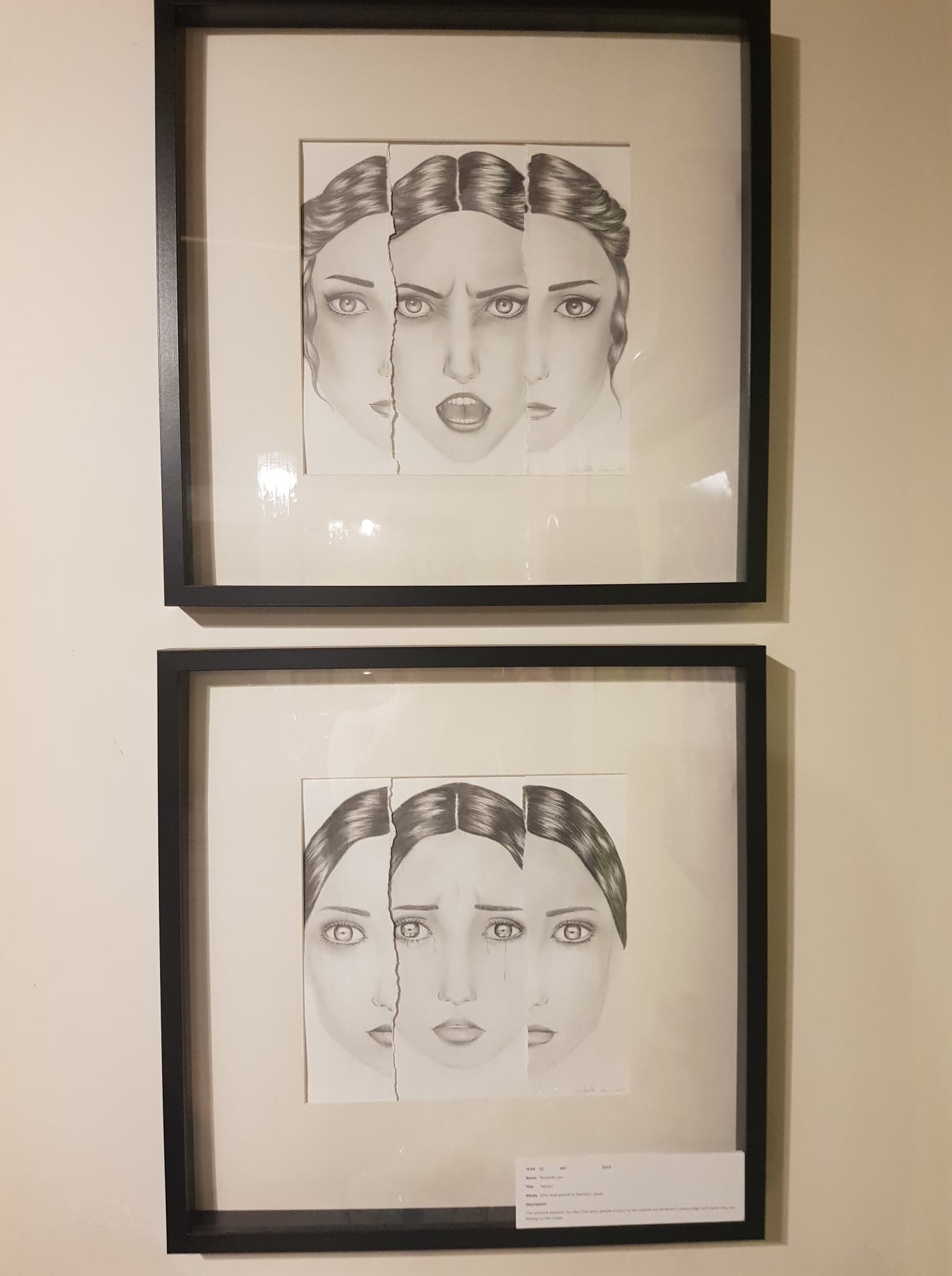
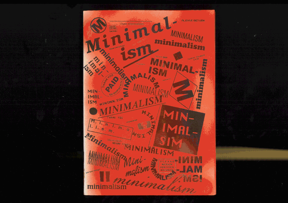
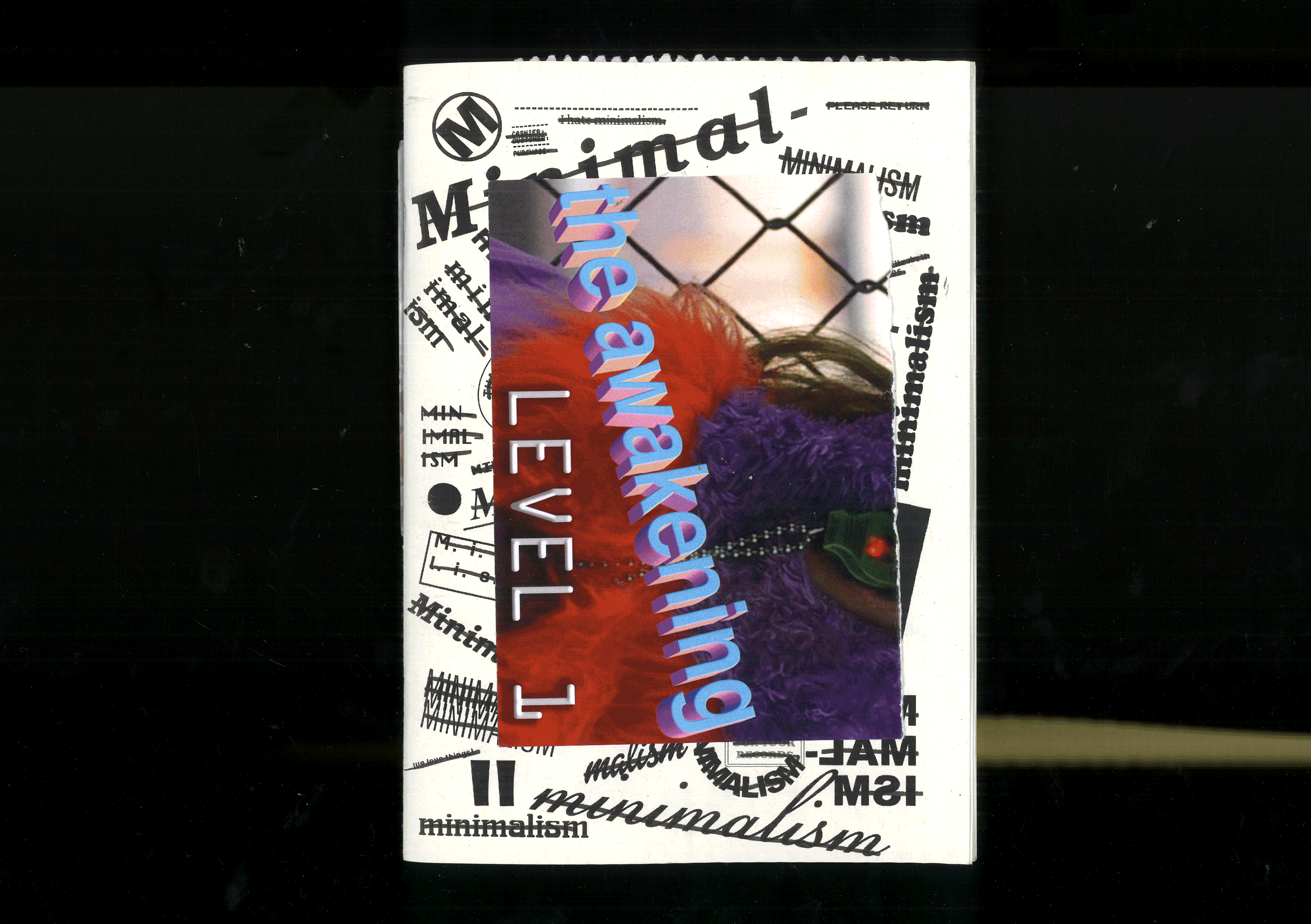
(Khandwala 2019). Critchlow series of zines Minimalism (see figure 1 and 2) are a customisable cluttered celebration of collecting in direct opposition to minimalisms doctrine of declutter and its untouchable mystic (Khandwala 2019). She layers found objects in particular plastic bags, receipts, tickets and stickers to create page spreads that are as overstimulating as consumption is to your average person who has not reached the supposed “clarity” and “peace” of selectivity. She also included with each zine a pack of unused ephemera and encourages her audience to add to the jumble of imagery (see figure 3) (Critchlow 2019). This interactive element makes Critchlows zines feel accessible. It emphasis her rejection of the classist and alienist elements of minimal design by allowing the audience to not just observe her work from a dignified distance but be a part of the end result.

Figure 1. Critchlow, Elizabeth. Minimalism. Zine. Accessed 13 April, 2019. https://www.elizabethcritchlow.com/minimalism.
Figure 2. Critchlow, Elizabeth. Minimalism. Zine. Accessed 13 April, 2019. https://www.elizabethcritchlow.com/minimalism.
Figure 3. Critchlow, Elizabeth. Minimalism. Zine ephemera. Accessed 13 April, 2019. https://www.elizabethcritchlow.com/minimalism.

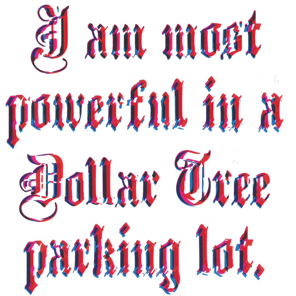
Another work of Critchlows stood out to me as I was browsing her website, Dollar Tree (see figure 4) a series of three typographic prints (Critchlow 2019). The prints read “I am most powerful in a Dollar Tree parking lot” in three different colour combinations (Critchlow 2019). The words speak of a lower class experience, standing outside a dollar store. This is a relatable experience to many people, they have been to dollars stores before, there is no luxury or exclusivity to speak of and yet she elevates the dollar store. She describes the experience as imbuing her with power (Critchlow 2019). What I connected with in this work is the type face itself. It is a Olde English style type, one which I would say falls under the umbrella of “bad taste”. It is tacky and cartoonish, and yet its historical connotation lend weight and religiosity to her words. The character of the typeface is what in turn imbues the content with power. Why do we consider it a poor taste typeface if it serves its function and adds to the design? I do not believe a simplified type that would be considered “fresh” and following modern notions of aesthetics would have had the same impact.

Figure 4. Critchlow, Elizabeth. Dollar Tree. Digital Print. Accessed 13 April, 2019. https://www.elizabethcritchlow.com/dollar-tree.

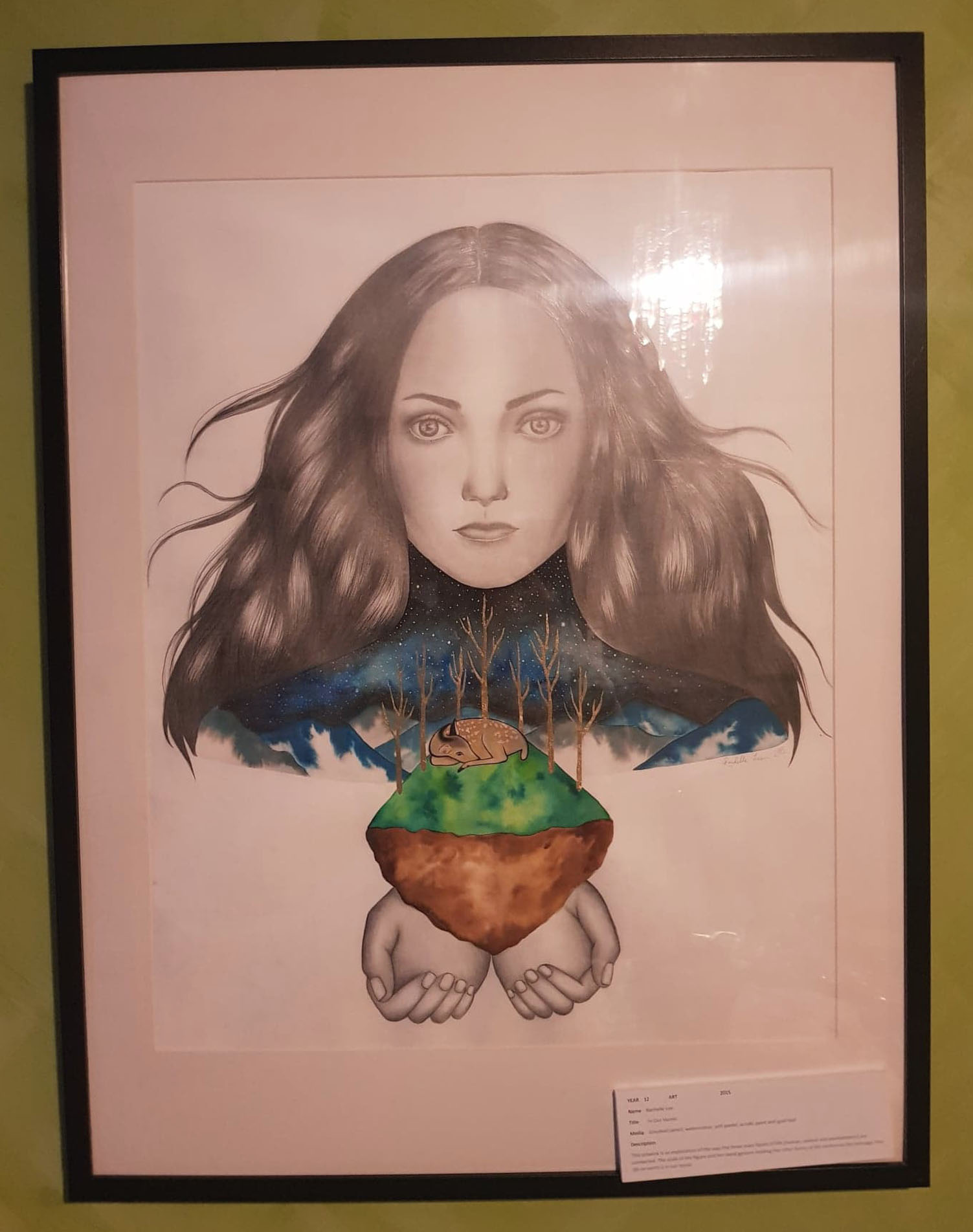
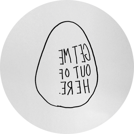
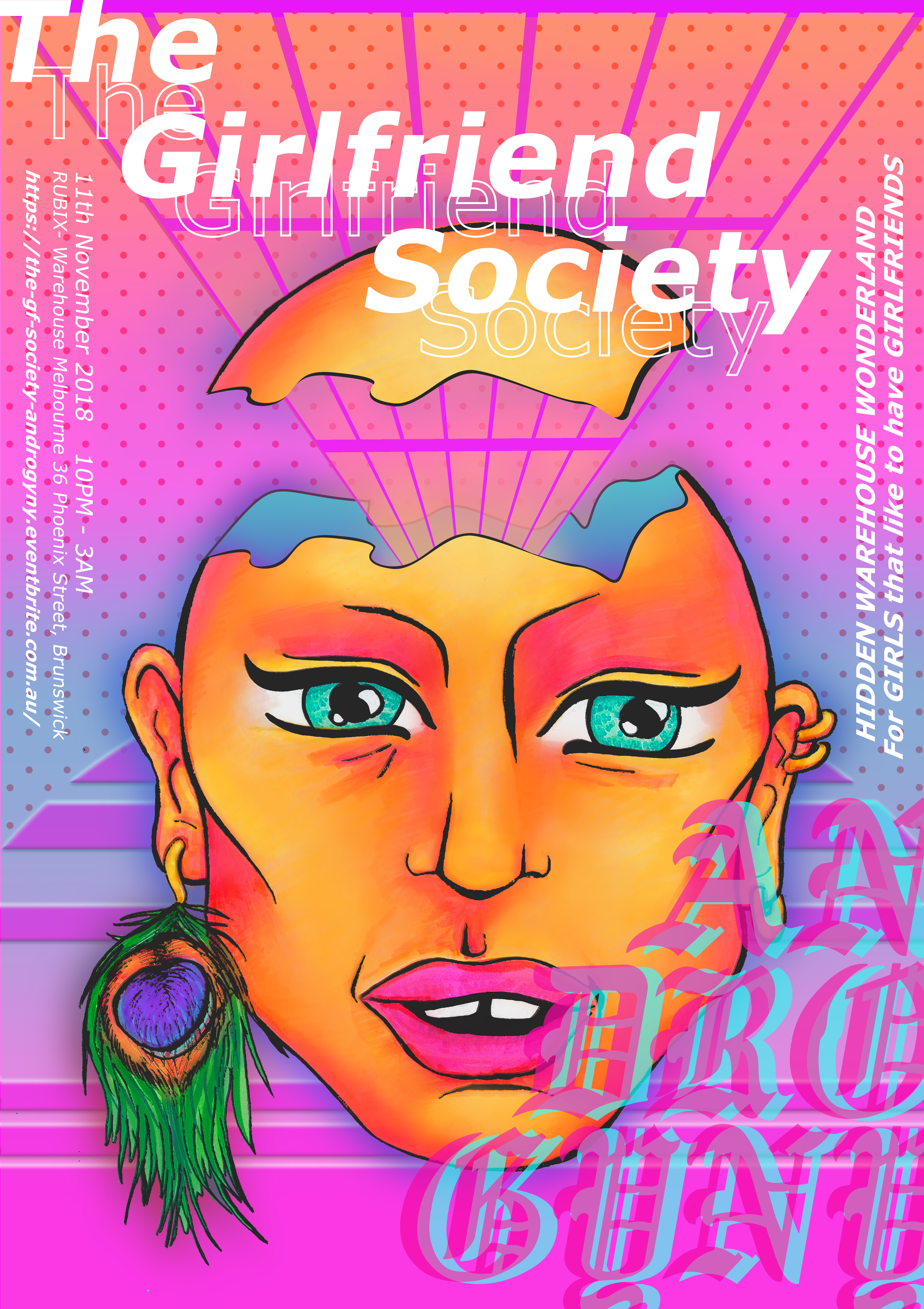
This type face appeals to me, I have even used it in a past work (see figure 5). In semester 1 of last year we were tasked to create an event poster, having spent a fair while attempting to create a clean modern looking design that was still visual intriguing I got frustrated. Out of this frustration I began to experiment with elements that I would traditionally consider “ugly”. The first of which was this type face. I thought it was so camp and jarringly 90s that using it would be funny. I showed some initial mock ups to my tutor who hated the type. They explained to me that there is a difference between poorly executed design and well executed design in poor taste. Rather than scrapping the type which had grown on me I changed the style of my design, focusing on creating a vaporwave inspired piece. Vaporwave which is a cyberpunk aesthetic that makes ironic use of Nostalgic 80/ 90s web design, neo classical elements, Japanese culture and cheesy internet humour (Bacon 2018). Its layered bold approach seemed such a relief to the stark rigid forms of minimalist design. It allowed me the freedom to  have fun with colours and design motifs that would generally be considered in poor taste. I used gradients that I would have once deemed “childish” in design, hot pinks and purples that I traditionally would have thought of as garish. Why is it that I have these associates, these taste? Is it my personal view that I was born with? It seems more likely a taught standard because I liked what I made and yet I would never consider it a high piece of design. It wouldn’t be used by a up market brand or to promote an important event. Due to its maximised approach it has been taught to me to be seen as lower class, reserved for those who can’t afford the high price tag that comes with simplicity.

Figure 5. Bourke, Sarah. 2018. The Girlfriend Society. Copic marker, coloured pencil and digital manipulation.

It is difficult to try see beyond class norms and standards in design but it is also critical. In order to create design that is ethical and new we must question our prior education and our perceived tastes. Push past the accepted idea of what is “good” taste and “good” design. Only when we each apply this mindset to our own design practise can we push design forward.

References

Redmond Bacon. 2018. The Vaporwave Aesthetic. Sound on Time. October 14. Accessed April 15, 2019. https://soundontime.com/vaporwave-aesthetic/.

Bourdieu, Pierre. 1984. A Social Critique of the Judgement of Taste. Translated by Richard Nice. London: Routledge & Kegan Paul.

Bourke, Sarah. 2018. The Girlfriend Society. Copic marker, coloured pencil and digital manipulation.

Christoforidou, Despina & Elin Olander & Anders Warell. 2012. Good Taste vs. Good Design: A Tug of War in the Light of Bling. The Design Journal 15, no. 2.

Karyn Cooper. 2018. What is Minimalist Design?. Hunker. March 22. Accessed April 13, 2019. https://www.hunker.com/13709024/what-is-minimalist-design.

Penny Craswell, blog. 2018. Design and Maximalism: the Anti-Minimalist Movement. The Design Writter. September 4. Accessed April 15, 2019. https://thedesignwriter.com.au/design-and-maximalism/

Critchlow, Elizabeth. Dollar Tree. Digital print. Accessed April 13, 2019. https://www.elizabethcritchlow.com/dollar-tree.

Critchlow, Elizabeth. Minimalism. Zine series. Accessed April 13, 2019. https://www.elizabethcritchlow.com/minimalism.

Fagan, Chelsea. 2017. Minimalism: another boring product wealthy people can buy. The Guardian. March 4. 2017. Accessed April 15, 2019. https://www.theguardian.com/lifeandstyle/2017/mar/04/minimalism-conspicuous-consumption-class.

Ferry, Kathryn. 2017. Clutter and the Clash of Middle-class Tastes in the Domestic Interior. De Gruyter. September 5. 2017. Accessed April 14, 2019. https://www.degruyter.com/downloadpdf/j/culture.2017.1.issue-1/culture-2017-0011/culture-2017-0011.pdf.

Friedlander, David. 2016. Minimalism: Class, Fetishes and the Fate of the Planet. The Medium. September 2. 2016. Accessed April 13, 2019. https://medium.com/hothouse/minimalism-class-fetishes-and-the-fate-of-the-planet-7324255746e5.

Khandwala, Anoushka. 2019. Why minimalism is a class issue + You might not need that expensive adobe subscription. Eye on Design, April 3. Accessed April 13, 2019. https://eyeondesign.aiga.org/why-minimalism-is-a-class-issue-you-might-not-need-that-expensive-adobe-subscription/.

Ada Ivanoff. 2014. What is Minimalism. Sitepoint. June 6. Accessed April 14, 2019. https://www.sitepoint.com/what-is-minimalism/

Jamieson, Ruth. 2017. In the world of magazines, what’s so good about bad taste? Eye on Design, January 12. Accessed April 15, 2019.https://eyeondesign.aiga.org/in-the-world-of-magazines-whats-so-good-about-bad-taste/.

Jenkins, Tiffany. 2014. Why we should stand up for good taste. The BBC. October 21. 2014. Accessed April 14, 2019. http://www.bbc.com/culture/story/20140605-what-makes-good-taste.

Mack, Adam. 2012. The Politics of Good Taste. The Senses and Society 7, no. 1. Accessed April 15, 2019. https://doi.org/10.2752/174589312X13173255802166.

The Minimalist. Design Minimalism: What, Why & How. Accessed April 15, 2019.https://www.theminimalists.com/minimalism/

Marc Schenker, blog. 2018. The Minimalist Design Trend: Why Less is More. Creative Market. January 30. Accessed April 13, 2019 https://creativemarket.com/blog/minimalist-design-trend.

The Danger of Reduction

“Designing Women” is the National Gallery of Victoria’s  exhibition highlighting contemporary female designers. It showcases over 50 key works from 1980-2018 featuring fashion design, architecture, industrial design, digital design, ceramics and jewellery design (NGV 2018). The purpose of the exhibition was to shine a light on the achievements of female designers and the role they play in pushing design forward in innovative and inspiring ways.

I visited the exhibition and was impressed by the diversity of the collection and the range of pieces. The exhibition is grouped into four key narratives: leadership, community, teamwork and research. While reading the explanations for these themes and the gallery notes beside each piece I was encouraged to think about women’s historical and cultural role in design. I was being led to view each piece in direct relation to the gender of its designer. This is of course expected as it is an exhibition that focuses on women. However it is interesting how many different things can be said about these pieces that go beyond gender.

Kirkham and Attfield in their anthology of essays “The Gendered Object” encourage that we look beyond an object as simply a physical thing but rather think of it in terms of human experience (Kirkham and Attfield 1996, 1-11). How we interact with it, how we use and how it makes us feel (Kirkham and Attfield 1996, 1-11). To look at the sum of its parts we should consider an object through every possible lens. This includes looking through the lens of historical and cultural context, lens of philosophy, psychology, feminism, sexuality and more (Kirkham and Attfield 1996, 1-11). When attending an exhibition that largely focuses on one lens it highlights that approach and can often result in the other considerations being forgotten. I believe that while it is a wonderful thing the NGV has done by exhibiting the work of female designers who are often overlooked in our patriarchal society it can result in the works being seen as “female” or “feminine” which runs the risk of reducing a piece to just one of its possible interpretations. When viewing the works on display at Designing Women I would encourage that the audience should think beyond gender for each piece. These are not “female” designs these are designs created by designers who happen to be women. And these designers have not created every piece to be a statement on their womanhood. Of course design once out of the designers hand should be free to be interpreted any way its viewer sees fit but I would encourage the viewers of this exhibition to really try to fully ponder the possible nuances and all the interpretations of each piece.

The piece that intrigued me the most was Horse Lamp (see figure 1 and 2), it immediately triggered a strong emotional response from me that took some time to unpack and understand what it was I was feeling. Horse Lamp 2006, is a true to scale sculptor of a horse with a cylindrical functioning lamp attachment sprouting from its head. The design was created by Stockholm based group Front Design, including designers Sofia Lagerkvist, Anna Lindgren, Charlotte von der Lancken and Katja Sävström. If you had forgotten the true size of a horse this lamp will remind you that they are very large indeed. The horse dwarfs the attached lampshade and everything around it. It was a popular product that sold well and has been featured in many exhibitions (Hobson 2016). As such it has been viewed by many people and interpreted in many different ways. Many that I’m sure Front Design never would have imagined. I believe that to truly understand this piece we must adopt Kirkham’s and Attfield’s multifaceted approach and analyse all possible meanings and themes. We must not let the focus of the exhibition be our only interpretation or we are in danger of reducing these works to the single dimension of gender.

Figure 1. Front Design. 2006. Horse Lamp.
PVC plastic, polycarbonate, steel, viscose,
E27 bulb and electricals. Accessed 12 April, 2019. https://www.1stdibs.com/furniture/lighting/floor-lamps/moooi-horse-lamp-front-design/id-f_7640833/.
Figure 2. Front Design. 2006. Horse Lamp.
PVC plastic, polycarbonate, steel, viscose,
E27 bulb and electricals. Accessed 12 April, 2019.
https://www.1stdibs.com/furniture/lighting/floor-lamps/moooi-horse-lamp-front-design/id-f_7640833/.

 With an exhibition focused on female designers it is easy to think of each piece through the lens of gender. To think of feminist theory and “was does this piece say?” in relation to that field. It is important that we do think about that. Horse Lamp in this context could easily be viewed as a feminist piece. This lamp struck me as having a very male energy. The work is made of a PVC viscose laminate shade, a metal frame structure and polyester horse. Metal and plastics are often viewed as “male” materials whereas wood and clay are seen as “female”. It was large, dark and imposing, qualities that are traditionally associated with masculinity. And yet it is a lamp with no gender. If I was to view this through a feminist lens I would say that women are traditionally taught to not take up too much space, to shrink themselves, to be smaller and quieter. This lamp is none of those things. Its enormity is overwhelming, it cannot help but draw attention to itself. The black of it frame is bold and dark, the complete opposite of what is expected from a female designer.

Had this piece been in an exhibition with a different focus I’m sure I would have interpreted it differently. Had this horse lamp been in an exhibition showing off the best of modern Scandinavian design my thoughts perhaps would have been on its rejection of minimalism and functionality. The typical characteristics of Scandinavian design being light muted colours, wide spaces and simplified functional forms (Contemporist 2016). Scandinavian interiors uses minimal décor and furniture to create a bright, cohesive and open feeling to a room (Lakzy 2018). Maximising the amount of space and minimising clutter (Smith Brother Construction 2016). Focusing on furniture that is functional without drawing attention to itself is best (Lakzy 2018). Traditionally industrial designers are trained to design objects that perform specific tasks. The shape, form and size of an object is designed to make that task easy (NGV 2018). Lamps would traditionally be designed to be small, non-intrusive and not take up too much space. This lamp is different, its enormous form fills the room and reminds every one of its presence. The black looming quality it possess won’t let it be forgotten and make it difficult to cohesively work into a room. Front Design by creating a piece so absurd and out-of-place seem to laugh at the serious, uniform design culture surrounding them in Stockholm. They instead encourage us to break free and laugh with them. Laugh at the visual of a horse with a lamp on its head. Their experimental design is pushing us to move forward, past our expectations of what new design coming out of Scandinavia should looks like.

In an exhibition focused on nature the focus could have been on Horse Lamps use of an animal as the base of the lamp. Possibly a reminder that we are so disconnected from nature that the true size of a horse is shocking to us. Or a critic of how we think about animals. We often only think of animals as existing for our use, for us to eat, to experiment on, to put to work (Grover 2011). Even in a kinder scenario we use them as pets, we treat them as our possessions rather than autonomous beings. The horse for hundreds of years has been used by humans. Horses ploughed our fields, pulled our carriages, charged with us into war, carried us around, we even use them for sport (Grover 2011). Here a horse, a creature that once widely roamed the fields, is turned into furniture. This could be symbolic of our relationship with horses. Our treatment of them as servants turns them from a living being into an unfeeling object that like furniture exists simply for our use.

Everybody interpretation of design will be different and each of these interpretations is valid. It is important that we don’t forget how complex the world we live in is and how our different experiences will shape how we see, interact with and understand an object. Exhibitions encourages us to focus on one way of seeing. This can be a very important tool as it is with NGV’s “Designing Women” as a female perceptive is often forgotten but it is not and should not be the only way. I encourage you to go and see this exhibition, celebrate female designers but do not forget that they are also just designers whose works span many themes and each of these themes should be remembered.

References

Contemporist. 2016. 10 Common Features Of Scandinavian Interior Design. Contemporist. July 14. Accessed April 13, 2019. http://www.contemporist.com/10-common-features-of-scandinavian-interior-design/.

Front Design. 2006. Horse Lamp. PVC plastic, polycarbonate, steel, viscose, E27 bulb and electricals. Accessed 12 April, 2019. https://www.1stdibs.com/furniture/lighting/floor-lamps/moooi-horse-lamp-front-design/id-f_7640833/.

Sami Grover. 2011. Are Working Animals our Partners or our Slaves. Tree Hugger. October 27. Accessed April 14, 2019. https://www.treehugger.com/culture/are-working-animals-our-partners-or-our-slaves.html.

Hansgrophe. Front Design – the Swedish “Avant-gardistes”. Accessed April 13, 2019. http://www.hansgrohe.com.au/21309.htm.

Ben Hobson. 2016. Front’s Lifesize Horse Lamp for Moooi was a Provocative Experiment.  Dezeen. August 17. Accessed April 13, 2019. https://www.dezeen.com/2016/08/17/video-interview-front-lifesize-horse-lamp-animal-collection-moooi-experiment-movie/

Kirkham, Patt and Judy Attfield. 1996. The Gendered Object. Manchester: Manchester University Press.

Mary Lakzy, blog. 2017. 8 Basics of Scandinavian Style Interior Design. Comelite Archirecture. April 14. Accessed April 15, 2019. https://comelite-arch.com/blog/scandinavian-style-interior-design/.

NGV. 2018. Designing Women: Artwork Labels. Accessed April 11, 2019. https://www.ngv.vic.gov.au/wp-content/uploads/2018/10/Designing-Women_Large-print-labels.pdf.

NGV. 2018. Designing Women: Modern-Day Trailblazers Defining the Future Through Design. NGV. Accessed April 11, 2019. https://www.ngv.vic.gov.au/exhibition/designing-women/.

Smith Brothers Construction. 2016. The Philosophy of Scandinavian Design. Smith Brothers Construction. May 5. Accessed April 15, 2019. https://smithbrothersconstruction.com/the-philosophy-of-scandinavian-design/.

Abstraction | The widening gap between universities and the land they rest on

I will explore how indigenous concepts of knowledge are at odds with traditional academic modes of acquiring knowledge through research, and how that nexus of ideas have been explored in three-fold as part of the Shapes of Knowledge exhibit at MUMA.
This is not an all encompassing analysis of indigenous design or rights, I am under qualified to give that.

Exploring the gap of knowledge production through the lens of Brian Martin, analysis of the meaning of the event

Dr. Brian Martin, a professor at Monash, is a descendant of the Muruwari, Bundjalung and Kamilaroi peoples and former deputy director of the Institute of Koorie Education at Deakin (1). He specializes in indigenous relations, and how they have been improperly engaged with for hundreds of years in Australia. He was thus a valuable speaker at Threefold, a series of three public talks on different ways of exploring knowledge and identity. These talks were an interactive extension of the Shapes of Knowledge exhibit (2) run by Dr. James Oliver, which explored how different entities produce and share knowledge. This particular event featured many speakers that presented on their particular corner of oppression in the world at large, and how universities are woefully unable to engage with it. The talks were pithy, engaging, and intellectually rigorous responses to the key question ‘Where is the university?’(3).

Methexical Countryscape Kamilaroi #9, 2017

Most of the speakers gave a ten-minute performance. Martin, in contrast, did only two things. First, he played a video of his work, which featured him laying out single panels one by one to create a photorealistic charcoal sketch entitled Methexical Countryscape Kamilaroi #9. The work was simple, elegant and impactful, harnessing the full scale of artistic endeavour for political impact and sociopolitical engagement. This demonstration had no music or other distractions, which magnified the clear message that the ancient construction, and more recently, systematic destruction, of the natural environment had critically changed Australia and the relationship people have with country. Second, he quietly said one sentence: ‘The university is an abstraction from the land’.


‘The university is an abstraction from the land.

Prof. Brian Martin

During a later discussion, Martin broke down what he meant by this statement. The university is a physical distortion of the land that it resides on. Indeed, in order for the university to exist, destruction of place necessarily occurred. And with each extra story of each new building, the physical distance between the earth and dirt the land began as, is increased. Furthermore, the way university systems operate acts to mask the value of traditional indigenous knowledge production. The bureaucracies act as the foundation for the traditional model of tertiary education, value analysis, and vicarious inquiry rather than lived experience.


John Berger in his book ways of seeing explores the varying ways we can perceive and synthesize knowledge. Our perception of objects and our subsequent analysis of the significance of an object differ wildly depending on who is viewing it and the context they are coming from when they engage with it. This can be used to explore the alternative perceptions of land that exist between contemporary Australian culture and historical indigenous understanding. On the one hand, land is seen as financially valuable and as an object of power and control. This perception may be driven by a colonial conquest that is core to Australia’s history. On the other, there is a respect and interdependency of the indigenous community and land that has existed for an order of magnitude longer than a western capitalist viewpoint. This plays into the idea that “the relationship of what we see and what we know is never settled” (4) because these different narratives struggle to adequately engage with each other.
Universities remain bastions of the intellectual class and attempt to integrate their expertise and wealth of knowledge into society’s perception of success. As intellectual capital has been increasingly valued by society, perversely, societies own biases have reflected into university culture. Historically, universities have not been particularly culturally diverse, and when diverse or minority academics have been successful, they have done so in spite of an educational paradigm that did not value lived experience as a unique and worthwhile form of knowledge production. Establishment tertiary education has also transitioned more to integrating with industry and capitalist ideals. Entrepreneurship, graduate employment prospects, and tangible outcomes are increasingly the metrics of success through university. This commodification of intellectual output was laid out by Noam Chomsky in his 1967 essay ‘Responsibility of Intellectuals’(5) where he argues that intellectuals are increasingly becoming subservient to power rather than shaping power structures in society (). This, he argues, coincides with the decline of conventional consumerist western consumption and is a signal of late-stage capitalism.
Given that the alternative narratives between indigenous and western concepts of information, knowledge, and place are often incompatible, bureaucracies in institutions are sometimes implicitly prioritizing certain rights. A pushback against this is the indigenous design charter (6), that asserts that indigenous respect and engagement also extends to control over built environments, goods, and outputs. We see this in projects like the Mulka Project (7). Core to the successful implementation of such a charter is the concept of preemptive engagement. That is, rather than seeking consent for actions or decisions taken, like creating a new program or product, in order to be truly culturally sensitive those in power need to allow the indigenous experience to shape their decision making and task prioritization. It is not a final hurdle, but rather a first step.  

Drawing upon Indigenous ways of knowing and political philosophy in the 21st century offers a critical lens to view the widening gulf between reality and the abstract ivory towers of the university.

References:


1. starweekly.com.au/news/referendum-exhibition-comes-to-werribee/

2. monash.edu/muma/exhibitions/exhibition-archive/2019/Shapes-of-knowledge

3. monash.edu/muma/events/2019/threefoldparallelperformance

4. waysofseeingwaysofseeing.com/ways-of-seeing-john-berger-5.7.pdf

5. nybooks.com/articles/1967/02/23/a-special-supplement-the-responsibility-of-intelle/

6. design.org.au/documents/item/216

7. monash.edu/muma/exhibitions/exhibition-archive/2019/Shapes-of-knowledge/the-mulka-project


In a man’s world. The story of Bell Kogan

How one woman broke into a part of design where women were seldom allowed to explore and decided she was there to stay.

She is known as the godmother of Industrial design, and for good reason. Bell Kogan had an extremely prolific career traversing the intersection of product design, art, and graphical thinking. Considered the first female industrial designer in the US (1) he pushed into the world of industrial design during the time when there was a shift towards professionalism (2), and was a trailblazer by allowing minority actors and disadvantaged people (in particular women) to engage in the new immature industry that was manufacturing in the 1950s. Unfortunately, the canon of design tends to gloss over women and Kogan is no exception. She has been maligned by history, and although this small blog can do no major part in addressing that wrong, it can at least be said that students nearly half a century later consider, value and recognise the significance of her work both for its own merit and what it signifies.

Belle Kogan in 1955

This portrait of Kogan in 1955 shows a powerful and focused designer at apex of her craft. She is pictured using tools that no doubt for the time would have been considered objects solely for the hands of men, like slide rules and protractors, to create complex sketches and drawings. The contented and focused smile that sits on her face perhaps demonstrates the ease with which she plays across plays the craft which she is so excellent in.

When Pierre Bourdieu discusses the economy of cultural goods across all cultural practices, the natural progression is that a culture will accept the producers of that work (3). Kogan, while avidly contributing to her epoch of the design canon, wasn’t promoted to the upper echelons of her profession while her male counterparts were.


‘[Design] didn’t just happen’

Belle Kogan


A 1935 display of Kogan’s designs at the Exposition of Arts and Industries at Radio City Forum, New York City

This collection of Kogan’s designs shows the variety of homewares that she created in ceramic, glass, and metal (particularly silver plated brass). These designs with there expertly and seamlessly fit it in to the decorative art that was so prolific and influential in that area.

Her full name clearly posted on the back of this prominent placement signifies a U-turn in recognition for two reasons:
Up until this point, women were consistently undermined as cultural producers in three major ways. Firstly, women systematically faced barriers that prevented them from pursuing design education. For instance, women in the bauhaus were funneled into traditionally feminine disciplines like weaving over male-centric ones like architecture (4). When this barrier is surmounted, the work of female industrial designers was frequently attributed to men. This perpetuated the false narrative that women were incapable of complex design. Otherwise, works frequently went nameless and uncredited. When Kogan began to receive greater recognition, by extension all women may have been recognized as able contributors to the field of industrial design. When a physical good was manufactured and distributed, it in turn became a physical manifestation of women’s design ability.

Gold-plated No. K-1 Zippo, 1938

This gold plated lighter from the final years of the 1930s is one of the most enduring legacies in the history of American Art Deco design. It’s a modified zippo lighter with a simple geometric pattern which complements the clean plane on the surface of the cuboid lighter. What’s curious is that it is easy to imagine a misogynist of the era using such a lighter every day to light cigarettes and cigars in gentleman’s clubs where Kogan was no doubt unable to enter. Such men were likely oblivious that a woman was responsible for this quintessential piece of American manufacturing. Had they known, they may have been less likely to use it as a tool to prop up the patriarchy. It’s this kind of subtle influence and demonstration of complexity in labour that creates a mechanism to transition the misogynist actors of old into the progressives of today. The importance of cultural producers like Kogan, who by virtue of their existence paddle a progressive message, cannot be overstated.

Rendering of Sugar Bowl, 1958

Sweetening the Deal

The rendering of the sugar bowl highlights Kogan‘s ability to take elegant and minimal decorative design and sketch workable technical drawings that could be taken straight through to the manufacturing stage. Her ability to run the gamut of the design process was a critical element of Kogen successful design practice (5).

Why we must remember Belle Kogan today

The makeup of current design industries and educational establishments are finally tilting away from the historical hegemony of generally old, white, European men, making now the time to truly acknowledge the creative outputs of disadvantaged groups that have always been poised for recognition.

References:

  1. https://www.idsa.org/content/belle-kogan-fidsa
  2. Women designers is there a gender trap?, 1990
  3. A Social Critique of the Judgement of Taste by Pierre Bourdieu, 1984
  4. https://www.artsy.net/article/artsy-editorial-women-bauhaus-school
  5. https://www.inclusity.com/belle-kogan-1902-2000/

One of the iconic famous art-directors of all time

The Didot logo poster is the creative design of the Didot logo inspired by the works of Alexey Brodovitch. Brodovitch is a household name in the graphic design world. He is the brain behind the modern glossy magazine which focuses on style. During his time, Brodovitch also founded fashion and advertising photography. The works of Brodovitch was driven by the changes in complexity, size, and values which were effectively implemented in his works to provide the viewers of the resulting materials with a sequence of varying experiences that evoked positive energy and movement on the resulting works. 

Didot Poster
By Chommi Chainukulsila 2017

My Didot poster which features the Dior models makes use of the same principles which were implemented by Brodovitch and are still in use in the modern aesthetic arena and is also heavily implemented by the women in graphic design. Despite being rendered invisible by the largely male-dominated industry. Connory (2019), insinuates women in graphic design plays a key role in setting the trends of the industry. The women have been involved in the design work in a various way such as theorists, partitioners, historians, consumers, and as objects of representing (Buckley, 1986). In my opinion, the exploration of ideas in graphic design had been largely done through the collection references from other design work, collaboration with other individuals through a community copying the original design works of individuals such as Alexey Brodovitch and many more. In most cases, the exploration of the ideas is inspired by the curiosity and creativity of individuals. The exploration of these ideas makes use of various methods such as selection, classification, and prioritization of a given kind of design. The exploration is also affected by categorizing the designers in terms of their styles and movements which results in varied modes of graphic design production. According to Buckley (1986), women are believed to posses sex-specific skills which act as key determinants of their design abilities. These sex-specific determinants make the women dexterous, decorative, and meticulous thus driving their capabilities to explore ideas more than men. These skill exhibited by women enable them to naturally suit certain areas in the design industry of the decorative arts such as the embroidery, jewelry, weaving, graphic illustration, pottery, knitting, and many others. The resulting design works of these women are always used by both men and women making them universal.

Harper’s Bazaar, February 1952 
Photograph by Richard Avedon 

  Alexey Brodovitch revolutionized the Harper’s Bazaar magazine by creating an iconic Didot logo which acted as an inspiration to some of the greatest visual artists of the 20th century (Purcell, 2002). The Brodovitch designs have a signature use of white space with a cinematic quality brought about by the obsessive cropping of the layouts, These qualities are seen in the Brodovitch’s design work resonates with the design principles which revolves around movement, balance, emphasis, hierarchy, repetition, contrast, rhythm, pattern, proportion, unity and variety. In essence, every design work implements these key design principles to create aesthetically things while optimizing the experiences of the user at the same time. These key design principles enabled Brodovitch to come up with pages that blend beautifully, typographies, cropped photographs as well as designs that were bold for Harper’s Bazaar magazine (Purcell, 2002). The implementation of these principles enables Brodovitch to revolutionize the design of the at the magazine inspiring visual artist of the 20th century as a result. 

If you don’t like full skirts… 
Article in Harper’s Bazaar, Photographs by 
George Hoyningen-Huene 
March 1938

 During his time at Harper’s Bazaar magazine, Brodovitch departed from static layouts as well as the conventional posed studio photographs to smoothing which was considered exciting and was latterly replicated in various magazines of the United States. The emphasis of his design was unique double-page spread where photography was exquisite with crisp Bodoni typeface, and elegant white space was laid out in a blend. In my opinion, every artwork is an expression. Artworks always represent the inner state of the artist. Thus, in the most cause, the artist may make use of various channels such as form, color, or the medium to expire or manifest their inner states. The artist often creates their artworks by beginning in various combinations of mediums such as paints on canvas. In some cases, the artists may create existing artwork using a different combination of materials bringing out a different perspective of the artwork. Thus, in the three classical branches of art which include sculpture, painting, and architecture, the ideas may be manifested differently depending on the inner state of the artist which influences his or her choices of color, form or the medium of expression. The expression of feelings by these artists hugely relies on the medium assisted by form and color. However, Buckley (1986) argues that in some cases that, the manifestation of ideas by the artists is always influenced by their gender, as women tend to give a feminine approach to their issues. 

Artworks always represent the inner state of the artist. The workers are always done in accordance with the design principles. However, some of the best designers in history such as Alexey Brodovitch seemed to have disregarded the then existing principles of design to come up with revolutionary designs. Brodovitch’s design ideas were manifested through form, and medium, which made them unique. Nonetheless, today the exploration of ideas in graphic design has been done through the collection, references from other design work, collaboration with other individuals through a community and copying the original design works of individuals as opposed to Brodovitch era. The exploration of these ideas has made use of various methods such as selection, classification, and prioritization of a given kind of design. 

References

Buckley, C. (1986). Made in patriarchy: Toward a feminist analysis of women and design. Design Issues, 3-14.

Connory, J. (2019). Plotting the Historical Pipeline of Women in Graphic Design. Retrieved 11 April 2019, from http://dharn.org.au/plotting-the-historical-pipeline-of-women-in-graphic-design/

Purcell, K. W. (2002). Alexey Brodovitch. Phaidon Press.

How do you define beauty?

Everyone has different views and opinions that are informed by a multitude of factors including our education, up-bringing and morals. So it’s hardly surprising that we don’t all share the same view of what we consider as ‘beauty’.

Earlier this year, Zara, a Spanish fast fashion retailer released a campaign featuring Chinese model Li Jingwen which sparked outrage on Chinese social media. Many people were irritated at the campaign and vented on social media about it under the hashtag “Insult to China.” (May, Mou 2019) According to the New York Times, one commenter wrote, “Why are freckled faces misconstrued as high fashion?”, while another wrote, “just the West’s beauty standards for Asians, very different from ours. For those women to be called the most beautiful in Asia feels like discrimination to the rest of us.”(May, Mou 2019) It’s clear that many people believed Zara were being culturally insensitive by trying to push Western beauty standards onto the Chinese community. However, Zara posted a response on PearVideo saying that the campaign was for “global markets” and “our headquarters in Spain picked the model, they might have a different beauty standard… And we didn’t photoshop the photos”. (Chenyu 2019) Although it seems Zara never intended any harm with their photoshoot, it’s interesting to see how a seemingly small design decision created such an uproar.

The image itself depicts the home screen of a Zara webpage advertising their beauty products. On the left is their usual set-up of the shopping categories as well as their logo. On the right two thirds is a close up portrait of Jing Wen. Her face is angled to the right and her expression is quite monotone, with her eyes gazing towards the camera. The background is empty, her hair has been slicked back from her face and her clothing is black which ensures that the viewers eyes are drawn to her face, in particular the dark pink lipstick that they are advertising and also -perhaps unintentionally- her freckles. As her freckles are so visible, it gives the campaign a ‘natural’, unedited and fresh feel. Situated on top of her cheek are the large words “Beauty is here”, accompanied by some smaller type that reads “paint it matte, shine bright, ultimate, perfume”, making it obvious that the photo is an accompaniment to their advertising of beauty products. (fig.1)

figure 1. Zara homepage, 2019

I found it very interesting to read about this campaign and people’s abhorrence to it because to me personally, if I saw this on the Zara website, my only thoughts would be that it’s cool that there is Asian representation. To me, her freckles aren’t ugly, and she simply looks fresh faced and digitally unaltered. However, this just further proves how different people’s standards of beauty are because for so many people in the Chinese community, the freckles are hideous. As someone who is Australian born Chinese, it makes me wonder how differently my perceptions of beauty would be had I not been born in regional Australia.

Growing up on the Mornington Peninsula, I was surrounded by Caucasian people. Not only that, the media around me, from movies, to books to advertisements also lacked in cultural diversity. Consequently, growing up, I always thought that Caucasian people were the most attractive group of people. This is very evident in the fashion illustrations I used to do, where I would draw skinny, white women with large eyes and pointed noses and it never occurred to me to draw people from other races. For my Year 12 VCE final pieces for art, I created three portraits of women, that were all Caucasian. The former artwork (fig.2), was based off a photo of a friend, so I do think it made sense that she is fair-skinned, with long wavy hair and large eyes, however for the two other faces (fig.3), I actually used a few different references of models and made up faces. And as you can see, they all have Caucasian features.

figure 2. Untitled, Rachelle Lee 2015
figure 3. Untitled, Rachelle Lee 2015

The way in which I unconsciously made these decisions aligns to the issues brought forward in Dimeji Onafuwa’s journal, “Allies and Decoloniality : A Review of the Intersectional Perspectives on Design, Politics, and Power Symposium” (Onafuwa, 2018) Onafuwa describes how the lack of awareness of designers can be discriminatory without them even realizing. (Onafuwa, 2018,). In the 1950s, there was an issue with the Kodak Shirley cards (fig.4) because for years, it was used by photo labs to calibrate skin tones, shadows and lighting during the printing process. (Del Barco, 2014) The film was flawed because it meant that if wasn’t suitable for people with darker skin and if a photo was taken featuring people with different skin tones, the shot would come out as partially under or over exposed. This goes to show how representing only one race is troublesome.

fig.4 Kodak Shirley card

While it is clear that standards of beauty differ from person to person, it’s important to be culturally aware and encourage diversity so we don’t relive the same mistakes of the past.

References

Chenyu, Liang. “Chinese Netizens Decry, Then Defend, Zara Model’S Freckles”. Sixth Tone, Last modified 2019. https://www.sixthtone.com/news/1003572/chinese-netizens-decry%2C-then-defend%2C-zara-models-freckles.

DEL BARCO, MANDALIT. “NPR Choice Page”. Npr.Org, Last modified 2019. https://www.npr.org/2014/11/13/363517842/for-decades-kodak-s-shirley-cards-set-photography-s-skin-tone-standard.

May, Tiffany, and Zoe Mou. “‘Insult To China’: A Model’S Freckles Spark An Online Storm”. Nytimes.Com, Last modified 2019. https://www.nytimes.com/2019/02/19/world/asia/china-freckles-zara-jing-wen.html.

Onafuwa, Dimeji. “Allies And Decoloniality: A Review Of The Intersectional Perspectives On Design, Politics, And Power Symposium”. Design And Culture 10, no. 1 (2018): 7-15. doi:10.1080/17547075.2018.1430995.

Art and knowledge

Currently showing at MUMA, is the knowledge-driven exhibition ‘Shapes of Knowledge’. Curated by Hannah Matthews, this exhibition features a diverse range of projects originating from Australia, Asia, Europe and Africa that invite the viewer to ponder how art and knowledge can inform each other and how it is shared. (MUMA, 2018)

The exhibition encompasses eight different projects that are quite different in their execution. Incorporating sculpture, audio, photography, video, clothing and print, the exhibition was an informative and sensory experience.

Upon entering the exhibition, the audience finds themselves in a room with an abundance of visual stimuli. All four walls are covered from top to bottom with a large print of a natural landscape that allow you to feel almost as if you’re in the middle of yolŋu country. Two of which depict a forest area, laden with green trees and grass, and a red dirt pathway in the centre. The other two walls portray a different landscape, this one being an ocean view, with soft gradient blues of the water which extend onto a collection of black rocks and then extend onto another area of greenery. In the centre of the room stands a display of seven screens all in a circle facing outwards and standing on a grey platform(fig.1). The displays all show different visuals such as video, video editing stills and sound editing programs, that the audience find out are part of ‘The Mulka Project’.

Figure 1. The Mulka Project room, 2018

According to the description accompanying the room, ‘The Mulka Project’, is a “digital library and production centre located in Yirrkala in north-east Arnhem Land”. (MUMA, 2018) Since 2008, The Mulka Project has existed in order to support and document Yolŋu cultural knowledge and language, and operates out of the Buku-Larrnggay Mulka Centre under the guidance of members of the community.

The first two screens I saw showed a video being played of a ceremony, next to another screen showing a screenshot of the videos in an editing program (fig.2). This signified the video making aspect of the project. Every year, Yolŋu filmmakers create over 100 new films which feature events such as bapurru ceremonies and films in the presence of senior law holders, as well as different aspects of their culture in general such as their food, art and dance. Importantly, there are films in the collection that have never been seen because they are waiting for senior elders to approve the films and allow them to go public with them.

Figure 2. The Mulka Project video, 2018

This directly links to the Australian Indigenous Design Charter: Communication Design’s (AIDC:CD, 2016) number two point – “Self-determined. Respect for the rights of Indigenous peoples to oversee representation creation of their culture in design practice”(AIDC:CD,2016). In response to the Australian Government’s call for people to be more considerate when creating artwork that involves Australian Aboriginal and Torres Strait Islander people’s cultures and national identity,  the AIDC:CD is a set of 10 protocols that designers are expected to follow when sharing Indigenous knowledge in their work. The AIDC:CD is extremely important because it holds all creatives in Australia to a high legal, ethical and professional standard and makes sure that Indigenous communities aren’t being exploited when they are being represented in artworks.

The next two screens I saw, featured what appeared to be sound waves on an editing program(fig.3). Upon reading the description, it became evident that it references how The Mulka Project has been archiving songs from thirteen clans to ensure that they aren’t forgotten in the future. According to the description, since 2015, the music studio has also allowed songwriters and musicians to work with Yolŋu sound engineers to create new styles of music that incorporate their traditional songs. This links to the AIDC:CD protocol number one point : “Indigenous led. Ensure Indigenous representation  creation in design practice is Indigenous led.”(AIDC:CD, 2016) This is an important point because it makes sure that Indigenous people are at the forefront of the practice and have a big say in how much their traditional song is transformed with the newer modern techniques. I think it’s great because the Indigenous people are the only ones that will know where to draw the line when it comes to how much their traditional song can be altered before it becomes too much.

Figure 3. The Mulka Project sound, 2018

The next screens display a slideshow of traditional photos, as well as a glimpse into the editing software that uses facial recognition software so that everyone in the  Yolŋu community can type in their name and find out who their ancestors are(fig.4). The Mulka Museum is home to over 400 bark paintings, sculptures, artefacts and a photographic archive that spans ninety years of ancestry. This relates to the AIDC:CD protocol number five point : “Impact of design. Always consider the reception and implications of all designs so that they are respectful to Indigenous culture” (AIDC:CD, 2016) I believe this point resonates with The Mulka Museum as the impact of it has been well considered and is actually a beneficial tool for the community to use.

Figure.4 The Mulka Museum, 2018

Overall, this exhibition was mind-opening and caused me to think about new ideas. The Mulka Project was executed in a concise but clever way that easily depicted to the audience the decisions and techniques behind the project.

References

Indigenous Architecture and Design Victoria, Design Institute of Australia, Deakin University. “Australian Indigenous Design Charter – Communication Design(AIDC:CD)”, 2016.

MUMA, “Shapes of Knowledge Media Release”, 2018

How can “form” make one design a “Good design”?

Figure 1. Zaha Hadid, “Genesy”, 2009

Zaha Hadid (1950 – 2016), an architect who was very well known for her radical deconstructivist design and who became the first female architect to be awarded the Priztker Architecture Prize in 2004 (Zukowsky, 2019). Recently, one of her work was displayed at the The NGV “Designing Women” exhibition which outlined and praised the roles of women in design in the contemporary culture (NGV). Out of all the pieces displayed at NGV, Hadid’s work interested me the most which is a floor lamp designed by her in 2009, called the Genesy Lamp (Figure 1). I find it appealing for both being functional and has its own unique personality. In this blog, I want to talk about how Zaha Hadid delivered her exploration and research about systems of growth in the natural world via the the Genesy Lamp while referring to the piece of work to “Good Design” and “Bad Design”.

The Genesy Lamp is a floor lamp made out of Polyurethane with gloss finish. It has a very organic shape as it is inspired by the growth of trees in the forest, like a sweeping canopy that grows through a strong supporting network at the base.‎ The main components of this organic analogy are transformed into the Genesy Lamp’s fluid design. The design gets more and more complex further up as it spreads out into more branches, which makes the design more dynamic. With the height of 195cm, one can stand underneath the light and feel like standing underneath a tree, or a tall natural creature. The negative space between the branches adds more contrast to the piece, the contrast between positive and negative, convex and concave, tension and compression. With a linear halogen light in the head and and LED light projector covered in the lower section, together with the touchpad power and dimming controls built in the middle part of the body, the Genesy Lamp has both direct and indirect lighting which can be adjustable.

The Genesy Lamp lamp is a good example when talking about “Good Design” as it can serve both sides: Functions and Aesthetic. Design work are meant to have their own personalities and stories, and design is not always about just the aesthetic (Christoforidou, 2012). It is also about originality as its value is taken away when the designer is just trying to imitate someone’s previous work. While talking about the beauty of good design, “Beauty” was divided into three different ways, one is “pure beauty” which means non-functional, another type of beauty is the one that has purpose, such as architecture and the last one is the kind of beauty that exists in the ideally beautiful, morality for instance (Christoforidou, 2012). Furthermore, it is suggested that instead of “taste”, designers usually choose to focus more on “forms”, therefore “good taste” becomes “good forms”. Form language is sometimes used as a criteria for criticism and a good understanding of forms is based on subjective values such as balance and symmetry (Christoforidou, 2012).

Looking back to Hadid’s work, a floor lamp, which is definitely functional, has a very organic, beautiful and distinct shape that reflects Zaha Hadid’s style very well and the audience can also easily tell where she got the inspiration from. It is suggested that “Good Design” can only be measured in relation to the intention of the designer and “Bad Design” are the ones that cannot deliver the designer’s intention (Christoforidou, 2012). In an exclusive interview with Zaha Hadid by Wow Magazine in 5th of May, 2013, she said that her work was about working with concepts, logic and methods that examine and organize the complexities of contemporary life patterns. Moreover, in an another interview with Phillip Stevens from Designboom, she also stated that her design approach was very abstract as a result of her interest for fragmentation and with ideas of abstraction and explosion. Hadid was also very famous for her fluidity in her designs and she was called the “Queen of curve”. Her intention and design approach were shown clearly in the Genesy Lamp as she came up with a unique concept she she brought the fluid, complexity and patterns into the lamp, which matches the statemenr above about what “Good Design” is. From that, it is concluded that to make “Good Design”, a designer’s competency is very crucial to criticize whether a design is good or not. If one practitioner wishes to  be acknowledged for their creativity and imagination and skills, designing something just for the aesthetic is not enough but there has to be a certain depth in their thoughts and objectives.

The terms “Good Design” is still very vague in our modern life nowadays and there are a lot of discussions and arguments around it. It is also about the barrier between being functional and being aesthetical. Some believe that good designs should only serve the visual purpose and some think that designs are made to improve the living standards of the society, not to think about the appearance. Should designers shift their design principles to just one side or should they try to keep the balance in between, just like what Zaha Hadid did with the Genesy Lamp? The question has yet to be  answered because of the variation of the definition of “Good design”.

Reference:

Figure 1. Zaha Hadid, Genesy, 2009. Exhibited at National Gallery of Victoria (NGV).

Designing Women, NGV International, Melbourne, accessed 01/04/2019.https://www.ngv.vic.gov.au/exhibition/designing-women

Christoforidou, Despina. Olander, Elin. Warell, Anders.  Svengren Holm, Lisbeth. 2012. “Good Taste vs. Good Design: A Tug of War in the Light of Bling.” The Design Journal, Vol.15, No. 2 (2012): 188- 191.

Stevens, Phillip. “Zaha Hadid Interview Discussing Her Shoes for United Nude.” Designboom. October 11, 2016. Accessed April 01, 2019. https://www.designboom.com/design/zaha-hadid-interview-united-nude-re-inventing-shoes-5vie-milan-design-week-04-11-2015/.

“Zaha Hadid Architects | Genesy Lamp.” Arthitecturalcom Zaha Hadid Architects Genesy Lamp Comments. Accessed April 01, 2019. https://www.arthitectural.com/zaha-hadid-architects-genesy-lamp/.

Zukowsky, John. “Zaha Hadid.” Encyclopædia Britannica. March 27, 2019. Accessed April 01, 2019. https://www.britannica.com/biography/Zaha-Hadid.

“Ways of Designing: Zaha Hadid.” WOW! (Ways Of Working) Webmagazine. March 15, 2018. Accessed April 01, 2019. https://wow-webmagazine.com/ways-of-designing-exclusive-interview-zaha-hadid.

Forgotten Hero of Design – Ruby Lindsay

In the design industry, there have been many talented design practitioners out there with their names not being well-known, especially for women in the design industry. A while ago when the society still had a strong negative view on working women, a lot of female designers found it hard to shine. Today, I am going to talk about the career path of Ruby Lindsay (1885 – 1919), one of the very first female designers and illustrators in Australia back in the day, by referring to women in design and analysing one of her work which is called “Illustration for Punch, title ‘The Ascent of Woman’, by Ruby Lindsay, 31 October, pp. 639,1907” (Figure 2).  

Ruby Lindsay pursued a full-time career in magazine and book illustration In the early-20th century. Lindsay was born in a family with five brothers and she was described by one of her brothers, Daryl Lindsay, that she never went anywhere without her notebook and pencils. She created many beautiful work during the Arts and Craft movement, the period when designers focused more on handmade design instead of the mass production of the Industrial Revolution.

Figure 1. Ruby Lindsay, Image downloaded from http://www.normanlindsay.com.au/events/ruby-lindsay-exhibition.php

Even though Ruby Lindsay contributed a lot to the design industry, her name was not that well-known as it should be because of the society at the time. During that period, working women were marginalised. Lindsay also separated herself from the articles with full of discrimination toward women which was said to be very extreme in its Nationalist tone, which marginalised and flouted women (Connory, 2019).

Ruby Lindsay was also overshadowed by her own brothers, Percy Lindsay (1870–1952) and Sir Lionel Lindsay (1874-1961), who also worked in the art and design industry, specialised in cartoons and they got their work published in the Bulletin, an Australian magazine at that time. Norman Lindsay (1879-1969) who was the author and illustrator of The Magic Pudding,  and Daryl Lindsay (1889-1976), who was knighted for his services to art in 1963 (Connory, 2019). To separate herself from her famous brothers, she had to change her work name several times, such as ‘Ruby Lyn”, “Ruby Lyne”, or “Ruby Lind”.

In 1907, Lindsay had a chance to show her work at the Melbourne Exhibition Buildings hosted the extraordinary Women’s Work Exhibition. The event was said to draw both royal and international audiences and over 250,000 spectators and exhibited women’s craftwork and patriotism showcasing a distinctly feminine response to the Australia society (Connory, 2019).

Figure 2. The Ascent of Woman’, by Ruby Lindsay, 31 October, pp. 639,1907

One of Lindsay’s illustrations that appeared in Punch at the time, shown in Figure 2, communicated her will for women to succeed at the exhibition . As shown in the artwork, we can tell from the background that the setting for this work is ancient Greek. The main subject is a woman standing straight while holding an axe and a pot. In the ancient Greek culture, women were not expected to work and be the main income source as the modern days. They were expected to get married, stay home and raise their children and they were only involved in indoor work, such as running household work, wool working and weaving (Cartwright, 2016). Moreover, women could not even attend public assemblies, vote, or hold public office and their names were not to be mentioned in public. They had very few rights for themselves, their lives were mostly controlled by their husband, father or male relative in their life. Based on the information above and compare with Lindsay’s artwork, we can see she was trying to encourage women to contribute more to the society outside of their homes and to demonstrate that women are much more valuable than just domesticated objects (Cartwright, 2016).

In an article called “Plotting the Historical Pipeline of Women in Graphic Design” written by Jane Connory which talks more about their presence in the Australian graphic industry, the amount of female students studying graphic design was higher than male students. Connory did an interview with Lynda Warner, who graduated from Swinburne University in 1973 and found out that she got a very mixed feeling about the design industry. According to Warner, when she started as a graphic designer, the industry was more male dominant. It’s the society and industry’s point of view that made the female designers career much harder. Refer back to Ruby Lindsay’s design career, she became marginal as she was overlooked by the society as a female designer and by her own brothers (Connory, 2017).

Women in design has always been an interesting topic not just in the past but also at the present. In the past, the main reason that held women back was the social perspective on the women’s role. Ruby Lindsay was a talented designer and illustrator but could not shine under such pressure from the society. Today, when people have a much more positive view about the issue, however, there are still a lot of obstacles that hold a lot of  women back from pursuing their career. Even though Ruby Lindsay’s career did not make to its prime time, her almost forgotten legacy is very valuable because it created a strong base for the Australian design community.

Reference:

“Ruby Lindsay – The Gentle Illustrator.” Ruby Lindsay – The Gentle Illustrator | Norman Lindsay Gallery & Museum. Accessed April 2, 2019. http://www.normanlindsay.com.au/events/ruby-lindsay-exhibition.php.

Connory, Jane. “Hidden Women of History: Ruby Lindsay, One of Australia’s First Female Graphic Designers.” The Conversation. January 22, 2019. Accessed April 2, 2019. https://theconversation.com/hidden-women-of-history-ruby-lindsay-one-of-australias-first-female-graphic-designers-109184.

Cartwright, Mark. “Women in Ancient Greece.” Ancient History Encyclopedia. July 27, 2016. Accessed April 2, 2019. https://www.ancient.eu/article/927/women-in-ancient-greece/.

Connory, Jane. (2017). Plotting the Historical Pipeline of Women in Graphic Design, p.1-5.

What the F**** is Design Discourse Now?

The world of design and fine art have always been boxed together as a similar or singular discipline until recently. Design was almost seen as a branch of fine art and only started to gain a recognisable difference in identity and history in a modernist society. As a practicing designer and artist I have experienced both worlds separately and the relationship they both hold in the public forum as well as within the industries. The issues within design discourse have been explored by many practicing designers such as Frank Chimero. The power of knowledge could be the saving grace to solidify design in this age. 

Design discourse has been an open ended question for a long time with many different opinions to further confuse it. Many ask what is it and what is seen as successful design? Is it interdisciplinary? 20th century modernist design like Bauhaus paved the way to creating a very heteronormative aesthetic in which we practice in our everyday life. Yet factors such as ethics, sustainability and the general responsibility design upholds is creating a new generation of design as we begin to have a broader understanding of how to contextualise our design practice in a post modern era. The concepts in which we are breaking down and analysing can propel a new attitude for design discourse so we can understand the future and fix these gaps and flaws that seem to plague the industry.

Victor Margolin1 described the differences of the art and design word, delving into the expectations they uphold socially and culturally. The art world has a structured formula or, “a framework for the presentation of a work ”2. It’s so well established with high status perspectives controlling the definition of art despite there being no ontological definition or, “definitive characterisation.”3 Whilst this art world system may have its flaws it has created a history and structure for the identity of fine art. On the other hand, there is an, “absence of a design world”4, which can be understood through the four spheres of design; research, education, discourse and practice. The research element has encountered an overhaul of information diluting the structure and understanding of design. The lack of outsider knowledge on design practice and its importance and place can not only discredit the industry but reduce, “financial and institutional aid”5 .  

Frank Chimero is a designer, illustrator, and author working as a visual partner across branding, publication, and digital projects. As an active member of the design and art community he has written and spoken about many of the elements of design and how his practice has been influenced by the, “field’s principles and expectations”6. In a speech presented by Chimero at Harvard University for the School of Design, he breaks down design much like Margolin, but as design ideals; decoration, construction and articulation. Despite decoration being the first element of the viewers experience with the work, Chimero described the desperation and stress he felt to maintain a, “witty and likeable”7 persona throughout his work. Whilst the construction sector of Chimero’s design definition explained how he developed, “beyond appearances and begins to consider how work operates”8, yet it can subtract the ornamental aspect and implement a, “brute simplicity”9. The articulation of design is divulged as a combination of decoration and construction by “emphasizes clarity, fluency, and coherence over the maddening prettiness”10. The correlation between both Margolin and Chimero has introduced a new conversation between a new design world and the general public. I find strong relations between not only the theory but with the influence of process in my own practice. 

Figure 1.  “Designing in Border Lands” Graphics, by Frank Chimero
Figure 2.  “Designing in Border Lands” Graphics, by Frank Chimero

Within my practice as an artist and a graphic designer I often find they impact each other yet are two very seperate practices. As an artist I create oil paintings often focusing on the human body and the relationship between the body, emotion and prevalent issues among young people. As a designer I have a holistic approach when working with companies as I believe it strengths my knowledge of how to create effective designs for the given context. I enjoy the idea of the design world and the fine art world interacting with the different practices and methods. Within my own practice I try to combine functionality with aesthetics and knowledge, as well as implementing ideas of social function and evoked emotion into both aspects of design and art. I believe that the influence of the two is strengthening my work by expanding the issues I base my ideas on from a personal sense whilst escaping, as Chimero stated, “the monotony of the media cycle”11 and towards more universal concepts. 

As a university student you are introduced to the world of design and the baggage that comes with it. If you don’t manage to grasp the concept of the flaws and benefits of the field, you will begin to as you move into the workforce and experience them first hand. But during these first years, information is fed with a heavy focus on art history due to its more structural framework compared to that of design. Yet if students are encouraged to discuss design discourse and to question the, “mould for a designer”12, it will be influential in making additions to the current position and changing the way design operates in society. My understanding of design discourse has become more of a prevalent issue not only conceptually but in the physical world which is why I resonate with Chimero. Whilst I admire his works aesthetically and see similar colour schemes and themes between our works, his mindset throughout the process is how I contextualise my work with his. Growing from a young child who appreciates the aesthetic values, all the way through to ones career and beginning to move towards seeing that the, “conception of work is more flexible than we typically believe”13. Questioning that the mould a designer has to fit into, “does not suggest the mould is wrong, just that we may need more than one kind”14. This concept is evident in my perspective and is transferred into my process much like Chimero. As Margolin stated, “the chaos that currently exists in the design…this will not happen overnight”15, yet it remains a major influence in my practice, Chimero’s and hopefully many others. 

Design discourse has remained a question mark for a long time and it will take significant effort from the industry and more appreciation and support from the external world to flourish. The expectations of a designer can be quite limiting in theory but there are a multitude of ways one can go about pursuing their design practice. As a fine artist and a designer I appreciate the correlation between the two and have a vested interest in seeing how they can strengthen each other in functionality and aesthetics. I find interesting correlations between my work and Frank Chimero’s, not only in the finished product but the process of our practice. 

  1. Victor Margolin (2013) Design Studies: Tasks and Challenges, The Design Journal, 16:4, 400-407

2. Victor Margolin (2013) Design Studies: Tasks and Challenges, The Design Journal, 16:4, 401

3. Ibid. , 402

4. Ibid. , 404

5. Ibid. , 404

6. Frank Chimero, Harvard Speech adaptation (2014) History Design Studio Graduate School of Design, “Designing in the Border Lands”, accessed 2 April 2019, https://frankchimero.com/writing/designing-in-the-borderlands/

7. Ibid.

8. Ibid.

9. Ibid.

10. Ibid.

11. Ibid.

12. Ibid.

13. Ibid.

14. Ibid.

15. Victor Margolin (2013) Design Studies: Tasks and Challenges, The Design Journal, 16:4, 406

16. Frank Chimero, Harvard Speech adaptation (2014) History Design Studio Graduate School of Design, “Designing in the Border Lands”, accessed 2 April 2019, https://frankchimero.com/writing/designing-in-the-borderlands/

Figure 1; Frank Chimero Graphics, accessed 2 April 2019, https://frankchimero.com/writing/designing-in-the-borderlands/

Figure 2; Frank Chimero Graphics, accessed 2 April 2019, https://frankchimero.com/writing/designing-in-the-borderlands/