Gender Priorities

Shapes of knowledge1 is a collaborative project combining eight projects from different artists displayed in the MUMA2 at Monash University. It is a response to contemporary art and, “a growing international discourse around pedagogy”3. One of the Berlin – Canberra based artists named Alexa Martinis4 created a work named, “Our Future Network”5, a feminist based video exploring gender roles. The way in which feminist issues are comparative to the wellness industry in a modern sense has interesting parallels and many contradictory themes.

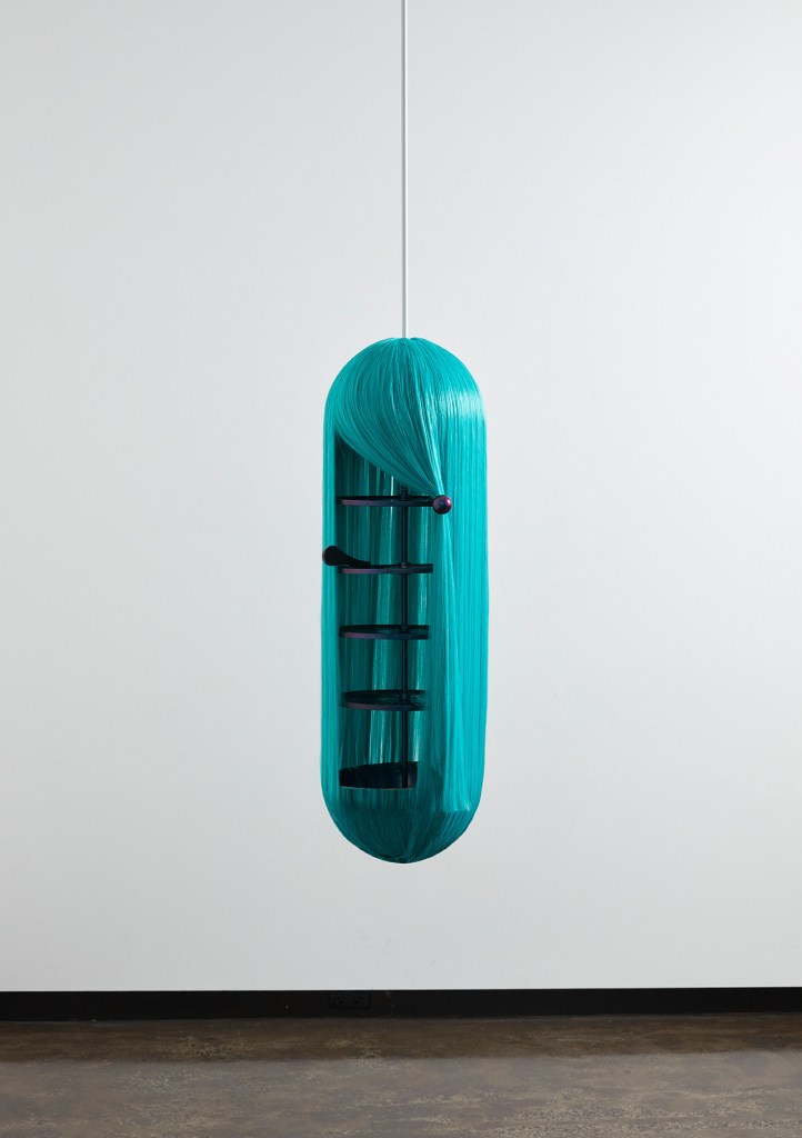
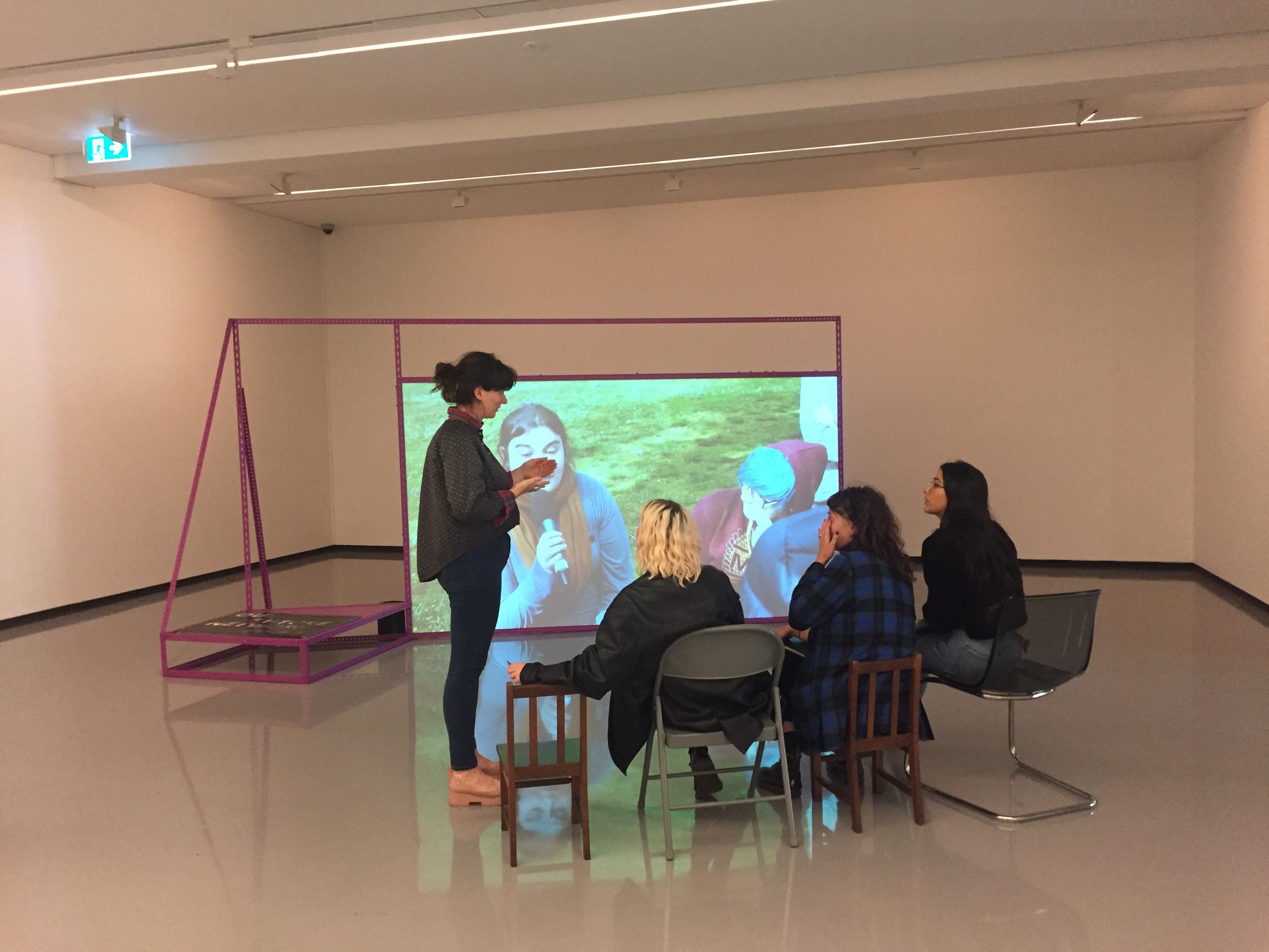
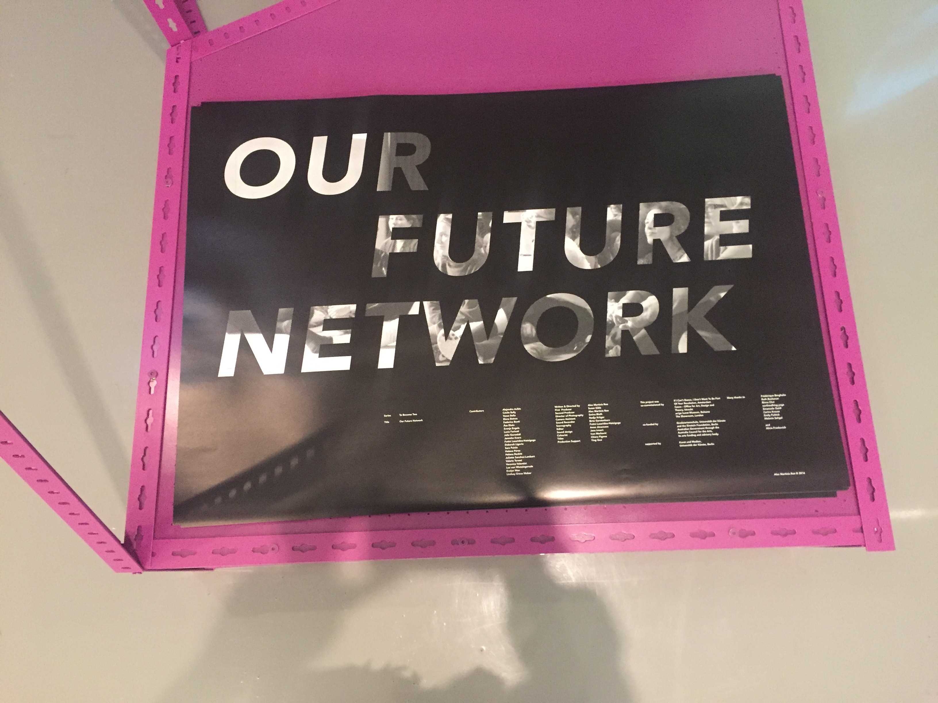
The MUMA museum, in its essence, has a very contemporary yet calming atmosphere. As many of the projects that are shown are research based, there are large quantities of information to be consumed so it provides an optimal learning space. As you walk into the space at the very back of the first room it is a little darker than the rest. The “Our Future Network”6 installation is comprised of a large purple industrial frame containing a screen and a shelf. The screen is constantly playing the content of the video work whilst the shelf holds a black and grey poster, displaying the works title. A variety of different and mismatched chairs have been assembled for the viewer to sit on whilst watching the feature length film. These chairs add a raw value to the experience which match with the very real and confronting subject matter discussed throughout the video. Watching the video is almost meditative and maintains a trance like focus within the viewer.    

Figure 1. “Our Future Network” installation, by Alex Martinis at MUMA
Figure 2. “Our Future Network” Poster, by Alex Martinis at MUMA

The contents of the film explores gender roles throughout modern everyday lives from a feminist perspective and elaborates on how to overcome certain situations or expectations from the male gaze. The kitchen is referred to as a political space where a female is usually expected to uphold a household lifestyle such as cleaning, cooking and arguing with their spouse. The idea of “living apart together”7, from a female perspective has less freedom as a male typically would be in a heteronormative environment that is still very prevalent today. Language and the gender connotations attached for woman can consist of using phrases like, “i don’t know”, which can be used to degrade their knowledge and power. Giving females confidence through speech in a public and private structure can evoke a stronger sense of identity and reshape the set expectation, which is an example of how the work tackles these feminist conceptual complexities. Identity, language and gender roles are all being presented with a sense of community and woman power collectively as the featured women sit together and chat about the ideas as well as separately reading prepared scripts. It is very raw and real with a variety of ages and cultures coming together. 

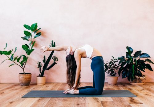
Themes throughout, “Our future network”8, can be described as a journey to wellness which is relevant in Australian culture today. The wellness industry is one of the largest growing industries in western culture. Yoga is an example of a wellness trend which is both a, “sociocultural phenomenon and a multibillion dollar industry”9 . Yet the modern day wellness concepts are controversial and question the original intentions of becoming a healthier and better version of ones self. Branding and imagery has been obscured into a thin, white, beautiful woman now advertised as the standard for the practice rather than genuine heath and mental benefits. The design and aesthetic qualities seem to trump the classic therapy of the practice. Clothing, yoga mats and other accessories create a massive profit and are seen as an important element of yoga in western society. In conjunction with the wellness industry yoga is worth, “$3.4 trillion US dollars… three times larger than the USD $1 trillion worldwide pharmaceutical industry”10. The experience of a luxurious lifestyle is often associated, attracting a certain class and justifies ones self worth and adds to their social status. In reference (see figure 3) we can see the stereotype displayed. It runs through a theme of not only the beautiful white woman. but includes trends of indoor plants and aesthetic colour scheme. It is aspirational to most which gives an idea behind how these economic ventures thrive. Cultural yoga was traditionally a self journey and it has transformed into a profiting life style brand and a measurement of social status.   

Figure 3. Yoga 231

Comparatively, the wellness industry in western culture compared to feminist concepts within households and the average woman both aim to create a sense of confidence and self worth. Yet the processes and motivations behind each are starkly opposing. These feminist concepts discussed and role played tackle the involvement of the male gaze and breaking free of oppressive behaviours whether intentional or not. It could be argued that western adaptation of yoga is an, “passive and lateral strategy”11 rather than a, “an active and engrained social, environmental and cultural awareness preposition”12. “Moral dimension”13 can instead, “divide social classes”14. The project displayed could be a reminder of the prevalent social weaknesses that often get overlooked in a consumerist society.

As a society we need to be aware of branding and social cosmetics, as the more informed we are the more we can understand what we are engaging in on a day to day basis and make personal decisions based off that.  MUMA Shapes of Knowledge15 exhibition provides a plethora of information especially the project “Our Future Network”16 which provides a feminist approach to identity, belonging and gender roles. The wellness industry instead of being a raw and real approach to self care and health, can conform to an expensive service. Rather than having spiritual and health benefits, we can understand how society can morph even holistic lifestyles into a capitalist gain. 

  1. Shapes of Knowledge exhibition, MUMA Monash, 2019
  2. Monash University Museum of Art, Building F, Monash University, Caulfield campus, 900 Princes Hwy Service Rd, Caulfield East VIC 3145
  3. https://www.monash.edu/muma/exhibitions/exhibition-archive/2019/Shapes-of-knowledge
  4. Alex Martinis Roe, “Our Future Network”, Installation and Poster, MUMA Monash, 2019
  5. Ibid.
  6. Ibid.
  7. Idid.
  8. Ibid.
  9. Juliana Luna Moore, “The Yoga Industry: A Conscious Luxury Experience in the transformation Economy”, 1-3, 3

10. Ibid., 4

11. Ibid., 15

12. Ibid., 15

13. Ibid., 22

14. Ibid., 22

15. Monash University Museum of Art

16. Alex Martinis Roe, “Our Future Network”, Installation and Poster, MUMA Monash, 2019

Figure 1; Alex Martinis, “Our Future Network”, Installation, MUMA Monash, 2019

Figure 2; Alex Martinis, “Our Future Network”, Poster, MUMA Monash, 2019

Figure 3; Yoga 231, Stock Image, accessed 8 April 2019, http://www.yoga213.com.au/geelong/whats-on/

The significance of subculture

Mainstream culture is the culture that is held within a large amount of people residing in a society, or in other words, it is the culture that seems the most “normal” to those that live in a specific area of the world. The majority of members can accept this culture, such as the high-quality learning, something worthy of being learned and all the things that proceed naturally from it and that are accepted. People always think that culture should present a positive, healthy and beautiful overall style, but when there is a mainstream culture, there will certainly be other cultures. We cannot ignore the non-mainstream culture because most people do not like it. The supposed non-mainstream culture is only relative to the mainstream culture. With the transformation and reconstruction of the system, the division and reorganization of interests and the influence and infiltration of various social ideological trends, culture presents a complex situation, on the one hand, the rise of mainstream culture, on the other hand, the continuous breeding of non-mainstream culture.

People yearn for good taste and see beauty as something elevated and divine. They think that the relationship between taste and cultural identity is also very important. Culture is important because it influences an individual’s life in a variety of ways, including values, views, desires, fears, views and worries. Many people think that most people like is the good taste, while others like is the bad taste. So, there are so many subcultures cannot be accepted. Good taste is defined as something that is “socially constructed”. This means that good taste depends on “the intrinsic value that one has”, it means that people with a process or system create criteria for judging what is good taste.

Anyone can say that something is good or bad, pleasant or unpleasant, in my opinion there is no criteria to judge the taste, the only thing we can say is whether the taste is in line with the trend of the times, which is similar to fashion. For example, the heavy metal fashion. Heavy metal fashion is the style of dress, body modification, make-up, hairstyle, and so on, taken on by fans of heavy metal, or, as they are often called, metalheads or headbangers. Regardless of the changes of the times, it has remained constant key elements like the black clothes, long hair and leather jackets.

Spike “bands” or gauntlets are a common element among fans.

Many people cannot understand heavy metal fashion, it is different from any fashion, but its distinct aspects of heavy metal fashion can be credited to various bands. The style and clothing of metal absorbed a wide variety of influences as diverse as the music genres borrow influences. Because of the link between clothing and the different sub-styles influenced by music influences that one can sometimes determine one’s particular taste for music simply from the overall appearance. Sometimes people do not like the dark fashion, obviously, everyone has his own understanding of beauty and his own view of good taste. No one can change that, because everyone is independent and cognitive. So, the good taste for the product design is not depend on the closed system and the fashion industry, it depends on some people who think it is good. One of the most obvious features of this culture is the studded style, like the studded leather jackets, studded bracelets, studded belts, spiked gauntlets.

Hades Footwear

Some brands have developed this feature into people’s lives, for example the brand Hades Footwear. Its motto is “inability to conform”, because we represent those who want to be different. As a strong promoter of individuality, they have put renowned designers and shoemakers together to form one of the most beautiful collections of shoes, each design having its own story and craftsmanship that is sure to make heads turn. In this brand, shoes always be the black with exaggerated ornament, use something that looks uncomfortable and it is different from the normal shoes. Many people cannot understand this style, however, if people focus on the role of the product for users and users, rather than what the product is, people will ignore the surface statement based on taste, rather than better understand the design. Sometimes people cannot understand, because each artist’s design works have different meanings, they may also include their experiences. When people cannot understand some artwork, maybe they don’t have the same experience or story, or the mood of an artist when he creates art.

In my opinion mainstream culture is widespread, the culture of most people and the normal way of action. But a subculture differs in one or more ways from the mainstream culture. Subcultures are norms and values which are distinct from the majority and a group within a wider society. When we have attention about mainstream culture, we also need to not ignore the subculture. It was also the conviction of another group of people, something they believed in.

References:

Christoforidou, D., Olander, E., Warell, A., & Holm, L. S. (2012). Good taste vs. good design: A tug of war in the light of bling. The Design Journal15(2), 185-202.

Gelder, Ken (2007). Subcultures: Cultural Histories and Social Practice, March 2007.

Seiler, Robert M. “Human Communication in the British Cultural Studies Tradition.”
http://people.ucalgary.ca/~rseiler/british.htm

Huq, Rupa (2006). ‘Beyond subculture’, 2006.

Weinstein, Deena (5 August 2009). “Heavy Metal: The Music And Its Culture”. Da Capo Press. Retrieved 18 March 2018 – via Google Books.

Pysnakova, Michaela. “Understanding the Meaning of Consumption of Everyday Lives of ‘Mainstream’ Youth in the Czech Republic” in New Perspectives on Consumer Culture Theory and Research, p64.

How much you will value the function and concept of a product.

Figure 1

Figure 2

Figure 1 is a camera I designed for the blind people, Mer camera and the name Mer is inspired from the word memory. The design concept of this camera is to hope that it can let the blind people enjoy the happiness of taking photos and share photos as normal people. For this blog I would like to share some ideas that how the functionality and design concept play an important role in the “good taste (Christoforidou et al., 2012)” of products in some way by comparing with my personal work Mer camera and the Ergorapido designed by Łukasz Jemioł (figure 2).

First of all, I would like to give a brief concept of Mer camera. When I designed this camera, I started by analyzing the general reasons why normal people use and own a camera. Generally speaking, there are two reasons. The first one is to record some precious moments in life, or to create some impressive images in the form of photography art. One day in the future the photos can help people recall the scene at that time, or use photos to share their own visual feelings with others. That is the first reason, but another reason to use and own a camera is a little different.

Another reason is some people want to achieve a kind of lifestyle by having a camera in their life. In other word, the functionalities of camera just a small part of the reason why they own a camera, they’re more concerned on what it means to own a camera. It could be a lifestyle of being that loves to travel and live, or it could be people who want to show their concern for the beauty of life. As a conclusion, they purchase cameras to cater for their self-satisfaction. They purchase for the meaning behind the objects. The yoga industry is a good example, As Juliana Luna Mora mentioned in the article “yoga is a multisensory luxury experience, providing consumers with achievement of both tangible and intangible physical, mental and spiritual individual needs and aspirations (Juliana, 2018).”

What’s more, Mer camera is completely focus on the function. More specifically, figure 1 the switch located on the top of the camera, and when you turn on the switch, there will be a slight sound and a shaking as the feedback. The switch is designed move left or right only. It allows the blind people to better understand whether the camera is on or off. Furthermore, The Braille next to the buttons can help blind people understand the function of each button more quickly. For instance, if a blind person just got the new camera, he might want to take a try right away. Then the Braille can help him understand the function of each button immediately without spending a lot of time reading the introduction first. Also, blind people cannot use the icons to locate the key information they want quickly, they may often need to read the instruction from the very beginning to find the information they need. Therefore, giving some key buttons with Braille can save their time to a certain extent. For the blind people, functionality is their main consideration. They also have their own “good taste” for the products, so is this camera a good taste or bad taste for the blind people? Will it feel the same as the “Bling” product we saw? Compared to the Ergorapido, “Electrolux has developed a model of a handheld vacuum cleaner, the Ergorapido, in a limited edition designed by Łukasz Jemioł, whose external shape is the same as the original but it is encrusted with approximately 4,000 Swarovski crystals (Design You Trust, 2011).” In my opinion, the Ergorapido is a very good example of bling product, “Bling is obvious, straight to the point, and easy to recognize. A bling product shouts out its message: bigger is better, more is better, glitzier is better (Christoforidou and Olander , 2009).” So when we want to judge if the Ergorapido is “good taste”, we cannot just focus on its functionality, but from its main concept when it is designed which is obvious, more is better and glitzier is better. It is the same as blind people, in order to figure out if a product meets the “good taste”, we cannot just think of a product from one side, whether from its function or how many diamonds it has. According to Lisbeth Svengren Holm, “Consequently, it is not appropriate to simply express a taste-related opinion; one must also show that the thoughts behind that opinion are adequate to count as an expression of taste. It requires a legitimization to be judged as a competent arbiter (Christoforidou et al., 2012).” And “Referring to Plato, Brunius (1961) states that beauty in objects implies partaking of the truly beautiful, that is, the form or the idea of beauty (Christoforidou et al., 2012).” The meaning behind a product is an important role in its value. Now for Mer camera how much you will value its functions and how much you will value its concept?

REFERENCE

  1. Christoforidou, D., Olander, E., Warell, A. and Holm, L. (2012). Good Taste vs. Good Design: A Tug of War in the Light of Bling. The Design Journal, 15(2), pp.185-202.
  • Christoforidou, D. and Olander, E (2008a). ‘Bling bling and how its message captures our interest – or is bling bling as tasteless as the design elite find it?’ Nordcode 7th Seminar: Paradoxes within Design Research – Mechanisms and Contradictions, Lund, Sweden, 28–30 May 2008.
  • Juliana, M. (2018). THE YOGA INDUSTRY: A CONSCIOUS LUXURY EXPERIENCE IN THE TRANSFORMATION ECONOMY. PhD Candidate and Teaching Associate. Monash University.

The famous woman designer-Elliat Rich

Standing mirror. Elliat Rich, 2018

This artwork standing mirror is one part of Elliat Rich’s Other Places series of limited-edition furniture design. This mirror is showing in the NGV, the theme is designing women, by focusing on the work, histories and achievements of designing women, the exhibition reveals that female designers, in our culture they also have a number of iconic and thought-provoking work. When I first saw this mirror, I thought it was just a simple mirror to let people see their clothes neatly. Then I found that this mirror did not like the ordinary mirror that people usually use. Instead, it could not use very clearly, and had a very vague feeling. What’s even more surprising is that his mirror was green and blue. When people look at it, they have a fantastic feeling because they cannot see the picture very clearly. At that time, I did not realize the special meaning of this mirror. I just wonder why a mirror should be designed like this and about this exhibition why women cannot be acknowledged for their professional contributions.

In fact, people always ignore that women offer fresh perspectives on the contributions for the practice and profession of design, women designers have a very important development in design. People have a prejudice that women should not be in this industry. They think women will lose customers in many choices, they cannot coordinate the relationship between children, family and design, and they cannot tailor their working hours to fit their personal needs. It is clear that discrimination against women is much more deeply embedded across our culture. But design is certainly different. in nature It is not technically or managerially. First of all it needs foremost creative and involves special visualization skills. Little is known about women designers in the Australian graphic design industry, but Elliat Rich give a very beautiful example for the women design.

Elliat Rich want to inspire people to think, to have imagination for design. Then according to Philippa Nicole Barr, he writes, ‘All of the works upheld Rich’s fascination with the local landscape and her interest in using design to craft a new vision of the future.’ This artwork drawing on entitled draws on observations of the Australian landscape, inspired by Rich’s experiences living in Alice Springs and driving along desert roads, standing mirror reflects her observations of the distinct haze of the distant ranges. Women have a greater advantage in design, they will feel more delicately about what they see, and then design it. Elliat Rich’s design is trying to capture that and make it into something tangible. She thinks the feeling can become “their own mythical things” with “their own entity and presence”, so she create the standing mirror.

Standing mirror shifts from morning to dusk, from north to south. it is a musing on these observations. This mirror catches and bend the light, the colours blend, reflect, merge. Elliat Rich explains that on the one hand the mirror is a part of illusion, it is a solid gas, on the other hand the mirror is the shadow of a mountain, it is part thing as well as it is a space for reflection. Elliat Rich’s artwork creates an environment of inspiration, vision and entrepreneurship in her own communities. Standing mirror it allows people being to different kinds of thought including ideas, beliefs and values. Standing mirror opened people’s eyes to a way of living with both art and design. This design Based on people’s expectations of furniture, but beyond that expectation, it transcends function, sculpture and art and is just can expressed in design language. This is the beginning of an ongoing exploration into imagined myths, reminders of present wonders and desired futures. This mirror summarizes cumulative observations, Elliat Rich use a very long time to view different places to create this artwork. People always think that women are illogical and inexperienced that men are better suited to undertake this work,but they are more patient than men. For this artwork, Elliat Rich have spent a lot of years trying to name that colour, part emerald and part magenta, she wants to capture that quality. It is what Elliat’ve seen, and what Elliat’ve imagined, furniture that evokes and embodies the landscapes of Australia. It encapsulates accumulated observations, imagined myths, reminders of present wonders and desired futures, these are the meaning of standing mirror. In order to create, she went to a very remote place to observe, standing mirror use different materials and bound those enigmatic elements together in a magic feeling. All speak directly to an experience of and within the Australian landscape, the distinct Australian haze that renders the land mute but vibrant.

So in my opinion women are playing a more and more important role in the wider contemporary design industry. They also contribute a lot to the development of design, and they cannot be ignored. It also emphasizes the argument that the further popularity of female designers and the more gender-inclusive concerns of design historians are not negotiable. Male and female designers should have equal status, people should not repudiate them.

Reference:

Figure 1. Standing mirror, Elliat Rich, 2018, Photographs by Sean Fennessy courtesy of Sophie Gannon Gallery.

Bruce, Margaret. and Lewis, Jenny. April 1990. Women designers — is there a gender trap?

Connory, Jane. 2017. Plotting the Historical Pipeline of Women in Graphic Design.

Carolan, Nicholas. From the red centre to the heart, design that’s going places.

‘Designwork 02’ At Sophie Gannon Gallery, The Design Files. https://thedesignfiles.net/2018/03/designwork-02-at-sophie-gannon-gallery

Forgotten superheroes of design

In today’s society, many designers are remembered by the world, such as Le Corbusier (1887 — 1965), Marcel Breuer (1902 — 1981), Massimo Vignelli (1931 — 2014), etc. They are all famous designers. However, in my researchof famous designers, I found thatalmost is mandesigners, just have several female designers are remembered.Why is this happening? What causes it? Why are female designers forgotten? I wrote this blog about these questions.


Figure 1 is Sophia Hayden.
Figure 2 is Woman’s Building. World’s Columbian Exposition (1892: Chicago, Ill.).

After my research, I found that a female designer named Sophia Hayden, her ability is very strong, but she was forgotten by the world. Sophia Hayden (1868 — 1953) was an American architect and the first female graduate of a four-year program in architecture at the Massachusetts institute of technology (Wikipedia, 2019). And Hayden won the national competition to design the Woman’s Building for the 1893 World’s Columbian Exposition (Remembering Sophia Hayden, architect of the Woman’s Building, 2018). After Hayden graduated, she accepted a job as a mechanical drawing teacher at a high school in Boston because she was a woman and might have trouble finding an entry-level apprenticeship (Wikipedia, 2019). After a series of sexism, she became frustrated with the unfairness and broke down. She decided to retire from architecture (or maybe not), but she stopped being an architect. In 1894, she designed a Memorial Building for the Women’s Clubs of America, but it was never constructed. She later married artist William Bennett, and her name slipped into obscurity. When she died in 1953, Bennett died at the Winthrop Convalescent Nursing Home in 1953, her obituary did not even note her accomplishment (Remembering Sophia Hayden, architect of the Woman’s Building, 2018).

In her life, she graduated from MIT in 1890 with a degree in architecture, with honors. However, graduated in architecture was difficult to find work as a woman architect, so she accepted a position as a technical drawing teacher at a school in Boston. It was the first time she had experienced sexism, this shows that woman is not treated fairly when they look for jobs. In 1891, she saw a notice inviting female architects to take part in a competition. This is a women’s building for the world’s Columbian exposition, and this project is significant because women plan every aspect of the building. Hayden won the competition, she was number one in this competition, and she designed a three-story white building, the building including pavilions at the center and end, multiple arches and columned terraces. The classical features of the building in the style of the Italian Renaissance. She was paid only $1,000 for her designs, while some male architects earned $10,000 for similar buildings. This is the second time she has been subjected to sexism,this shows women are not treated fairly regardingpay. Hayden’s architecture won for its “exquisite style, artistic taste, and intimate and elegant interior lobby.” However, despite her gold medal from the women’s governing council, male commentators have been rather arrogant, claiming the structure has “feminine” qualities such as elegance and grace. This is the third time she has been subjected to sexism, this shows women are not treated fairly regardingdesign. Rumours that she had a nervous breakdown was taken as evidence that women were unfit to work in construction. After the fair, the women’s pavilion was demolished, and Hayden, frustrated with how he had been treated, quit architecture.  In her career, the Woman’s Building is the only one Hayden has ever designed.

Regardinggender discrimination, I have read a book called Design and Culture: The Journal of The Design Studies Forum, in which men can actually determine women’s aesthetic taste. They believe that the women have white skin are good-looking, which leads to the fact that women all over the world want white skin. During Sophia Hayden’s career,her works were always restricted by men, which led to many ideas that could not be realized, causing a heavy blow to her body and soul. Therefore, she decided not to design architecture and quit the industry. So much so that she was marginalized by society, and even her only architectural work was demolished, and there was no trace of her design in this world.

After the above detailed analysis of Sophia Hayden, I came to a conclusion. The reason why mostly famous designers are male designers is that there was discrimination against women in the early society, which led to the oppression of many talented female designers and their inability to show their strength, which resulted in their marginalization and made their information inaccessible to the present audience. Sophia Hayden is a typical example. After being oppressed, she chose to quit the construction industry with her outstanding ability, which makes it a pity that another excellent work is missing in the history of design.

I think society values men and treats women with sexism. This may be because men are in the dominant position in the society and family, while women tend to be treated unfairly due to their disadvantage. I hope there will be no more sexism in our society. Men and women are equal, and they do or perform the same duties in the society, we need to equal employment opportunities, equal wages, equal treatment of design outcomes and so on.

References:

En.wikipedia.org. (2019). Sophia Hayden. [online] Available at: https://en.wikipedia.org/wiki/Sophia_Hayden [Accessed 11 Apr. 2019].

Blumberg, N. (2019). Sophia Hayden | American architect. [online] Encyclopedia Britannica. Available at: https://www.britannica.com/biography/Sophia-Hayden [Accessed 11 Apr. 2019].

Onafuwa, D. (2018). Allies and Decoloniality: A Review of the Intersectional Perspectives on Design, Politics, and Power Symposium. Design and Culture, 10(1), pp.7-15.

Chicago’s 1893 World’s Fair. (2018). Remembering Sophia Hayden, architect of the Woman’s Building – Chicago’s 1893 World’s Fair. [online] Available at: https://worldsfairchicago1893.com/2018/10/17/sophia-hayden/ [Accessed 11 Apr. 2019].

Do you think the flax chair has good taste?

Figure 1. Christien Meindertsma, flax chair, April 11th, 2019

The series of flax project by Christien Meindertsma aims to uncover the material’s rich history and showcase both its utilitarian capabilities and the work of craftspeople who specialize in working with it (Flax Project: Christien Meindertsma’s Newest Work, 2019). Meindertsma’s passion lies in uncovering the processing of raw materials and the lengthy journey these materials take a route to finished products (Flax Project: Christien Meindertsma’s Newest Work, 2019).

Christien Meindertsma is a female designer and born in Dutch. Meindertsma’s idea often focus to different products and research the use of raw material.From early on in her career, Christien Meindertsma has made an international name for herself with her inquisitive and explorative approach to the world and the products that surround us (Meindertsma, 2019). During the creation of her work, the result of her project may be a record of the process itself, or it may be an investigation and a reference to commercial products. After detailed investigation and documentation, locally produced themes and undeveloped resources feature in her work. Meindertsma seeks to uncover processes that have become distant industrialization and encourage a deeper understanding of the materials and products around us. Meindertsma has spent several years researching the possibilities of flax, even investing in crop from a flax farm to better understand the plant’s cultivation and processing (Christien Meindertsma designs fully biodegradable chair using flax, 2019).

“What I like about flax is that it’s a precious material that was traditionally used for high-quality fabric, but also the fact that the plant grows really well in our climate,” said the Dutch designer. “There’s a good reason to work with the plant, because it needs very little to grow.” (Christien Meindertsma designs fully biodegradable chair using flax, 2019).

The flax chair is designed in 2015, won the Dutch Design Award and Future Award in 2016 and manufactured in 2017. The main material is flax fibre (Linum usitatissimum) and polylactic acid ed. During the process of flax chair, her purchased an entire harvest of a Dutch flax farmer with the ambition of exploring show flax products might stay more locally produced, this is a typical of Meindertsma’s approach. From 2009 to 2015, she devoted her time to document the cultivation and harvesting of flax in the Netherlands. She teamed up with Label/Breed and natural fiber specialist Enkev to develop a new Breed of bioplastics that combines flax and PLA. It’s a groundbreaking material that combines natural flax fibers with powerful bioplastics and is hot-pressed in molds. The chair is made of a piece of composite material, which is rarely wasted. The flax chair is biodegradable and rugged, its volume and texture are hemp, and the resulting product is cheap, environmentally friendly and sustainable. 

Kant differentiates between different kinds of beauty. Pure beauty, which is considered non-useful. Another kind of beauty is that which has a purpose (Good Taste vs. Good Design: A Tug of War in the Light of Bling, 2012).The beauty of the flax chair is the second kind of beauty, the beauty of purpose. The purpose of the flax chair is to be environmentally friendly, produce almost no waste of materials, and have a good texture. This makes the flax chairs very tasteful. However, Meindertsma believes that as a designer, it is easy to make beautiful things, but these beautiful things may be useless or unproductive, so these things should not be the purpose of the designer’s design objects. Designers should design things that solve problems. Therefore, Meindertsma believes that pure beauty is considered useless without good taste.

I know this project is great for the innovation of materials and design concept, but my question is, do you think the flax chair has a good taste? What would an audience choose if it had a flax chair and a bling chair? Do viewers value the intrinsic value of an object more than the physical beauty of an object? Is it bad taste to like a useless work of art?

In my opinion, the flax chair represents that the materials used to make things can be pure natural and not waste the earth’s resources. It’s a great piece of art that helps to people realize that there are a lot of materials that need to be innovated to create things that don’t waste the earth’s resources. Good design has the capacity to solve problems that sometimes we didn’t even know we had.When designers look at an object, they should not only consider it is aesthetic appearance, but they should also challenge it to make it more functional, to meet the needs of the user, or to achieve its purpose more gracefully. However, it is debatable the audience’s choice of such a chair is good taste, and choice of useless design is bad taste.

References:

Housele, L. (2016). Interview: Christien Meindertsma | 2016/ Arita. [online] 2016/ Arita. Available at: https://cri-arita.com/2016/interviews/interview-christien-meindertsma.html [Accessed 9 Apr. 2019].

Urback, M. (2019). Flax Project: Christien Meindertsma’s Newest Work | handful of salt. [online] Handfulofsalt.com. Available at: http://www.handfulofsalt.com/flax-project-christien-meindertsmas-newest-work/ [Accessed 9 Apr. 2019].

Meindertsma, C. (2019). Christien Meindertsma. [online] Designskolen Kolding. Available at: https://www.designskolenkolding.dk/en/calendar/christien-meindertsma [Accessed 10 Apr. 2019].

Tucker, E. (2019). Christien Meindertsma designs fully biodegradable chair using flax. [online] Dezeen. Available at: https://www.dezeen.com/2016/11/14/christien-meindertsma-flax-chair-furniture-design-biodegradable-dutch-design-week-2016-awards/ [Accessed 10 Apr. 2019].

Roodnat, S. (2019). christienmeindertsma. [online] Christienmeindertsma.com. Available at: https://christienmeindertsma.com/Flax-Chair [Accessed 10 Apr. 2019].

Christoforidou, D., Olander, E., Warell, A. and Holm, L. (2012). Good Taste vs. Good Design: A Tug of War in the Light of Bling. The Design Journal, 15(2), pp.185-202.

Forgotten superheroes of design–Corita Kent

Figure 1, the juiciest tomato of all, Corita Kent, 1964
Figure 2, Campbell’s Soup Cans, Andy Warhol, 1962

From the past to today’s design industry, female designers always challenge their status in a male-dominated society. If a woman designer wants to achieve their design career and remain an influential position in design history has been a struggle against the recognized social order and its gender issue.[1] One of an American female designer was born in 1918 called Corita Kent who had created numerous artworks in her life. She involves spiritual, pop cultural, literary, consumer culture and political thoughts in her works.[2] During the 1960s, Kent is seemed like a curiosity or a difference in the pop art movement. Undoubtedly you must know Andy Warhol, a screen printing The Juiciest Tomato of All (fig.1) developed by Kent in 1964 was inspired under Warhol’s Campbell’s Soup Cans (fig.2).

As for the print, it shows the text ‘tomato’ in bold, made in like an advertisement or logo. The colors are shown in orange, red and yellow which are analogous colors. Despite you see in a distance, it quite obvious to recognize the word “TOMATO”. Once you have drawn in, you could see a message in the footnote that indicated “Mary Mother is the Juiciest Tomato of All” which is an advertising jingle for Del Monte tomato sauce. Kent had used her humor way to present for imagining Mary as a huge juiciest tomato. I think Kent really simply use a powerful text to demonstrate her thought and when people see it will transfer to an image of the political message. Due to Kent was a Catholic nun and had a strong connection with religious culture, under the influence of her environment, “She was inspired by the efforts of the Vatican Council II in 1962 to modernize Catholic liturgy by incorporating vernacular language in the church.”[3] She took the view of church to modernize to the Virgin Mother Mary use the innovative way by looking at the every-day object and give a new meaning to it. Furthermore, it seems Kent made the concerns of Vatican II turns into a contemporary society to catch people’s attention. As Malpass indicated that, “its intention is to engage the audiences imagination and intellect to convey message”[4] Kent emphasis her role and opinions to let audiences raise their awareness. The work also represents divine not only exist in church or religion culture but relevant in people daily life. Kant recovered the spiritual in another language to promote that goal which is demonstrated that the kindness and generosity of Mother Mary and Christ can also be found in a modern day.[5]

In this way, we could see Kent takes advantage of advertising slogan for her own use to present friendlier of Catholicism instead of a formal impression. I think the way she designs it could be considered as “It liberates us from conventions and opens us up for creativity and a zest for life.”[6] Her artwork conveys about her personal idea, political message and background to audiences during pop movement. Once when you see the work in a different angle, you would realize how the texts transfer to an image in your mind could be such a powerful form.

However, some religious traditionalists were strongly against Kent’s action. They thought the way Kent described Mary Mother to juiciest tomato which is a scandal to the archdiocese.[7] It has shown the conflict between Kent’s religious and her design visual argument. According to Liene Jakobsone, design “it links with contemporary world conditions through its pluralistic stance, endorsing a public that is broad and multiple.”[8] Therefore, tradition religious people might criticize this work may threat to their position and harm to conservative divine ideology. Moreover, Norman claims that design beauty comes from audience’s conscious reflectionand experience influenced by knowledge, learning and culture.[9] It seems those people who have traditional religious culture may affect their taste on the work in the result of a critical way.

After exploring Kent’s work, I feel like she may have a significant status in design aspect, while not many people know her. In my opinion, it is hard to build a stable designer status in the mid 20th century that is male-dominated period. Furthermore, Kent was a nun, she has her political and spiritual message that affected in her work which could not make numerous people are in common and realize. Kent was not a part of the mainstream because she stands in conflict position between Catholic and normal society which is too radical to church and too religious for modern society. Additionally, she stood apart from the right people in the 1960s of the conflicts between social and political. In the result, she was not got married in her life so there is no generation to propagate her design ideology.

In conclusion, Kent had proved that she took a risk on her design expression to people understand that is an innovative way to present her political language and creativity. Also, she used her way to play around with language to promote her political and spiritual ideas in her work to become a pop artist and social activist during the pop art culture movement. Nowadays, we should realize not only her way to use powerful texts from advertising but also her works have meaningful. It inspired people their opinions for society’s behaviors, help people around us and against selfish action so to build a better society community. Those are the ideas of Kent may convey to people to think about her works.

Footnotes

[1] Jane Connory, Plotting the Historical Pipeline of women in graphic design, [online] Available at: http://dharn.org.au/dharn2017/plotting-the-historical-pipeline-of-women-in-graphic-design/

[2] harvardartmuseums.org. [online] Available at: https://www.harvardartmuseums.org/visit/exhibitions/4830/corita-kent-and-the-language-of-pop

[3] harvardmagazine.com. [online] Available at:  https://harvardmagazine.com/2015/08/corita-kent-nun-with-a-pop-art-habit

[4] Liene Jakobsone. “Critical design as approach to next thinking”, The Design Journal, 20, (2017): 4.

[5] Ibid.

[6] Despina Christoforidou, Elin Olander, Anders Warell, and Lisbeth Svengren Holm. “Good Taste Vs. Good Design: A Tug Of War In The Light Of Bling,” The Design Journal 15, no. 2 (2012): 197.

[7] theguardian.com/artanddesign. [online] Available at:  https://www.theguardian.com/artanddesign/2018/apr/22/corita-kent-the-pop-art-nun#img-2

[8] Carl DiSalvo. “Design and the construction of publics,” Design Issues, volume 25, no.1, Winter (2009): 48.

[9] Despina Christoforidou, Elin Olander, Anders Warell, and Lisbeth Svengren Holm. “Good Taste Vs. Good Design: A Tug Of War In The Light Of Bling,” The Design Journal 15, no. 2 (2012): 188.

What is the idea of Weaver convey to you?

Figure 1, Elliat Rich, Weaver, 2018, Suspended shelf, Synthetic fibre, aluminium, 1000×300×300mm
Figure 2, the scenario of The Matrix’s red pill/blue pill, 1999

The NGV’s designing women exhibition presents the role of female designers as significant in contemporary design. It demonstrated that female designers always be ignored in a male-dominated industry so they try to design something iconic and inspiring works to increase their status, recognize their skills and thinking in society.[1] Female designers have challenged gender prejudice from the past until today, its result is really clear to show many women have their important position and value in the design area nowadays.

One of the works included in designing women exhibition is Weaver(Fig.1) which is designed by Elliat Rich. When I first saw Weaver, I still could not recognize what is it but think as abstract art. The first impression is about the hair with extremely catching-eye light green color, I think there is a connection between women aesthetic and the sculpture. Rich said that “Weaver is a cylindrical shelf suspended from the ceiling that is covered in a curtain of turquoise synthetic fibre-the kind which is used in wigs. There are four shelves inside are coated in pearlescent chameleon paint that glitters, becoming iridescent as the light falls on it.”[2] The curtain hair and the synthetic material are so powerful and attractive. “Its magnetic qualities are strengthened by the practical utility of the piece.”[3] It also looks like a girl with the curtain hair being attached behind a metallic ‘ear’.[4] I feel like as Rich said that the gesture of pulling the hair behind the metallic ear is quite intimate and it is like an existing person that have personality and emotion of it. Also, we almost like having a relationship talking to each other.

Another information that Rich indicated that the whole shape of an oval is an inspiration from The Matrix’s red pill/blue pill(Fig.2). In my opinion, because taking a blue pill in that scenario means when you wake up in your bed and you just believe whatever you want to trust. I think the reason why Rich designed the form almost like a blue pill is that Rich has mentioned before her design is trying to inspire people to think and also let audiences to think about their thought of “what vision for the future”[5] they want to tell. Therefore, Rich has used the visual expression to suggest people think their own judgment towards the artwork and firmly believe in their design position. That is what I think about the communication that blue pill wants to indicate initially. Furthermore, Rich has demonstrated the blue pill in the film if people ingest it would “ensure a life of insensate complacency”.[6] Therefore, Rich suggests viewers consider the brighter and hopeful future involve the important people, places and events what matter the most in the design aspect.[7] Weaver is shown trying to find the path of being in the future.

Rich’s work is about telling her own story. She had experience traveled to Central Australia. She transferred the characteristic and landscape of the view to her design practice. “Elliat Rich’s work is about understanding and valuing places and revealing the material of landscape,” says Ewan McEoin, Senior Curator of the Contemporary Design and Architecture Department at the National Gallery of Victoria.[8] Weaver is one of Other Place series, it interprets the broad central Australian landscape by Rich had spent lots of times to investigate. Other Places have included long time observations, imagined myths and desired futures[9] to design thinking. Weaver is allowed audiences to be curious and feel joyful, inspire people to think more about the future because “the future is linked to now.”[10] According to Rich, Weaver is using design as a way of storytelling and means of navigating toward the future.”[11] It challenges people to think different variety of opinions towards the vision of the future, or could just be curious people to what is about the design story behind the work. In fact, Rich has no exact answers for it, but anyone who has potential in design creative field to decide unexpected propositions then can lead other people who have common in it, which means can lead to collective consensus.

From this view, I understand no matter the exact answer of the vision of future is, but the important part is Weaver offers an opportunity to people could be gathering around to think and discuss the same topic to present their own definition of the visions of future. Like the process of Rich constructing Weaver with the burlesque costume and set designer Bryn Meredith and the industrial designer George Gelagotis which are both Melbourne-based. The three designers are all contact through email and FaceTime, talking about their manufacturing ideas. Rich indicated that I want to inspire people, we don’t know what it looks like but it’s exciting to think about and we’re all going to get there together and it’s going to be great.[12] I think the process is part of the concept of Weaver, it could be explained that it provides a chance of gathering people around to have their considerations and feelings from a artwork or perhaps a design ideology behind the work.

Base on this point, I want to focus on people have different opinions of Weaver that conveys to them. Bourdieu claims that, “(Bling) liberates us from conventions and opens us up for creativity and a zest for life.”[13] I think Weaver could be the form that liberates us and open our thoughts of the visions of the future. What makes Weaver so drawn me to it, it because the story, the design ideology behind this work really inspiring me to think more. It relates to Plato’s thesis, a thought is what really counts and what preserves beauty, refinement, tastefulness.[14] Therefore, Weaver presents its own ideology aesthetic of design practice and becomes a success artwork not only is promoted by designer’s idea expressions but also focus more on what Weaver does for the audiences rather than what is Weaver itself.[15] By seeing through this way, maybe it could see Weaver provide us a broad space to think and also interact with each other.

Perhaps Weaver could be considered as a participatory design. It involves individuals to challenge their own thought in various way and the decisions may affect them.[16] Even though people could not join in the beginning of the design process but can encompass their different opinions from weaver which is no exact answer from those. Another message from Weaver is to attract people to produce their unique ideas and being together, this might be considered as a way of “redirective practice”[17].

Overall, Weaver has combined functional, women aesthetic, the material of landscape and the main ideology behind which is inspiring people to think the visions towards the future. Not only is a function furniture shelf but also is a strong idea that is emphasis on the beauty and how people communicate with the thoughts behind the object. Moreover, Weaver is provided an opportunity and considered as a participatory design to challenge people to think their own design propositions towards the visions of the future and gathering people together to share their different opinions. It also offers us open a broad design thinking to reach an innovative thought.

Footnotes

[1] ngv.vic.gov.au, (2018). Designing women exhibition at NGV.[online] Available at https://www.ngv.vic.gov.au/essay/designing-women/ [Accessed 27 Sep 18].

[2] grazia.com.au. [online] Available at: https://grazia.com.au/articles/elliat-rich-interview/

[3] Ibid.

[4] Ibid.

[5] Ibid.

[6] Ibid.

[7] Ibid.

[8] grazia.com.au. [online] Available at: https://grazia.com.au/articles/elliat-rich-interview/

[9] elliatrich.com [online] Available at: http://www.elliatrich.com/other-places

[10] grazia.com.au. [online] Available at: https://grazia.com.au/articles/elliat-rich-interview/

[11] Ibid.

[12] Ibid.

[13] Despina Christoforidou, Elin Olander, Anders Warell, and Lisbeth Svengren Holm. “Good Taste Vs. Good Design: A Tug Of War In The Light Of Bling,” The Design Journal 15, no. 2 (2012): 197.

[14] Ibid.,188.

[15] Ibid.,198.

[16] Matthew Holt, (2015) Tranformation of the Aesthetic: Art as Participatory Design, Design and Culture. 7:2. p.148.

[17] Ibid.,151.


Designing Women – Standing Mirror

Elliat Rich, Standing Mirror from the other places series, 2018

Standing Mirror is part of Elliat Rich’s Other Places series of limited furniture design. Rich evokes intuitive shift between experiences visions and materials which are achieved through the distance ranges. These result from the combination of dust, eucalyptus gas, light and any other magical element that lie between the audience and the masterpiece. Rich intends that the piece off-sets a conceptual underpinning that is filled with a sense of curiosity and joy. The unique color combination used provides a distinct taste which combines multiple hues. The elements used to enable Rich to derive both reality and illusion in a single set which results in the half-object and half reflection achieved. 

According to women design, women get minimal recognition for their work and expose the barriers to the success of women in the industry which occur in the areas of socialization, education and the work environment. These aspects are relevant to the understanding of the piece. The pure element that makes up the artwork are in themselves not given prominence in the same way that the female artists who make up the foundation of the industry are not given prominence (Bruce, 1990). The industry’s continued consideration of women as playing peripheral roles, they remain the courage of the industry. Comparable, in the artwork there is no dominant element, the mirror effect is achieved through the collective role of each component. Rich is an example of women who have taken professional design seriously. Rich completed her Bachelor of Design at the College of Fine Arts from the University of New South Wales and have given a solid input to it if her academic background and touch in Standing Mirror are anything to go by. 

There is a display of professionalism, hence design. The piece brings a balance between taste and design. Standing Mirror is associated with the pleasurable feeling helps determine the great taste as evidenced in the piece of art, provide a perspective on how taste and design differ. For example in marketing, artwork must appear to the sensory aspects of the audience and consumer. Taste is about what appeals to the sensory organs (Bruce, 1990). If this is the basis by which the quality of the artwork is to be determined, then women artists are as much competitive as their male counterparts. For instance, Rich’s Standing Mirror appeals to the sensory organs and thus can be categorized as having good taste. On this basis then, Rich like most women in graphic design, have as much taste as male artists. Hence, their work deserves equal recognition. According to Connory’s (2019), Standing Mirror qualifies sentiments about very few women getting recognition despite their constant contribution to the industry. Connory highlights the common defense by people who focus more on artworks done by male artists that what matter is a good design (Connory, 2019).

However, looking at Rich’s work, one can only be convinced that women create well thought out pieces of art that deserve recognition. The Standing Mirror exhibits the qualities that make a competent female designer. The article notes, and rightly so, that women graphic designers work hard to raise the ranks in the profession and bill themselves professionally (Buckley, 1986). If theoretically graphic design is presented as a male-dominated profession, then the contributions by women like Rich contradict this narrative. Traditionally, women have been confined to lesser domestic roles that are meant not to expose their competence (Buckley, 1986). The value of a work of art depends on its taste. Bad taste products are associated with lower values. On this basis, it is easy to disregard good designs for temporary aesthetic inclinations. The proper approach to viewing products is to consider the design which has more to do with the competence and professional skill associated with the product. The Standing Mirror is the result of a professional design which brings together many skills and elements. On this basis, therefore it merits to be considered among the best artwork. In my opinion, it is representative of other artwork by a female designer. Rich’s piece of art is her struggle ensuring that both the journey and destination have equal importance. The work captures her understanding of places and how she values the robust landscape that is the foundation for every art form. Rich inspiration is in how marginalized indigenous people have to make tough choices to remain relevant to their country. In the same sense, female artists have been pushed to the periphery as graphic design acquires professionalism. The Standing Mirror is, therefore, a symbolic mirror of how society transforms.  

 This piece of art capture the force that is female artists in shaping the future of design and how they remain competitive despite minimal recognition. There are aspects of leadership through the novelty and innovativeness of the idea captured by the art piece which informs of the vital role that women play in shaping the industry and which deserves to be noted. The combination of color hues to bring about a unified color resonates with the need to accommodate various talents, particularly those by female artists so that collaborative design and an accurate reflection of everyone’s input is realized as seen in the resultant mirror feel.   

References

Bruce, M., & Lewis, J. (1990). Women designers—is there a gender trap? Design Studies11(2), 114-120.

Buckley, C. (1986). Made in patriarchy: Toward a feminist analysis of women and design. Design Issues, 3-14.

Christoforidou, D., Olander, E., Warell, A., & Holm, L. S. (2012). Good taste vs. good design: A tug of war in the light of bling. The Design Journal15(2), 185-202.

Connory, J. (2019). Plotting the Historical Pipeline of Women in Graphic Design. Retrieved from http://dharn.org.au/plotting-the-historical-pipeline-of-women-in-graphic-design/

Forgotten Superheroes of Design Alison Forbes

Figure 1. Alison Forbes, photographed by Mark Strizic, 1972

Alison Forbes was one of if not the first full time independent book designers in Australia. She single-handedly changed Australian publishing through her remarkable career. Whilst designing hundreds of well-known titles, her legacy is on display in Australian homes, schools and libraries (Dominic Hofstede, 2016). Forbes’ journey is quite remarkable and she worked as a book designer for many decades, winning almost every award the publishing industry could bestow.

These awards included a special ‘Award of Honour’ given by the Australian Book Publishers Association. Some milestones Alison Forbes has designed include the first edition of Joan Lindsay’s Picnic at the Hanging Rock and Robin Boyd’s The Australian Ugliness.

Figure 2. I Can Jump Puddles, Alison Forbes, 1955

In 1955 , Alison Forbes’ design and illustration for Alan Marshall’s I Can Jump Puddles was acknowledged in the Australian Book Publishers Association Books of the Year. It laid the base for many awards to come through her career.

Focusing on the design for this book, we can notice that Forbes didn’t use any sort of signs or added any mystery towards the title, it was clear and visibly defining. I Can Jump Puddles was about looking through life and exploring reality, like and adventure and her design for this title did it justice. The materials used in her designs were modern for her time and represent classical designs that still hold aesthetic value as of today.

She truly did earn her title in the Hall of Fame by working with, over the years, many Australian publishing’s outstanding figures including Frank Eyre, Max Harris (Sun Books) and Andrew Fabinyi (Cheshire) (Pamela Ruskin, 1976). Forbes’ ideas weren’t expressed through colour or form explicitly as much as they expressed through medium and the image as a whole. Another one of her famous designs was The Land that Waited and the illustration through Forbes’ design certainly explained the direction the book was headed.

Figure 3. The Land that Waited, Alison Forbes, 1967

Through this title, we can see that Forbes didn’t need a variety of colors or certain gimmicks to attract the reader’s eye but the story the image told before the book had opened. In the design for The Land that Waited, her depiction of a fictional world with a mother kangaroo reaching high to nurture her children really did add beauty as well as suspense to the title. In my assessment, even without the modern touch of book designing, this is a title worth reading as the design represents the quality of the content it can hold.

Designing books, Forbes never strayed into commercial graphic design or advertising. Not tempted by the financial rewarding differences or the brighter spotlight that came with it. The result of this singular and directed focus towards her book designs created an everlasting body of work with its unique quality and quantity. This earned her the induction to the Hall of Fame. Forbes was included into the Australian Graphic Design Association’s Hall of Fame in 2016 (Dominic Hofstede, 2016).

Being a part of women of graphic design, Forbes eventually reached global recognition through her designs and sparked more reason and recognition towards the empowerment of women and was a source of motivation for anyone, regardless of gender to add towards the industry of graphic design. 

The argument exists that women with talents to become designers today have barriers existing as obstacles towards their career goals will not be faced by similarly talented men. These are crucial in determining the position of women not only in the designing industry but others as well. The first hurdle is getting enrolled for a degree course and completing it; the second is attaining a job which promises growth and the third is to have the opportunity to work towards success in that job. To encourage women to drift away from femininity isn’t the target but to highlight that the world needs female designing as it will contribute just as equally if not more towards the variety of productivity. As long as questions are raised in favor of the development of women in the industry, there will be susceptibility towards positive change.

In another well recognized book, Forbes gained a lot of recognition not only through her artwork but through being linked with the book’s success. Joan Lindsay’s Picnic at the Hanging Rock was widely considered by critics as one of the best Australian novels. Although the events in the novel were entirely fictional , it was framed as a true story depiction.

Figure 4. Joan Lindsay’s Picnic at the Hanging Rock, Alison Forbes, 1967

This highly reviewed novel later on had reached out to becoming a critically acclaimed film. It boasted huge success not only amongst Australians but readers around the globe. Even though Forbes’ art isn’t as modern as the designs today, it holds immense value and represents that even though design has flourished, true art doesn’t lose aesthetic value with time.

Are designers getting more recognition today?

The question that arises is based off the thought that most popular designs trace back to their relevant creations such as Rob Janoff who designed the Apple Co logo and Lindon Leader who designed the famous FedEx logo through Landor Associates which held a hidden image but with certain designs that don’t reach global recognition or have such an impact in the business world for which the designers aren’t highlighted and never given the recognition or opportunity they worked hard for.  People tend to admire the art that is at display but the backstory of what influenced it and how the designers reached that conclusive product is left within the shade unless specifically displayed. This can add to the value of design as it is given more importance by others if it stimulates emotions of the viewers.

Like Alison Forbes, there are many individual designers that belong to industries that are less financially dominant which have not been given the recognition they deserve which could highlight their work to a greater extent and spark motivation amongst others who pursue the same passion within those industries.

References:

Alison Forbes photographed by Mark Strizic, 1972 from https://www.agda.com.au/inspiration/hall-of-fame/alison-forbes/

Ruskin, Pamela. The Age. June 1976. Recollection Biographies. https://recollection.com.au/biographies/alison-forbes

Bruce, Margaret. and Lewis, Jenny. April 1990. Women designers — is there a gender trap?

Hofstede,Dominic. 2016. HALL OF FAME /ALISON FORBES. https://www.agda.com.au/inspiration/hall-of-fame/alison-forbes/