Forgotten superhero of design – Marianne Brandt

Figure 1. Marianne Brandt, Kandem Bedside Table Lamp (basic version) no. 702, 1928.

As one of the most influential modernist art school of the 20th century, the Bauhaus is regarded as a significant revolution in design. When it comes to the Bauhaus, some male artists such as Walter Gropius, Josef Albers, László Moholy-Nagy and Paul Klee are more familiar to a general audience. However, the female artists who also made great contributions to the Bauhaus are often recorded in the history books as wives of male designers, worse still, they are completely forgotten (Billard, 2018). In an era when female artists were continuously marginalized, Marianne Brandt, one of the Bauhaus female designer, had set her heart on design throughout her life.

Brandt is a German designer who could be considered one of the most successful female artists of the Bauhaus (Otto, 2013). She studied a wide range of disciplines such as painting, sculpture, photography, and design before she joined the Bauhaus school (Otto, 2013). In 1919, Walter Gropius founded the Bauhaus school and indicated that “any person whose basic technique is sufficient would be admitted without regard to age or sex” (Billard, 2018). While the Bauhaus provided an opportunity for women to get into art and design fields, the underlying ideas of Gropius were still affecting his behaviour. For example, women were only allowed to study in textiles, weaving, and pottery rather than the industrial design department (Veit, 2015). However, Brandt was admitted into the metalwork department based on her prominent work, which was outside the traditional arts and crafts areas associated with women (Billard, 2018). After joining the metal workshop, Brandt still suffered discrimination and treated unfairlyas she was a woman (Ritson, 2013). According to Bruce and Lewis, it is hard for female designers to study or work in the society if they are small minority in the group (Bruce and Lewis, 1990). However, through the persistence of Brandt, she finally gained recognition from other male designers in the metal workshop and took on leadership roles (Otto, 2013).

Followed the design principle of the Bauhaus, Brandt designed numerous commercially successful objects that paid more attention on industrial design and mass production. This period at the Bauhaus was the most fulfilling chapter of Brandt’s life. In 1924,Brandt designed a geometric tea infuser that became widely known (Otto, 2013). Another representative artwork of Brandt, shown in Figure 1, was the Kandem Bedside Table Lamp that designed for the lighting firm Kandem in 1928 (Veit, 2015).  This lamp was made by warm yellow enamelled metal with a cast iron base (Veit, 2015). The delicate lampshade would create an illuminated arc. With the aim of mass production, the lamp composed of basic and simple forms. The color it used was simplex. The base and the lampshade were connected by an adjustable neck that allowed to vary the direction of the light. Without any decoration, the lamp emphasized functionality and practicability by its simple and industrial design. The lamp that designed by Brandt help the Bauhaus establish the cooperative relations with the lighting company, which further influenced the Bauhaus to shift from handcraft to industrially mass produced products (Veit, 2015). In addition, Kandem sold more than 50,000 lamps in next few years (Veit, 2015).  Meanwhile, this lamp became a milestone in design history and had a great impact on the modern lamp design. 

When Brandt left the Bauhaus at the end of 1929, she started to work on furniture and interior design. Afterwards, she worked as an independent design consultant in 1932 and produced a number of photographs and photomontages (Otto, 2013). Although Brandt established her reputation when she worked at the Bauhaus, the employment opportunities were still limited and it was difficult to achieve her value and gain social recognition like other male colleagues after she left the Bauhaus (Otto, 2013). Gradually, Brandt’s works were overlooked or even forgotten by people. As Magdalena Droste said, the fact that Brandt was a woman had a strong effect on her fate and life, especially in an age that discriminated against female (Otto, 2013). Brandt’s work had never gained much academic attention as same as the Bauhaus period. After the World War II, Brandt was unable to find a regular job as a designer because she was a female so that she applied herself to painting and sculpture for survival (Veit, 2015). In the 1940s and 50s, women artists lost a large amount of space and their effect was more limited to the ornament, rather than the function (Bruce and Lewis, 1990).

In the following decades, Brandt accepted the reality of life and took lots of photographs in order to stress the significance of women (Otto, 2013). For affecting a new generation of designers, Brandt worked as a teacher in Dresden College of Fine Art and Berlin College of Applied Art (Otto, 2013). In her late years, a series of exhibitions and auctions of the Bauhaus artworks were held, which helped Brandt’s work attract wider attention again and be rediscovered and sufficiently acknowledged (Otto, 2013).

Nowadays, although the representative figures of the Bauhaus that most people known still are male designers, Brandt, as one of the female artists of the Bauhaus, also has a great influence on modern design. Moreover, it is clear that the continuing marginalization of women within design still exists in our society. As one of the representative personage of female designers, Marianne Brandt’s works are exhibited at many art museums such as the Metropolitan Museum of Art, the British Museum and the MoMA in New York (Billard, 2018), which encourage more women to fight against the gender discriminationand pursue their ideals in the male-dominated fields constantly.

Reference

Figure 1. Marianne Brandt, Kandem Bedside Table Lamp (basic version) no. 702, 1928.

Billard, Jillian. (2018). The Other Art History: The Forgotten Women of Bauhaus. [online] Artspace. Accessed 13/07/2018. Available at: https://www.artspace.com/magazine/art_101/in_depth/the-other-art-history-the-forgotten-women-of-bauhaus-55526

Bruce, Margaret. Lewis, Jenny. (1990). Women designers — is there a gender trap?  Design Studies, 11(2), pp.114-120.

Otto, Elizabeth. (2013). Marianne Brandt’s Experimental Landscapes in Painting and Photography during the National Socialist Period. History of Photography, 37(2), pp.167-181.

Ritson, Julia. (2013). Women from History: Marianne Brandt. [Blog] Creative Women’s Circle. Accessed 02/09/2013. Available at: https://www.creativewomenscircle.com.au/creative-womens-circle/women-history-marianne-brandt

Veit, Rebecca. (2015). Marianne Brandt, Bauhaus Powerhouse. [online] Core77. Accessed 26/05/2015. Available at: https://www.core77.com/posts/36776/Marianne-Brandt-Bauhaus-Powerhouse
How long would the culture of this artwork continue?

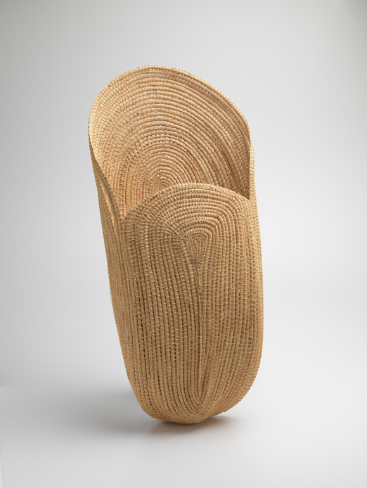
Figure 1. Yvonne Koolmatrie, Fish scoop, 2010.

Yvonne Koolmatrie designs a series of weaving artworks by using the traditional Ngarrindjeri coil and bundle technique.The designer applies the special and old materials into such artworks, which makes the ancient culture and the handicraft be continued to be voiced in the world. At the same time, the skill and the material that Koolmatrie used in her design connect herself with her country and ancestors (Designing Women, 2018). She firmly inherits and develops weaving culture, regardless of how the world changes. 

Koolmatrie is an Australian weaver who has lived all her life in Ngarrindjeri country (Art Gallery of NSW, 2014). The artwork shown in the figure 1 is a fish scoop wove by Koolmatrie. It is made from a local plant ‘sedge’ that grows along the Murray River in the country of the designer (Designing Women, 2018). The sedge as a medium, shows the conventional weaving techniques and the elegance of this artwork thoroughly. The Fish scoopis constructed from dried sedge rushes by using coiled basketry technique (Designing Women, 2018). The top is as wide as the bottom and there is a large, splayed opening at one end. The subtle smell, form and tone of the finished product clearly reflect the natural environment of the Murray River. Besides the cultural significance of the Fish scoopitself, it is functional. Women usually use it to collect fish caught in nets and to entrap fish and crayfish in the shallows (Designing Women, 2018). The Fish scoophas no redundant decoration, which emphasizes the value and the beauty of the material itself.

By adopting the indigenous technique and material, the series of weaving art pieces by Koolmatrie questions the true beauty of an artwork (McDonald, 2016). Although the Fish scoopembodies the delicate weaving technique, it has been commented as too monotonous to some extent. In my opinion, the Fish scoopshows the natural beauty without any ornament, which is different from most mainstream designs. The rejection of adding any patterns or painting it more colourful, to some degree, is another way to highlight the functionality and the material of the artwork. Everyone has different tastes about the beauty of an art piece. Some people prefer the decorative design. Meanwhile, some thoughts about the pure beauty that is considered useless (Christoforidou, 2012). For Koolmatrie, the material is everything to her artwork. It motivates she to insist the use of traditional skills. That is a gift of the old people who from Ngarrindjeri country (Designing Women, 2018). The artist has used sedge to weave since the 1980s and she never attempts to add patterns to make it more beautiful and attractive as the material is considered the true beauty of art by her. 

In addition, the Fish scoop, as one of the representative works of Koolmatrie, has a strong influence on the publicity and development of the traditional weaving technology. With the rapid development of the digital medium and industrialization, the conventional craft is generally to be neglected. More seriously, for better adapting to the changing social and economic circumstances, some handcrafts are replaced by more digital and industrialized art forms that could be mass produced (Berry, 2012). To protect and spread the skills and materials from Ngarrindjeri country, Koolmatrie attempts to educate and affect future generations to inherit this ancient culture through her designs. She teaches weaving and basket making as the teaching is regard as a significant part of maintaining the vitality and prosperity of cultures and traditions (McDonald, 2016). As a designer who works on the communication of aboriginal culture, Koolmatrie are expected to maintain, control and develop the cultural expressions of her land (Martin, 2019).

Besides the functionality and aesthetics of the artwork itself, every piece of art has a duty and meaning behind it. The Fish scoopreminds us of the significance of the ancient culture of ancestors. Koolmatrie creates a bridge between past and present through a weaving. She crafts and shapes the natural material into an object with a practical or symbolic purpose. The use of sedge reflects the designer’s deep love for her hometown and her praise of nature. Furthermore, in the broadest sense, the fusion of art and special material that from hometown represents the consolidation of culture, of tradition, of family and country (McDonald, 2016). By the insistence of Koolmatrie, more people notice the importance of natural material and craft. The Fish scoop ispurchased by NGV Supporters of Indigenous Art in 2012 and displayed at the National Gallery of Victoria (NGV), one of the most influential art museum in Australia, which continues to educate and affect people (Designing Women, 2018). Under the impact of such artworks, many young artists are abandoning the simply ornamental and beautiful art. They are educated for concerning more about nature issues and the combination of their art, material and traditional technology (Poynor, 2013).

It is clear that the weaving artwork created by Koolmatrie has a significant impact on contemporary art and design. It not only challenges perceptions of contemporary indigenous art but also leads weaving art of Australian (Art Gallery of NSW, 2014). But my question is, although the weaving artwork of Koolmatrie emphasized the material, skill and functionality, is this single art form enough to attract the attention of audiences? How could the traditional technology and material be more widely publicized and how could the culture be better protected if it only relies on Koolmatrie and other weavers? In the changing social background, does the designer need to cater to the mainstream taste to avoid this art culture being forgotten?

In my opinion, the Fish scoopis a great art piece to help more people realize the significance of natural materials and the traditional crafts. Also, it reminds artists not to forget the most original and primary art and culture. This series of weaving artwork has a strong influence on reviving an ancient art culture that is in danger of disappearing. The work of the designer Koolmatrie is tightly connected with the Murray River of her country and the rich cultural heritage of the land. She has been at the forefront of the rediscovery and development of the weaving traditions to push the boundaries of the art form. The process is slow, but valuable.

Reference

Figure 1. Yvonne Koolmatrie, Fish scoop, 2010. Exhibited at National Gallery of Victoria (NGV). 

Berry, Jess. 2012.Earthworks and Beyond. InThe Design Collective: An Approach to Practice,182-197. Cambridge Scholars Publishing.

Christoforidou, Despina. Olander, Elin. Warell, Anders.  Svengren Holm, Lisbeth. 2012. “Good Taste vs. Good Design: A Tug of War in the Light of Bling.” The Design Journal, Vol.15, No. 2 (2012): 185- 202.

Designing Women, NGV International, Melbourne, accessed 28/09/2018.https://www.ngv.vic.gov.au/exhibition/designing-women/

Martin, Brain. 2019. TDN3001 Lecture about Indigenous Design Charter.

McDonald, John. 2016. Tarnanthi: Festival of Aboriginal and Torres Strait Islander Art.In Sydney Morning Herald Column.

Poynor, Rick. 2013. Inkahoots and Socially Concerned Design: Part 1. In Essays Design Observer.

Tradition today: Indigenous art in Australia, Art Gallery of New South Wales, Sydney, accessed 2014. https://www.artgallery.nsw.gov.au/collection/artists/koolmatrie-yvonne/

Yang Metamorfosi

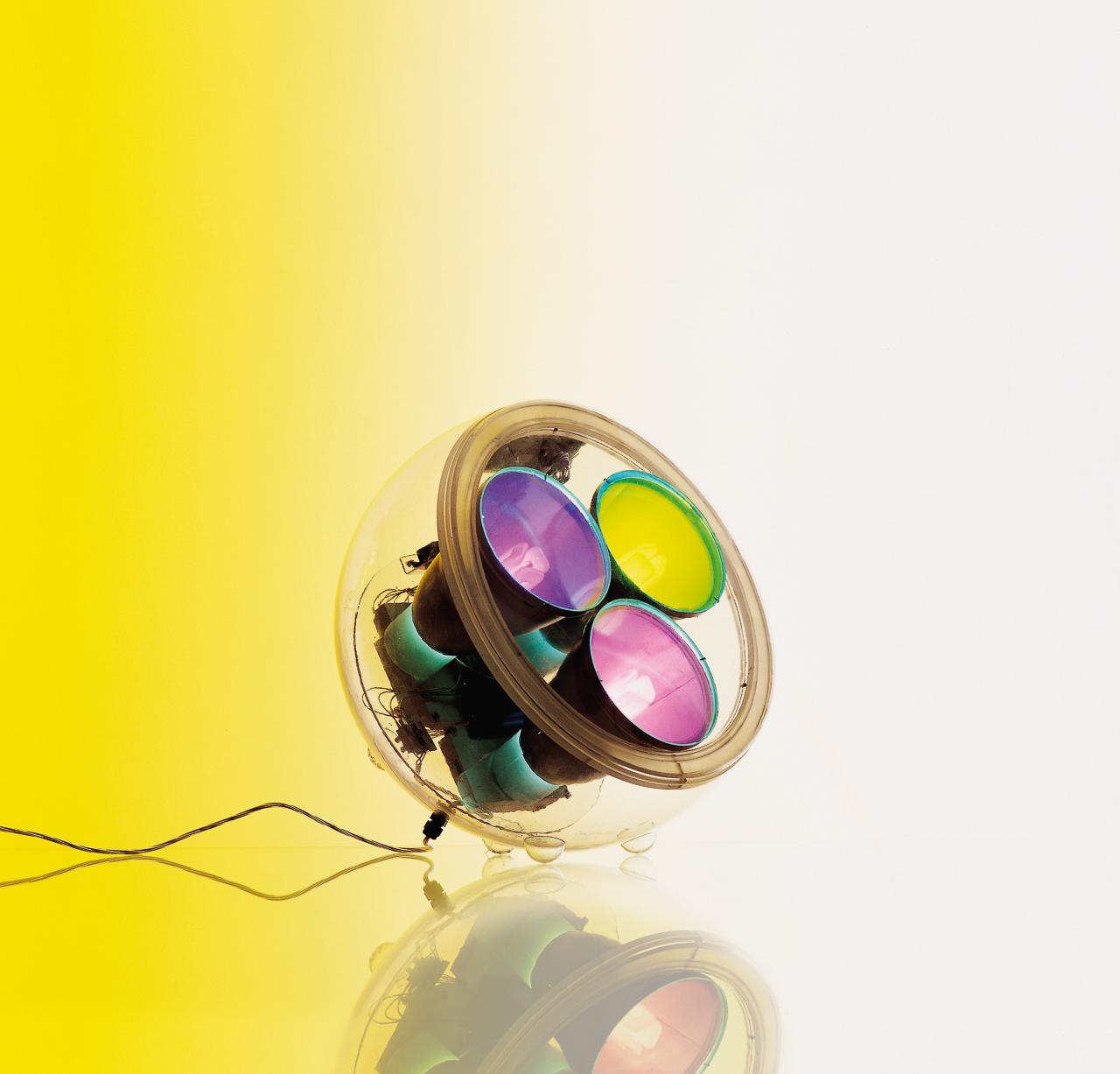
Figure 1. Yang Metamorphosis 2000, Carlotta de Bevilacqua

The highly valuable methacrylate structured table/floor lamp, the Yang is a modern piece of art that visibly demands recognition. Contained within a transparent polycarbonate case, the attention to detail gone to display the functioning of the fluorescent globes is very hard to ignore. Having a spherical design, placing at different inclinations won’t prove to be a worry whilst having a hinge for stability included within the design.

The absolutely stunning lamp boasts ten different functions that mimic colours in the light spectrums for a very stunning effect. In modern times, art has proven to go up in value and people have started to attempt investments in artwork as it is still admired whilst the years pass, on a higher level. Carlotta de Bevilacqua certainly shows with her artwork that women are very relevant within the industry and carries a presence with her flawless design. Today, we do admire art but we don’t go through any lengths to learn about artists and how they are inspired towards what they display. () Women in design go through discrimination and often counter obstacles to excel within the industry whilst being lesser in numbers for graduating and getting the opportunity.

Statistics show that even though women tackle hardships throughout their academic route, even after graduation, result in very less recognition on a larger scale. Yes their designs and art can be successful but their journey isn’t made any easier and the hardships aren’t highlighted within this discriminatory society. The reasons for some prominent leaks within the industry show that women lose motivation as maternal responsibilities fall towards them and that they are paid less when they become mothers (Jane Connory, 2017).

Being one of the women that stood out, Carlotta de Bevilacqua is one of the main representatives of design in modern business with her exemplary vision. Achieving her degree of architecture in 1983 at the Politecnico di Milano, she is the vice president & CEO of Artemide and President of Danese Milano, another widely known brand. 

 Having knowledge within the field of light, Carlotta designed lots of products for Artemide and Danese which earned her invention patents and awards, breaking the stereotype of women not achieving long term career success and standing out in the industry.

The Yang lamp was one of these products and it gives a proper representation to Carlotta’s knowledge and the way she implemented it. From products of Artemide reaching the 2,500 euro price mark, these designs have become a brand that commits to its value and is a known symbol of luxury. It shows that many can exist within one enclosure and if we look at it in such a way, we learn that the industry is there for men and women to co-exist and work towards productivity (Margaret Bruce, 1990).

“Objects, colors, every artwork, every light, everything is linked to our history—everything is a perception of the meaning of our personal life, and also, of course, an aesthetical way of living.” (Sabrina Santos, 2016)  

The highlighting point of such a great designer is the quantity of women who have become known figures in the industry as opposed to male designers. Why have they been invisible for so long? The aim for research gone into this particular question is to highlight contributions made by women in the design industry and shine light on their stories. The Yang Metamorfosi was no exception to exist as a staircase to elevate Carlotta and Artemide within the industry and towards global recognition not only for them but for Italian design and contribution within the design industry.

Rewinding to the image of the Yang table/floor lamp, it can be learnt that remarkable designs can come from anyone who displays hard work regardless of gender and the world may be deprived of such brilliant designs if women and men were given an equal chance to flourish within different industries, not just design.

Displaying science in a way that is impressive and explanatory to the truly shows that art finds a way throughout different aspects of education and reveals a way to make knowledge aesthetically pleasing. Carlotta’s contributions within the industry don’t reach a standstill there as she has been a university professor for the design faculty of the Milan Polytechnic whilst making a number of guest appearances for well-known organizations and educational setups. Carlotta’s competitive mindset shows exceptional function in the blending of humanism and science that aims to set innovation amongst society.

It’s easy to judge the increasing number of female graduates within the design courses, which were almost double of the previous decade’s average as positive. These developments for creating opportunity and equal growth for women did not reflect the same sort of positivity in hiring practices as these had the same statistics as before (Jane Connory, 2017). It is difficult to comment on the reality of this situation with no conclusive data that exists to make a comparison. Some factors did show how women were becoming distant from the industry and their long term careers  Most women do not face the flexibility after they become mothers to return to their work  which proved to be one of the many factors for hindering long term career development amongst them (Jane Connory, 2017). This can be countered by modifying work places to hold centers for babies’ routines and assigning flexible working hours to tailor to their needs. This would be challenging established workplaces where these facilities do not exist and are not thought about where clients expect practicality and success in work at both ends. These decisions are not made easily as women as you tend to lose clients while men at workplaces continue to flourish (Margaret Bruce, 1990).

To sustain your career as a women and mother, the understanding of the system has to be developed while you practice in the industry. Working against the stereotyping of women and creating balance between your life and work duties do tend to spark change in a business with a disruptive way but can still prove to not hinder its success and actually elevate it. 

References:

Figure 1. Carlotta de Bevilacqua, Yang Metamorphosis 2000, Photograph at https://www.ngv.vic.gov.au/essay/designing-women/ 

Connory, Jane. 2017. Plotting the Historical Pipeline of Women in Graphic Design. http://dharn.org.au/dharn2017/plotting-the-historical-pipeline-of-women-in-graphic-design/ 

Bruce, Margaret. and Lewis, Jenny. April 1990. Women designers — is there a gender trap?

Santos, Sabrina. In Residence: Carlotta de Bevilacqua. 5 March, 2016. https://www.archdaily.com/782934/in-residence-carlotta-de-bevilacqua.


Unequal equals

Instead of writing two disjointed pieces for this assignment, I found it a great opportunity to analyse the dynamics of the Vignelli duo. Husband and wife, Massimo Vignelli (1931-2014) and Elena (Lella) Valle (1957-2014), achieved a great deal of work together after establishing their own design firm. They are partially responsible for a lot of the successful design we see today. Although they were equally responsible for the success of their designs, it largely seems that Massimo was and is still credited the most recognition between the pair. I aim to discuss why Lella’s role was severely under recognised, how her hurdles still relate to female designers today, and why her influence is significant. 

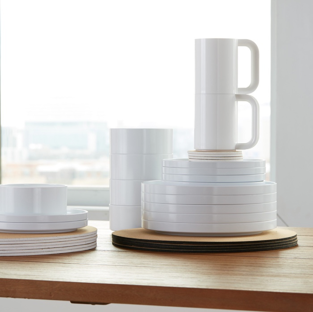
Lella was born into a family of Architects in Udine, Italy. She inevitably went to Architecture school where she met and married Architect Massimo. Together they travelled to America where Lella was employed and valued as an Interior Designer for Skidmore, Owings and Merrill. Her time there was short lived when their visa expired and they had to return back home. Once home, they established their own design firm Vignelli Associates and started strong by creating an award winning dinner stacking set made from melamine. As a result, their expertise was continually sort after which highlights how valuable they were. 

As an Italian designer, Lella was experienced with working in different design fields. She was extremely pragmatic and grounded as a designer. Having a multidisciplinary background meant a lot of her designs were very well informed and I believe this is why she was so successful. Her design approach highlights one of subtraction rather than addition; refinement rather than excess. Her maxim in life was “if you do it right, it will last forever”. This motto is commonly mistaken to belong to Massimo even though he is quoted saying it always belonged to Lella (Sellers 2017).

Although working as a team, Lella noted that “there were many meetings with clients when the men spoke directly to Massimo and ignored [her]” (Seiler, Kirkham and Vignelli 2011). The blatant attitude obviously is example of biased gender views expressed from that era. As a result of ongoing unfair treatment, Lella had confessed to feeling resentment towards her own clients (Seiler, Kirkham and Vignelli 2011). Her under recognition is almost insulting especially considering she was balancing motherhood on top of her successful business. If Lella worked as much as the average working mum works today -roughly 98 hours a week (Santos 2018)- it would be rude to suggest she was anything but hardworking.

Having grown up in Udine, its people known for their long silences and few words, Lella was always one to tell it straight. According to Massimo, Lella played an extremely important role from the very beginning of their design life. “[Lella] is not a person-person; she’s the one who will come and say, ‘this is no good’… It’s a critical role” (M. Vignelli 2011). 

Figure 1. Heller Stacking Dinnerware
Massimo and Lella Vignelli
1964

1971 was the year they founded Vignelli Associates but previous to that they had already designed everything from furniture to interiors. One of their better known designs in collaboration with Alan Heller was a compact dinner set that took advantage of the lightness and flexibility of melamine resin (Vignelli 2019). The award winning dinner ware can still be seen on the market today and exemplifies modularity, elegance, and most importantly timelessness. The set is a prime example of what it means to be good design (Christoforidou 2012). Its long and successful existence in the market are due to its effectiveness and timeless design. Their calculated refinement prefigured the minimalist aesthetic that was to sweep through design in the following decades (Sellers 2017).

The reoccurring problem I identified still remained in the way their designs were recognised. Many of the works the duo worked on solely recognised Massimo to be the designer. It’s uncertain why this underrepresentation still exists.

Why do I believe Lella was important? Lella was a well rounded designer and her intelligence was translated into informed designs. She practiced the process of subtracting which I believe is the most difficult thing to do as it is always easier to add than to simplify. She could identify and understand the absolute fundamentals of a project, thus, only designed something that was not on the market or was not already well done (Seiler, Kirkham and Vignelli 2011). On top of this, Lella managed to become a mother and sustain a successful business.

To finalise, Lella Vignelli was a significant character in the design field because she focused on the purest of design ideals. She was practical and always followed through with her work. Her strong work ethic shows through her decision to continue working instead of becoming a house wife. The ideas behind her designs were thoroughly thoughtful and well refined. Her designs had a real purpose and fulfilled a need within the market. I feel she is the epitome of the best kind of designer.


References

Christoforidou, Despina. “Good Taste vs Good Design: A Tug of War in the Light of Bling.” The Design Journal15, no. 2 (2012): 185-202.

Santos, Maricar. Working Mother.December 22, 2018. https://www.workingmother.com/when-you-factor-in-family-duties-average-working-mom-works-98-hours-week (accessed April 11, 2019).

Seiler, Melissa, Pat Kirkham, and Lella Vignelli. “Lella Vignelli on Vignelli: Design History, Concepts and Collaboration.” The University of Chicaco Press8, no. 1 (2011): 139-152.

Sellers, Libby. Women Design.London: Quarto, 2017.

Vignelli, Lella, and Massimo Vignelli. Design Within Reach.January 1, 2019. https://www.dwr.com/dining-dinnerware/heller-dinnerware-set/1075.html?lang=en_US (accessed April 8, 2019).

Vignelli, Massimo, interview by Mija Riedel. An Interview With Massimo Vignelli(June 6, 2011).

Massimo Vignelli and I

After considering this entire assignment as a whole, I decided it would be interesting to compare the roles and influences of Elena (1957-2014) and Massimo Vignelli (1931-2014). Although the pair were working collaboratively for decades after establishing their own Architecture and Design firm, I question why and how it came to be that Massimo was ultimately the face of the duo.  Within this piece, I also attempt to describe my own design practice, direction and goals in comparison to Massimo’s.

Good taste and good design – a topic we discussed in class (3 April 2019) that provoked the most conversation and seemed to be the most interesting. After further reading into the topic, I found it made the subject both clearer and more complicated. The ‘line’ that separates supposedly ‘good’ and ‘bad’ design is much more of a squiggly and faded one. “We must remember that what is considered good taste is socially constructed… There is a process or system of people creating the criteria for determining what is to be considered as good taste”  (Christoforidou 2012).

As a current Industrial Design student – one of many – at Monash University, I am surrounded by likeminded individuals. Because we are likeminded, do we not already have a subconscious standard of what we consider ‘good design’ based off our own design ethos? In that case, theoretically most of our ideas and projects that we put forth would be considered as good design by our classmates. I don’t believe this is the case. My belief is as follows: good design is a result of thoughtful thinking and conscious refinement. Thoughtful thinking comes from being educated in an array of areas. Conscious refinement is the ability to practice control. 

Massimo Vignelli was a whole hearted Modernist. With a background in Architecture, he advanced through various design disciplines but most notably in graphics and brand identity. He believed that “cross fertilisation is what enriches everybody, every design”  (Vignelli, An Interview with Massimo Vignelli 2011)and practiced clarity all throughout his work. When working in the United States, his agenda was to rid the world of ugliness and to “crusade for the rest of [his] life to fight vulgarity” (2011). When asked how to define vulgarity, Vignelli replied “a lack of intellectual elegance”. When further asked to define intellectual elegance, he replied “a lack of vulgarity”. He strongly believed his existence revolved around trying to raise the standard of design even if only an inch. Based on universal principles of rationality, Vignelli’s ethos was based on discipline in 

Figure 1. Tram Infographic Poster
Lisa Ly and Naomi Foo
2015

Having never previously known about the existence of Vignelli previous to this assignment, I found that there were already similarities between our design works. For an interface subject in 2015, I was asked to design a poster that delivered statistics in infographic form. The aim was to encourage readers to maintain a level of interest and engagement with the poster (as is the intent of any presentation poster). In this poster I focused on creating concise and clear graphics through the process of elimination. My design decisions ultimately came to asking questions like “does that really need to be included?”. “Well designed objects are easy to interpret and understand” (Norman 1988). It is the process of simplification that is the most difficult because it is always easier to add than it is to subtract. In the case of this poster, it was enormously difficult to identify the most crucial elements to keep and what could be forgone. I believe anybody who can do this right is a great designer.

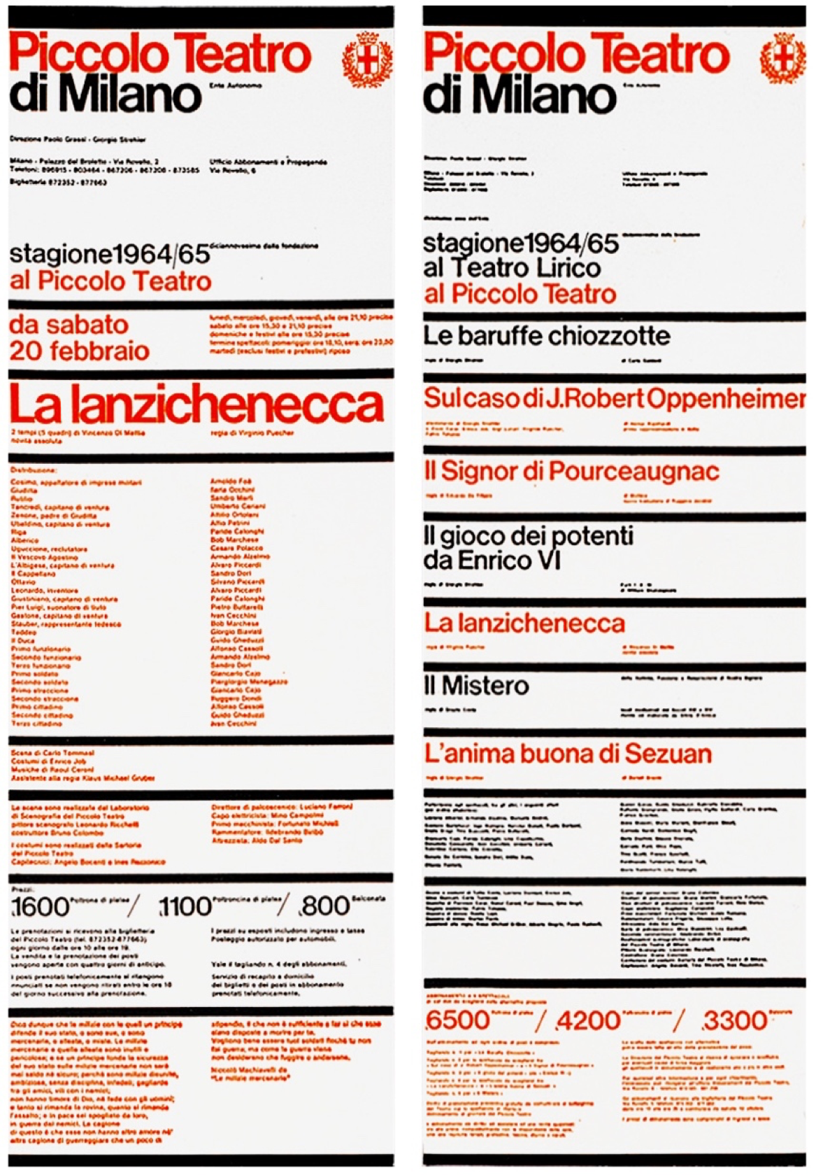
Figure 2. Piccolo Teatro Posters
Massimo Vignelli
1964

The posters Vignelli designed for Piccolo Teatro are regarded some of the best pieces of Italian graphic design. It displays “an excellent example of rhythm within order” (Vignelli, Massimo Vignelli 2013)and set design characteristics that have been followed even after all these years. The alternate colours indicated what show was playing at which theatre. The bright red also serves as a way to break up the large amount of information delivered. Vignelli was a strong promoter of the typeface Helvetica. He used the typeface for most of his designs due to its legibility and straightforwardness. The similarities between the two posters include a vertical format of information, clear boundaries for text, and immediate visual impact.

Where I may agree with his stance on the importance of applying intellectual elegance into each and every one of our designs, I don’t believe that I have enough of my own design material to support it yet. The environment created at university is not highly conducive to creating beautiful content just yet, especially not with the time pressures and financial restrictions. This doesn’t mean that I’m not already constantly critiquing the validity and direction of my work. Good design is always the end goal. 


References

Christoforidou, Despina. “Good Taste vs. Good Design: A Tug of War in the Light of Bling.” The Design Journal15, no. 2 (2012): 185-202.

Norman, Donald. The Design of Everyday Things.New York: Doubleday, 1988.

Vignelli, Massimo, interview by Mija Riedel. An Interview with Massimo Vignelli(June 6, 2011).

Vignelli, Massimo, interview by Nicola-Matteo Munari. Massimo Vignelli(September 9, 2013).

Bark to Neon at the NGV

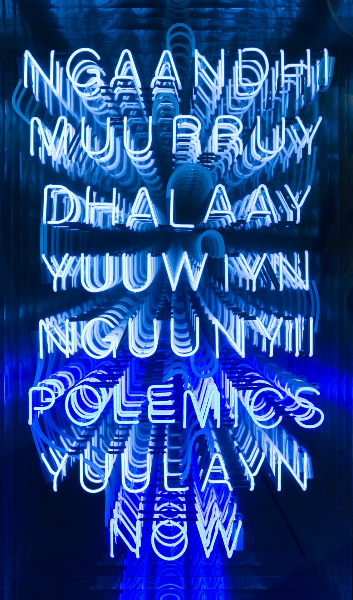
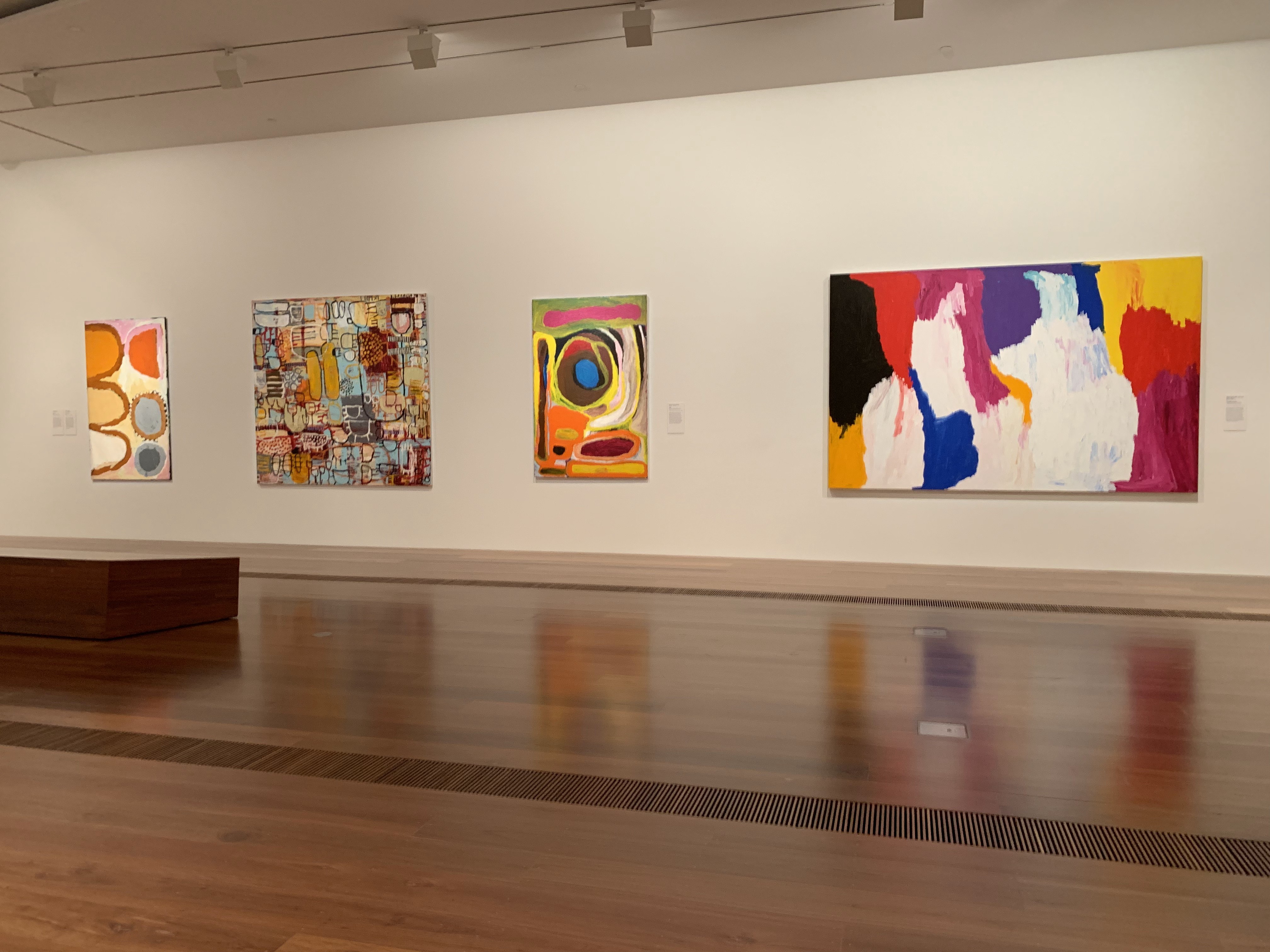
From Bark to Neon: Indigenous Art from the NGV Collection is an exhibition running from 3 November 2018 to 14 July 2019 and seeks to display the evolution of Indigenous Art in Australia. It presents artists from all over Australia, coming from different backgrounds, from individuals working in Aboriginal art centres to art school graduates working independently (NGV  2018).  Like the title of the exhibition states, it shows the evolution of artworks from traditional forms such as cave paintings to a more modern interpretation through the use of neon lights, as shown in Brook Andrew’s Polemic (Figure 1), which utilises neon and mirrors to convey his ideas. This exhibition’s intentions align with those of the Australian Indigenous Design Charter (AIDC), where they seek to promote the representation and commission of Australian Aboriginal and Torres Strait Islander culture through design (AIDC 2016) Where artists wish to convey their experiences through their artwork, the AIDC wishes that more designers would promote ethical use of these experiences in their design work, while still capturing the raw essence.  

Figure 1. Polemics (2000) by Brooke Andrew
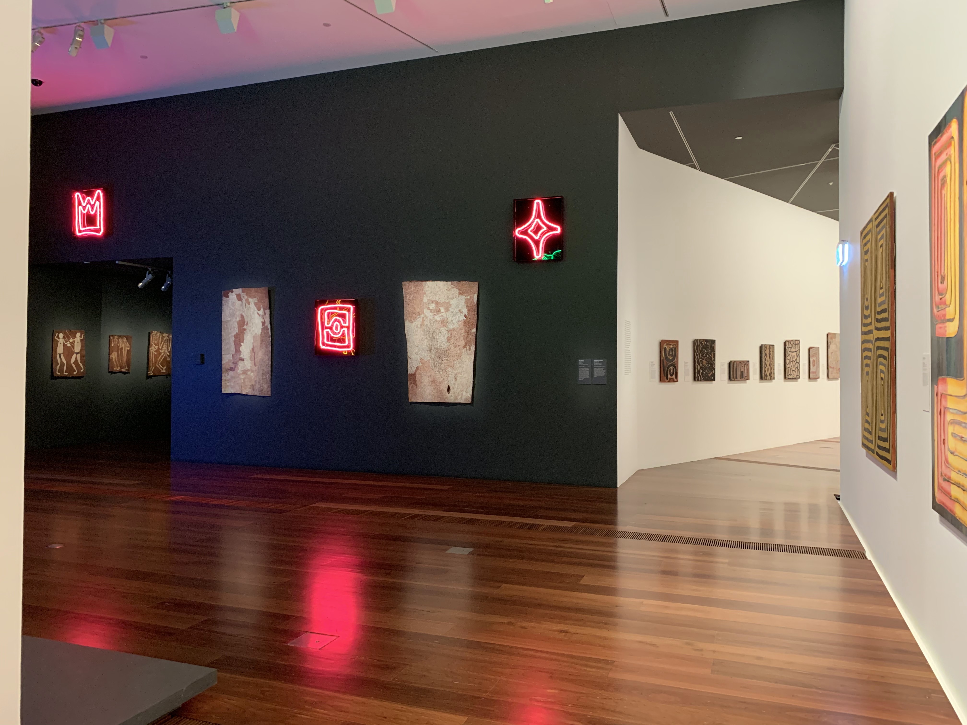
Figure 2. Layout of exhibition (detour on the left towards darker room)

Before looking into the displays, walking around the exhibition there is definitely a sense of theming in the layout of the rooms. From the outside, the exhibition appears to be lively and joyful, with light coloured walls and brightly lit rooms. However, that changes when you enter the exhibition, past the first wall hides a detour towards a darker room (Figure 2) with less light, darker walls and less vibrant artworks. This seeks to represent the darkness and suppression that was evident in the history of the indigenous population.  The lighting that was used throughout the exhibition was effective in creating an ambience to the room and evoking emotions toward certain artworks that otherwise may seem normal. The path to take through the exhibition is entirely up to the audience, they can either start with the more joyful rooms then the darker rooms, or take a detour into the darker room and finish up with a smaller, lighter room. The course you wish to take will no doubt change your emotional standing at the end of the exhibition. The darker rooms also felt more cramped with less space to move around, where as the last section (Figure 3) is a light and airy space. 

Figure 3. Last section of the exhibition
Figure 4. Dibirdibi Country (2008) by Mirdidingkingathi Juwarnda Sally Gabori

In the last section, there was a piece in particular that stood out, one of the first pieces to be seen coming out of the darker room, with your attention directed at its vibrancy. Figure 4 shows an artwork by Sally Gibori that represents her husband, Pat Gabori’s Country on Dulka Warngiid (Bentinck Island), Dibirdibi, and tells a story where a Rock Cod ancestor of the same name has been said to have carved up the South Wellesley Islands using its fins and ultimately ending up on Sweers Island where he was caught and eaten (QAGOMA 2016). This story, among a couple others, is important to note as it creates the basis of which most of her paintings are derived from. This artwork is constructed by using synthetic polymer paint on canvas and was made on Mornington Island, located in North Western Queensland in the Gulf of Carpentaria, in the same area in which the artwork is representing.

Looking closely at the artwork, the brush strokes on the canvas are mostly harsh , and where the colours change, there is a buildup of paint. This could be a result of extreme emotions by Sally when the painting was created, and can be represented by the hardships she may have experienced in her life. This is important in the recreation of experiences through art as it allows for the audience generate their own emotions toward the artwork. 

In relation to the intentions of the AIDC, although the artwork may not directly impact the designs of others, It allows for the audience, who may well include designers, to take into account these experiences to be reflected in their design. In that case the procedure in the representation of the Aboriginal and Torres Strait Islander culture in their design practice is encouraged by the AIDC through ethical and sound principles. They have been conceived to be an agent of change and to help the indigenous reconciliation process in Australia, and to encourage cultural innovation through inclusiveness (AIDC 2016). 

For both the artwork and for design practices, respect and recognition are key aspects to the success of works. It is important to try and understand the culture and experiences of Indigenous Australians, and to represent this in the most ethical and accurate way. In the same way that Sally Gabori and other artists represented in the exhibition has tried to communicate her experiences, we as designers must recognise these experiences and to try to keep the emotion as raw as possible and to not dilute their views with that of our own. The AIDC intends to be used as a best practice guide when interacting with the indigenous people and representing their culture and provides framework in which to adhere to when attempting to express indigenous culture and our national identity. 

References

[1] National Galley of Victoria, “From Bark To Neon: Indigenous Art From The NGV Collection – Artwork Labels” 

[2] Indigenous Design Charter, “Protocols for sharing Indigenous knowledge in communication design practice”  p5-6

[3] Queensland Art Gallery, ANCESTRAL STORYS AND PERSONAL HISTORY OVERLAP IN SALLY GABORI’S ART. https://blog.qagoma.qld.gov.au/ancestral-story-and-personal-history-overlap-in-sally-gaboris-art/ (Accessed 28 March 2019) 

[4] Indigenous Design Charter, “Protocols for sharing Indigenous knowledge in communication design practice”  p8-9

Forgotten superhero in graphic design

Image 1, Book cover created by Alison Forbes, I Can Jump Puddles written by Alan Marshall (https://abda.com.au/2017/07/10/alison-forbes-book-design-pioneer/, accessed 07/04/2019)

Alison Forbes as a full-time graphic designer, she has made a great effort on pushing the development of Australian culture as well as influenced as a female designer from graphic design. Alison Forbes was also a book cover graphic designer, and she had put into the Hall of fame (AGDA) in Australia. According to the reading Plotting the Historical Pipeline of women in graphic design written by Jane Connory, I learned that people did not pay attention to works designed by women graphic designers. The increasing numbers of female students in graphic design didn’t solve the problem of the statue of women designers.

Jane Connory considered that (Plotting the Historical Pipeline of women in graphic design, 2017, p2-p3) in 1985, although graduate women students outnumbered men by almost three to one from all Australian universities, the future society situation and future prospect make students feeling overwhelmed. At this stage, female graphic designers were facing the same position as the graduate feminine graphic design which is the unshakable female social status. However, although there were no female graphic designers participated in the AGDA first National Executive meeting in 1989 as well as all the chef and chairman were all males, Alison Forbes has received the AGDA first honor award for her continued and outstanding contribution on the production of Australia book covers design. According to the AGDA Hall Of Fame, her contribution including that she was the first full-time individually independent book cover designer in Australia,  her illustration for Alan Marshall’s I Can Jump Puddles has confirmed in the Australian Book Publishers Association (ABPA) Books of the Year as well as she became the first staff designer at Melbourne University Press at the age of 23. Her works occupied the most critical position in the development of Australia culture (Turning Pages: The brilliant career of Alison Forbes, designer, Jane Sullivan).

The methods Alison Forbes used for creating this artwork (Image 1) are paper, paintings, pen tool, and printmaking. Those are all traditional methods at that time. By using these tradition tools, Alison Forbes had done a lot of incredible works. However, the main ideas of graphic design now were mostly about numerous of inspirations and the requirement of works efficiency. There were millions of students graduate every year, and this caused high pressure and competitive. Because there are billions of ideas and works coming up every minute, so the process of complete a design needs less time than before. Otherwise, this unique idea will turn up from another graphic designer and will also be published by another company.

Although the process from ideas to a specific graphics product finish within a short period, the quality of the result was much better than before due to the rise of technologies. Also, the rapid development of society has led to an increase in work efficiency. Companies need more ideas that come from a professional graphic designer; the companies need prototypes, videos about their graphic works. Therefore, graphic designers from today have the knowledge on using technologies to made book covers, DVD covers, a variety of software used to edit videos, and also digital sketches on a computer, such as using an Adobe software called Photoshop and another Adobe software called Premiere Pro. These technics methods have changed the way graphic designers thinking and inspiriting because of the combination of traditional hand painting or making and the latest technologies with achievement in today. In addition, an important reason that people have forgotten most of the female designers including Alison Forbes was because of the society of female graphic designers.

The computer has replaced most of the works which used to finish by hands years ago. Consequently, computers and other electronic devices have made the aesthetic different compared to the last decade of years as well as people read books on their phone online. To buy a book will more about a collection. Although the book cover design works from Alison Forbes had occupied the most important position during the developing of Australia culture and graphic design field, female designers still need to speak for themselves.

Reference

Image 1, Book cover created by Alison Forbes, I Can Jump Puddles written by Alan Marshall (https://abda.com.au/2017/07/10/alison-forbes-book-design-pioneer/, accessed 07/04/2019)

Dominic Hofstede professional, Turning pages: The brilliant career of Alison Forbes, designer, accessed
05/04/2019 https://www.smh.com.au/entertainment/books/turning-pages-the-brilliant-career-of-alison-forbes-designer-20180510-h0zx0a.html

Pamela Ruskin, Alison Forbes, accessed 06/04/2019 https://recollection.com.au/biographies/alison-forbes

Jane Connory, Plotting the Historical Pipeline of women in graphic design p2-p3, p5-p6

ABC company, The Land That Waited, accessed 07/04/2019 https://aso.gov.au/titles/tv/the-land-that-waited/clip1/

ABDA Blog Alison Forbes: a book design pioneer, accessed 07/04/2019
https://abda.com.au/2017/07/10/alison-forbes-book-design-pioneer/

What materials did you consider designer used in this dress?

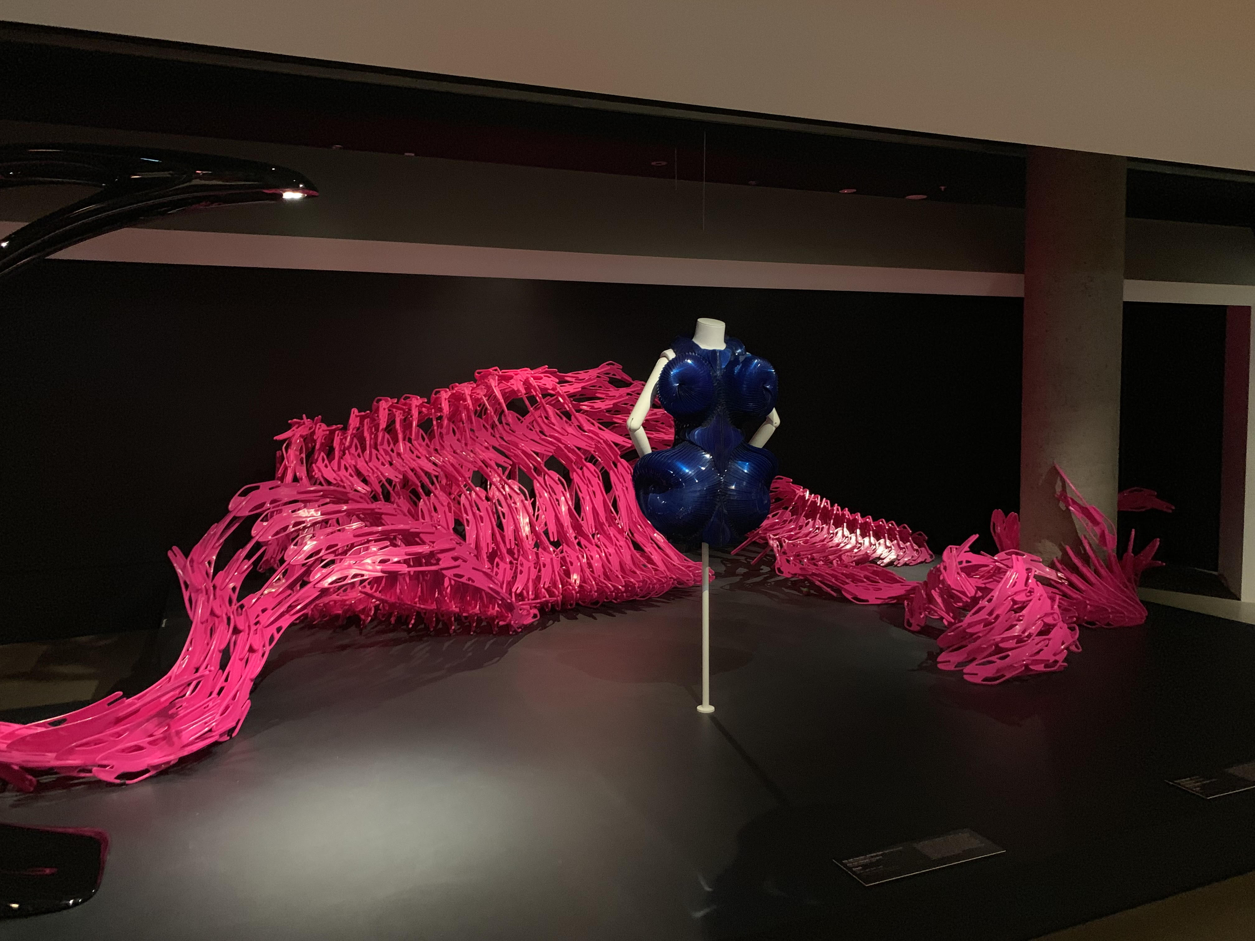
Image 1. Dress 2011, Iris Van Herpen, Amsterdam (fashion house), Iris van Herpen (designer), Photographed at National Gallery of Victoria (NGV)

Iris Van Herpen is a well-known woman Dutch fashion designer; her series of works demonstrated in-depth study on materials as a research designer. She cooperated with other designers, such as architecture and industrial designers. The Dress (image 1) 2011 shows a great result of a dress made by different materials instead of using needles or thread. Iris Van Herpen used a 3D printer to produce lace structures were no need for needles and thread. Also, she has applied different hand plisse techniques that are mostly forgotten today. To compare between the traditional hand plisse techniques and the modern mechanically folded plisse, the result of the hand plisse techniques was more organic and changeable. Iris Van Herpen considered to used modern technic to mimic nature reality. According to Iris van Herpen studio, Dutch fashion designer Iris van Herpen is a famous creator that known as one of fashion’s most forward-thinking research designer, because she has pushed the boundaries of fashion design forward. During her first show in 2007, van Herpen has been focused with discovering new forms and methods of sartorial representation by including the most traditional working methods, innovative novel materials, and garment construction methods on her unusual creative vision.

The Dress 2011 which also called a sleeveless blue dress, it was formed from semi-transparent acrylic sheets, laser cut and mounted onto a tulle ground to create a shield-like shape. The materials were using polyamide, blue transparent acrylic sheets, lasered transparent acrylic sheets, metal satin, burned copper gauze, smocked leather, fabric. She used a fresh way of making clothes which are combining traditional sartorial practices with the latest technologies; both methods help her to present her abstract concept idea of cloth. There are several technologies Iris van herpen has used in her work which including some technologies from industrial and architecture field. For example, the injection molding, 3D print, laser cutting, alchemy and the metamorphoses of materials. These techniques help Iris van herpen to sculpt her clothes resemble a moving form. Furthermore, the overall shape of the Dress (2011) has four ellipses in front of it which demonstrates women’s significant features; To reform the form of women’s body, also she emphasis these features to approach a movement effect on this Dress.

The Dress 2011 displayed at the National Gallery of Victoria which is one of the famous international art and design museums in Melbourne. According to the description from the National Gallery of Victoria, the main idea from the report is Iris Van Herpen is exceptionally expert at using and founding distinct materials and latest technologies to made clothes, and she is also an excellent woman designer in fashion design who was one of the first designers to apply 3D-printing as an attire construction technique. It’s not curious that man dominated fashion design just like any other design major, such as industrial design and graphic design. Although there have been some unforgettable impressive women fashion designers, such as Channel and Prada, the significant protagonists are always male designers. Moreover, design research was also mostly dominated by male designers.

There was a revolutionary architecture designed by a modernism designer Le Corbusier – The Villa Savoye in Poissy (1928–1931), which was made by reinforced concrete. Reinforced concrete is a new material that has changed the vision of architecture. Moreover, this house breakthrough the general understanding of an ordinary house at the time; People considered that houses were usually built of wood and with a triangle roof. The using of the new materials at that time is a novel way of acknowledging the flexibility of this new material and the influenced of the elements. Le Corbusier had promoted the development of international architecture at that time by using reinforced concrete to build the Villa Savoye. The idea of the discovery of new materials and finding the way of using materials and technic from Le Corbusier is familiar with Iris van herpen. Iris van herpen as a female designer, she has mentioned that every woman deserved to own customs for themselves by using the latest technologies. She used the 3D print technic to scan women’s body to get the cloth that suits them. Iris van Herpen was considering about women figure and how to design great fabric that only for woman, she was really thought about the form of a specific woman and how to design a cloth that fit the woman accurately; And she also created cloth that combines laser cut, 3D print, and traditional methods. However, back to the fashion design, people considered wearing tide brand as fashion, tide brand was a white shirt or sweater that printed with a logo on them. Also, the so-called innovating development in tide brand is a white shirt or sweater printed with another different logo. However, it is hard to define innovation; Is changing the logo that printed on the hoodie defined as innovation or designers discover unique ideas on a project and have an exploration on new materials and novel ways of making clothes defined as innovation? Compare to the way that designers used to innovate the street fashion or tide brand; I recognized the Dress (2011) of Iris van herpen. Moreover, it is commendable that iris van herpen is a female fashion designer. I think that the young fashion designer should learn the spirit of Iris van herpen.

According to “Women designers is there a gender trap? “ The author state that:

“We argue that, for a woman with the requisite talents to attempt to become a successful designer today, there are three stages where barriers are likely to be perceived and imposed, barriers that a similarly talented man would not face. The first hurdle is getting onto a degree course and completing this; the second is attaining a job and the third appertains to success at work.”

Iris van herpen succeed by persevering in self and never stop pushing forward the international women fashion trend; And, the new inspiration on combining the traditional hand making methods and the high technologies together, to create brand-new clothes to produce to most female customers. Iris van herpen mentioned (“The other-worldly couture of Iris van Herpen” November 30, 2018) that: “Over the years beauty and femininity have become more important to me – much wider than mere seduction. The people who wear my clothes are very strong women.” Iris van herpen is a unique and unusual fashion designer that think of women’s feeling of fashion and the trend of women international fashion. Her ideology has reflected on her other numerous works, such as two scenes called crystallization and shift souls.

I understand that it is a great idea that using new materials and high technologies to make clothes. There were questioning and controversy on the ideas from Iris van herpen. Nevertheless, she persisted. However, I considered that is it possible that all women have a tailor-made dress? Will the new materials and the users of latest technologies play its due value? Will the trend of dressing styles be improving by using new materials and techniques in the future? Consequently, Iris van herpen is a great female designer that persevere in self and genuinely thinking about making women’s feeling better. She also influences the status of female designers in fashion design.

Reference

Image 1. Dress 2011, Iris Van Herpen, Amsterdam (fashion house), Iris van Herpen (designer), Photographed at National Gallery of Victoria (NGV)

NGV International, Level 3 Contemporary Art & Design, DESIGNING WOMEN ngv.vic.gov.au. accessed 27/03/2019https://www.ngv.vic.gov.au/exhibition/designing-women/

Vogue magazine, Fall 2011 Couture Iris van Herpen, accessed 28/03/2019https://www.vogue.com/fashion-shows/fall-2011-couture/iris-van-herpen

Vogue magazine, Spring 2011 Reday-To-Wear Iris van Herpen, accessed 30/03/2019https://www.vogue.com/fashion-shows/spring-2011-ready-to-wear/iris-van-herpen

IRIS VAN HERPEN studio, ESCAPISM, accessed 30/03/2019https://www.irisvanherpen.com/haute-couture/crystallization

Iris van Herpen makes a case for fashion as a fine art, accessed 02/04/2019https://hyperallergic.com/337448/iris-van-herpen-makes-a-case-for-fashion-as-a-fine-art/

ELUXE magazine, by women, for women: why female fashion designers rule, accessed 02/04/2019https://eluxemagazine.com/fashion/female-fashion-designers/

NGV, “Everybody could have their body scanned and order clothes that fit perfectly”, accessed 03/04/2019https://www.dezeen.com/2013/04/24/iris-van-herpen-interview/

The other-worldly couture of Iris van herpen, accessed 05/04/2019https://howtospendit.ft.com/womens-style/204883-the-other-worldly-couture-of-iris-van-herpen

Margaret Bruce & Jenny Lewis. April 1990. Women designers is there a gender trap?. p114-p116, p118

The forgotten female modernism designer master

Lily Reich was active in the design field from the 1900s to 1930s. During this period, she has worked as an exhibition designer, fashion designer, furniture designer, and architect. The achievements that she got matched by few women(Matilda, 1996).

The early twentieth century was age turbulence, the progress of new technology and thought nurtured many great modernism designers like Walter Gropius, Mies van der Rohe, and Le Corbusier. Lily Reich’s name is not as widely known in contemporary as they are. However, as an essential member of Bauhaus history, her contribution is far more significant than her reputation.

As a female designer, Lily Reich also suffers from unfair treatment in the design field like other women, especially the recognition of their accomplishments. The contemporary history of the women who work in design and the tangible cultural heritage or heritage resulting from their work remains largely unknown today, not only to the general public but also to students, scholars, and professionals. Women’s works featured in textbooks on the history of architecture, the history of building technologies and engineering, urban history or design history(Helena, 2017). Even until recently, the position of female designers was not fair. According to the statistics of Australian designers, since the 1970s, women have been making up more than 50% of graphic design graduates. Until recently, the Australian graphic design association (AGDA) had only one woman in its hall of fame, Dahl Collings.

The amount of achievement and reward is unequal between men and women. Should be attributed to the lack of female designers overall ability?  According to research on Lily Reich’s career, this view does not hold water. After the industrial embroiderer training in 1908, Lily started work as a designer at the workshop of Josef Hoffmann in Viennese. She was involved in many fields, she became a member of the Deutscher Werkbund, also a member of the independent color art group. In 1926, Reich met Ludwig Mies van der Rohe and worked closely with him(The Bauhaus, 2019). For the most part, Reich’s achievement hides under the glare of Mies van der Rohe. People often categorize a woman’s success as a result of her cooperation with Mies van der Rohe, but in a lack of research into her work, it is very irresponsible. As is already well known, the renowned Representative Pavilion and also the German Electrical Industries Pavilion are both designed by Ludwig Mies van der Rohe. However, what it is less known is that  Reich and Mies had been in charge of developing the German sections in parts of the interiors of eight separate neoclassical palaces: the Southern Palace on the top of the mountain to display Germany industries in the fairgrounds of Montijüic. Reich and Mies design a wide range of furniture that has been designed to showcase a wide range of industrial products from compounds and visual objects to books and graphic arts. The official catalog includes a full-page AD for the “Lilly Reich Weave” steel tube MR 10 chair, as Smith goes to great lengths to promote his furniture in what appears to be a promising new market(Laura, 2017). The contribution of Lily Reich and Mies van der Rohe were on a par. However, the recorder is more inclined to give credit to Mies for this event. A similar situation occurred in the design of the Barcelona chair; this world-famous chair was also designed in collaboration with Reich and Mies. However, in most teaching texts, Reich is not named. Reich’s relationship with the chair would not have been known to the public without further investigation.

The unfair treatment of female designers is diverse.  For example, there were some great female designers like Reich who have been able to shine during their careers. But it is despised by the chroniclers of history. Nowadays, there are a large number of female designers entering the workforce today, but it is difficult to advance to influential positions. Sometimes it’s just that companies are biased against women like childbirth and maternity leave. These stubborn prejudices make us lose too much information in design education, and a large number of students may not learn the complete history of design.

Reference

Laura Martinez de Guereñu. 2017. MoMoWo: Women Designers, Craftswomen, Architects and Engineers between 1918 and 1945. (Art and Culture, History, Antiquity Press,2017), pp 250-256.

Helena Seražin. 2017. MoMoWo: Women Designers, Craftswomen, Architects and Engineers between 1918 and 1945. (Art and Culture, History, Antiquity Press,2017)

Jane Connory. 2017. Plotting the Historical Pipeline of Women in Graphic Design, (Design History Australia Research Network Press, 2017)

Matilda McQuaid, 1996. Lilly Reich and the Art of Exhibition Design. ( the museum of modern art Press,1996) pp 13-15

Bauhaus100.com

Accessed 10/4/2019

https://www.bauhaus100.com/the-bauhaus/people/masters-and-teachers/lilly-reich/

Lily Reich, Moma

Accessed 10/4/2019

https://www.moma.org/artists/8059

The Potential of Australian indigenous Design

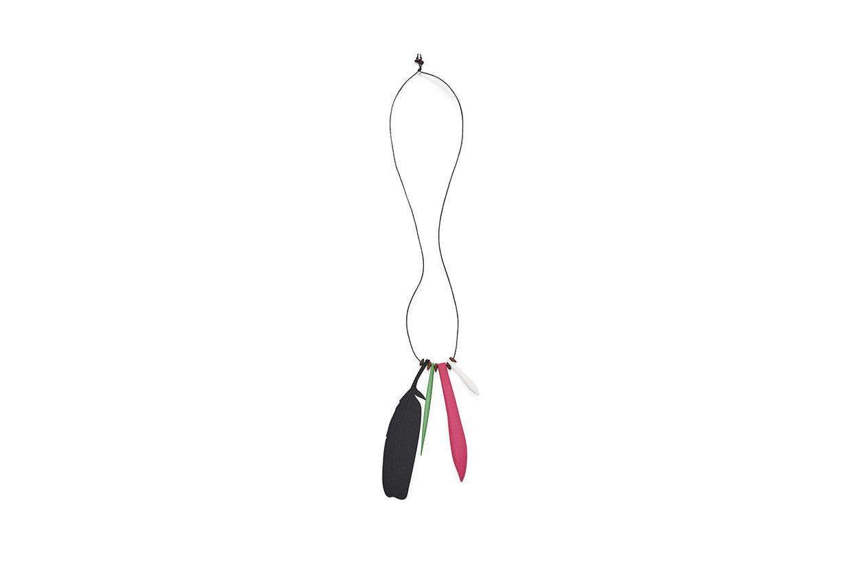
Figure 1. Maree Clarke, Necklace Crow feather, Green Quill, large pink tooth.
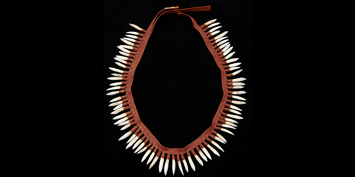
Figure 2. Maree Clarke, Thung-ung Coorang, (Kangaroo teeth necklace).

Maree Clarke is an aboriginal female designer of Australian. She has a cultural background from Mutti Mutti/Yorta Yorta and  Boom Wurrung/Wemba Wemba. Her design work is enhanced by new technologies, ensuring that her practice is contemporary and current, and the next step in the continuum that is the oldest living culture in the world(MUMA page, 2019). Meditation on the relationship between tradition and modernity is a central element of Maree’s oeuvre(MUMA page, 2019).

Her latest design work, shown in figure 1, is a collection of Jewelry that comes in gold plating, supersizing and 3d printed forms, they are shaped into the types of kangaroo teeth, quills, and feathers. Using organic material from animals for decoration is often seen as archaic and primitive. However, in this design, Maree Clarke endows cool color and texture for these natural forms. With these compositions, these animal body shapes illustrate concise and beautiful of contemporary jewelry design. In general, this work still communicates a traditional cultural practice. You can feel it is a design that passes on from an ancient ethnic in a form more acceptable to modern humans.

It is interesting that we can see an original cultural work is exhibited in the gallery exhibition now. According to Sharon West “As before this Indigenous art and cultural objects were generally perceived as ethnographic exhibits.  They were systematically documented and cataloged for the nation’s anthropological museums and University collections(West, 2007).” Australian mainstream aesthetic didn’t recognize the value of these indigenous cultures as art in the past. Art was only considered as the right of the powerful culture such as Europe, Japan, America. This situation is inevitable; dominant cultures have carried on extensive esthetics research and discussion and define the foundations of modern aesthetics, especially in the 20th century. Although the idea of modernization is global and comprehensive, unfortunately, for historical reasons, Australian aboriginal people and culture were not being added to the family of artistic creation. The intellectual property of Australian aboriginal people was not fully respected by the public until the promulgation of the AICD: CD ( Australian Indigenous Design Charter: Communication Design ). The charter has detailed criteria to guide the promotion of Australian indigenous design” ensure Indigenous representation creation in design practice is Indigenous-led; respect for the rights of Indigenous peoples to oversee representation creation of their culture in design practice; always consider the reception and implications of all designs so that they are respectful to Indigenous culture(AICD, 2016).” We have known these aboriginals culture community for a long time, but their culture is always used as a background, shown as a primitive way of life in Hollywood films or video games without deep thinking. The AICD claim that Indigenous participants are not merely to be referenced, but are active participants in the process(AICD, 2016). To understand the aboriginal culture, we need more indigenous to participate as a professional designer and artist to spread their religion.

The 3D printed crow feather and gold plating kangaroo teeth is an essential sign of Maree Clarke’s design. Compare this to her previous configuration Thung-ung Coorong, shown in figure 2; a necklace makes out of real kangaroo teeth. The process of Thung-ung is more traditional. To make a necklace like Thung-ung Coorang 2013, Clarke first collected teeth from dead kangaroos on the roadside in Mildura and Broken Hill. Clarke was inspired to revive the tradition while visiting the Victorian museum’s collection of 19th-century kangaroo necklaces(MUMA, 2019).  However, for the jewelry series, she considers the forms of kangaroo teeth and crow feathers as a symbol, there is no difference between a gold plating kangaroo teeth with a gold plating crucifix or gold plating buddha, they are all the cultural property left to us by our ancestors legacy that establishes a cultural identity with your group . As Maree said in a conversation “As a mob, we call Ravens and Crows Waa, they are watchers of the waterways” crow play as a different role in Boon Wurrung culture, it is a family story of them. It is glad to see the aboriginal artist to work as the leader to experiment with new methods to pass their culture to the next generation.

This work triggered my reflection on the culture of the minority group. Does our world miss out plentiful, great design from multi-culture background people?  We see a lot of dress, jewelry, and even architecture design that design based on a reference of minority culture. Designers easily take away the element they think is unique to make their work success, but these elements may have been misinterpreted from its original culture. The demands of the minority cultural groups and their cultural inheritance are ignored. The primary purpose of an aboriginal designer is not to design extraordinary; it is to spread their own culture to the world and carry on to the descendant.

The series of jewelry is excellent, it showed the potential of aboriginal designers, it represents every object displayed in museum or historical may be redesign to get public recognition, to regain its function in life, and remain its spiritual values. This project needs more indigenous designers to engage.

Reference

Sharon West, 2007. Old messages, new media: Jarrod Atkinson, Maree Clarke, Gary Lee, Genevieve Grieves, Dixon Patten, Allan Wickey (Brunswick, Vic. : Counihan Gallery in Brunswick Press,2007).

Rhall Steven, 2017. In conversation – Maree Clarke and Steven Rhall, Indigenous Art, Art–Exhibitions, Photofile, Vol. 100, 2017: 116-121

Arts Law Centre of Australia (2012). Indigenous Australian Art Commercial Code of Conduct.Retrieved 10 March 2016 from http://www.aitb.com.au/information-sheets/entry/indigenous australian-art-commercial-code-of-conduct

Arts Law Centre of Australia (2016). Artists in the Black: Information Sheet. Retrieved 20 October 2015 from http://www.aitb.com.au/information-sheets/entry/solid-arts-the-visual-arts and-crafts

The Design Files

Accessed 10/4/2019

https://thedesignfiles.net/2018/03/maree-clarke/

Vivien Anderson Gallery

Accessed 10/4/2019

http://www.vivienandersongallery.com/artists/maree-clarke/bio