Questioning Taste & Minimalism, is it Really so Great?

Elizabeth Critchlow is a contemporary designer whom I stumbled upon while researching and attempting to formulate my own opinions on what is good taste in design. She had been profiled and interviewed by Anoushka Khandwala, a contributor to the design magazine Eye on Design (Khandwala 2019). The title “Why Minimalism is a Class Issue + You Might Not Need That Expensive Adobe Subscription” immediately captured my attention (Khandwala 2019). The article and Critchlows ideas on minimalism and class stuck a cord with me. It recalled for me Pierre Bourdieu’s theory on taste from his book “Distinction: A Social Critique of the Judgement of Taste” (Bourdieu 1984, 1-7). Bourdieu believes that taste is learnt (Bourdieu 1984, 1-7). That education and origin dictate a person’s taste rather than viewing “taste in legitimate culture as a gift of nature” (Bourdieu 1984, 7). It is easier to appreciate and enjoy music or art if you are educated in its history and “stylistic properties”, such education is the privilege of those with wealth and high cultural status (Bourdieu 1984, 2-3). In this way he argues peoples preferences and purchases can be a coded message used to indicate their place in society (Bourdieu 1984, 2-3). I consider Bourdieu’s idea that “taste classifies, and it classifies the classifier” an important lens in which to better understand the rise of minimalism as design and as a philosophy (Bourdieu 1984, 6). It is important as a designer that I question the decisions I make in my own design practice and how these relate to different schools of thought. I have grown up surrounded by the accepted idea that minimalism is the supreme aesthetic but Critchlow and Bourdieu have me questioning my prior education. Through looking at my own past work in relation to Critchlows I hope to gain a deeper understanding of why I put such stock in minimalism. This blog post is dedicated to my exploration of the idea that minimalism is simply another style of design not objectively better or worse than any other however its elevation into a lifestyle brand has made the appreciation and use of it a signifier of wealth and social standing.

In today’s day and age the most prevalent style of design is minimalism. Minimalism arose in the 1960s as a rebuff to highly decorated, overtly lavish designs of the past (Cooper 2018). It emphasised the idea “less is more” (Ivanoff 2014). It features a focus on reduced, clean and sleek forms (Schenker 2018). This simplicity however is rarely born out of necessity, materials used in “Minimalists” architecture and interior design are often very expensive and high quality (Fagan 2017). For this reason it is considered the design and look of the upper-class. In much the way that once ravish decoration and excess were used to show once status, today it is once ability to be selective and sleek (Fagan 2017). Minimalism is a modern form of conspicuous consumption. A way to shows ones wealth through purchases. It is a very privileged idea to be able to reject the material. Those who can afford not to clutter their spaces with many cheap possessions. Glass tables that would need to be cleaned after each use to up keep their appearance. Kitchens with nearly nothing in them, speak of being above such common needs as cooking and eating. Minimalism is what people strive for, it is an aspirational aesthetic and brand. In the Eye on Design article Elizabeth Critchlow critics this rejection of consumerism to be in itself a very privileged position,

“People can afford to be minimalist because they can afford to throw things away, but know that they can re-buy it should they need to again in the future. They have that financial stability. I was raised in a way that you don’t throw anything away because you might need it again in the future, and going out and buying it again isn’t an option.”

(Khandwala 2019). Critchlow series of zines Minimalism (see figure 1 and 2) are a customisable cluttered celebration of collecting in direct opposition to minimalisms doctrine of declutter and its untouchable mystic (Khandwala 2019). She layers found objects in particular plastic bags, receipts, tickets and stickers to create page spreads that are as overstimulating as consumption is to your average person who has not reached the supposed “clarity” and “peace” of selectivity. She also included with each zine a pack of unused ephemera and encourages her audience to add to the jumble of imagery (see figure 3) (Critchlow 2019). This interactive element makes Critchlows zines feel accessible. It emphasis her rejection of the classist and alienist elements of minimal design by allowing the audience to not just observe her work from a dignified distance but be a part of the end result.
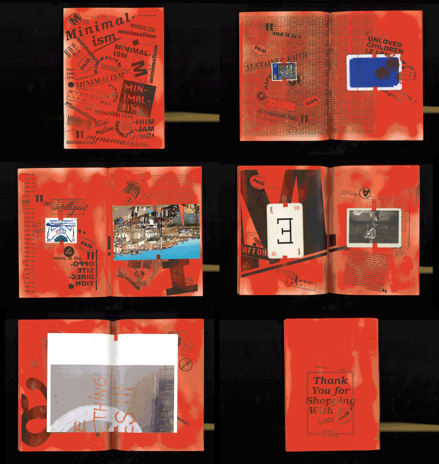
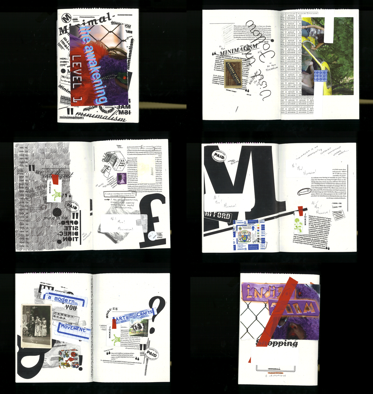
Figure 1. Critchlow, Elizabeth. Minimalism. Zine. Accessed 13 April, 2019. https://www.elizabethcritchlow.com/minimalism.
Figure 2. Critchlow, Elizabeth. Minimalism. Zine. Accessed 13 April, 2019. https://www.elizabethcritchlow.com/minimalism.
Figure 3. Critchlow, Elizabeth. Minimalism. Zine ephemera. Accessed 13 April, 2019. https://www.elizabethcritchlow.com/minimalism.

Another work of Critchlows stood out to me as I was browsing her website, Dollar Tree (see figure 4) a series of three typographic prints (Critchlow 2019). The prints read “I am most powerful in a Dollar Tree parking lot” in three different colour combinations (Critchlow 2019). The words speak of a lower class experience, standing outside a dollar store. This is a relatable experience to many people, they have been to dollars stores before, there is no luxury or exclusivity to speak of and yet she elevates the dollar store. She describes the experience as imbuing her with power (Critchlow 2019). What I connected with in this work is the type face itself. It is a Olde English style type, one which I would say falls under the umbrella of “bad taste”. It is tacky and cartoonish, and yet its historical connotation lend weight and religiosity to her words. The character of the typeface is what in turn imbues the content with power. Why do we consider it a poor taste typeface if it serves its function and adds to the design? I do not believe a simplified type that would be considered “fresh” and following modern notions of aesthetics would have had the same impact.
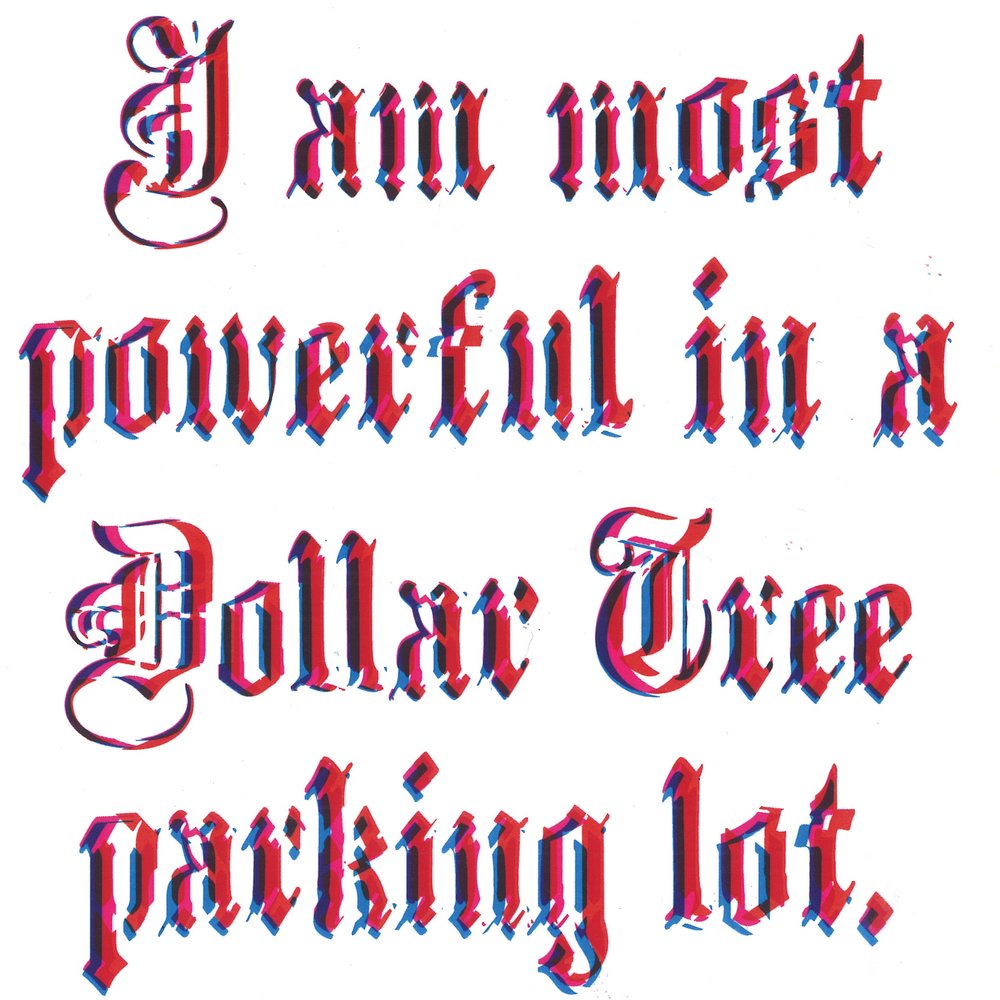
Figure 4. Critchlow, Elizabeth. Dollar Tree. Digital Print. Accessed 13 April, 2019. https://www.elizabethcritchlow.com/dollar-tree.

This type face appeals to me, I have even used it in a past work (see figure 5). In semester 1 of last year we were tasked to create an event poster, having spent a fair while attempting to create a clean modern looking design that was still visual intriguing I got frustrated. Out of this frustration I began to experiment with elements that I would traditionally consider “ugly”. The first of which was this type face. I thought it was so camp and jarringly 90s that using it would be funny. I showed some initial mock ups to my tutor who hated the type. They explained to me that there is a difference between poorly executed design and well executed design in poor taste. Rather than scrapping the type which had grown on me I changed the style of my design, focusing on creating a vaporwave inspired piece. Vaporwave which is a cyberpunk aesthetic that makes ironic use of Nostalgic 80/ 90s web design, neo classical elements, Japanese culture and cheesy internet humour (Bacon 2018). Its layered bold approach seemed such a relief to the stark rigid forms of minimalist design. It allowed me the freedom to  have fun with colours and design motifs that would generally be considered in poor taste. I used gradients that I would have once deemed “childish” in design, hot pinks and purples that I traditionally would have thought of as garish. Why is it that I have these associates, these taste? Is it my personal view that I was born with? It seems more likely a taught standard because I liked what I made and yet I would never consider it a high piece of design. It wouldn’t be used by a up market brand or to promote an important event. Due to its maximised approach it has been taught to me to be seen as lower class, reserved for those who can’t afford the high price tag that comes with simplicity.

Figure 5. Bourke, Sarah. 2018. The Girlfriend Society. Copic marker, coloured pencil and digital manipulation.

It is difficult to try see beyond class norms and standards in design but it is also critical. In order to create design that is ethical and new we must question our prior education and our perceived tastes. Push past the accepted idea of what is “good” taste and “good” design. Only when we each apply this mindset to our own design practise can we push design forward.

References

Redmond Bacon. 2018. The Vaporwave Aesthetic. Sound on Time. October 14. Accessed April 15, 2019. https://soundontime.com/vaporwave-aesthetic/.

Bourdieu, Pierre. 1984. A Social Critique of the Judgement of Taste. Translated by Richard Nice. London: Routledge & Kegan Paul.

Bourke, Sarah. 2018. The Girlfriend Society. Copic marker, coloured pencil and digital manipulation.

Christoforidou, Despina & Elin Olander & Anders Warell. 2012. Good Taste vs. Good Design: A Tug of War in the Light of Bling. The Design Journal 15, no. 2.

Karyn Cooper. 2018. What is Minimalist Design?. Hunker. March 22. Accessed April 13, 2019. https://www.hunker.com/13709024/what-is-minimalist-design.

Penny Craswell, blog. 2018. Design and Maximalism: the Anti-Minimalist Movement. The Design Writter. September 4. Accessed April 15, 2019. https://thedesignwriter.com.au/design-and-maximalism/

Critchlow, Elizabeth. Dollar Tree. Digital print. Accessed April 13, 2019. https://www.elizabethcritchlow.com/dollar-tree.

Critchlow, Elizabeth. Minimalism. Zine series. Accessed April 13, 2019. https://www.elizabethcritchlow.com/minimalism.

Fagan, Chelsea. 2017. Minimalism: another boring product wealthy people can buy. The Guardian. March 4. 2017. Accessed April 15, 2019. https://www.theguardian.com/lifeandstyle/2017/mar/04/minimalism-conspicuous-consumption-class.

Ferry, Kathryn. 2017. Clutter and the Clash of Middle-class Tastes in the Domestic Interior. De Gruyter. September 5. 2017. Accessed April 14, 2019. https://www.degruyter.com/downloadpdf/j/culture.2017.1.issue-1/culture-2017-0011/culture-2017-0011.pdf.

Friedlander, David. 2016. Minimalism: Class, Fetishes and the Fate of the Planet. The Medium. September 2. 2016. Accessed April 13, 2019. https://medium.com/hothouse/minimalism-class-fetishes-and-the-fate-of-the-planet-7324255746e5.

Khandwala, Anoushka. 2019. Why minimalism is a class issue + You might not need that expensive adobe subscription. Eye on Design, April 3. Accessed April 13, 2019. https://eyeondesign.aiga.org/why-minimalism-is-a-class-issue-you-might-not-need-that-expensive-adobe-subscription/.

Ada Ivanoff. 2014. What is Minimalism. Sitepoint. June 6. Accessed April 14, 2019. https://www.sitepoint.com/what-is-minimalism/

Jamieson, Ruth. 2017. In the world of magazines, what’s so good about bad taste? Eye on Design, January 12. Accessed April 15, 2019.https://eyeondesign.aiga.org/in-the-world-of-magazines-whats-so-good-about-bad-taste/.

Jenkins, Tiffany. 2014. Why we should stand up for good taste. The BBC. October 21. 2014. Accessed April 14, 2019. http://www.bbc.com/culture/story/20140605-what-makes-good-taste.

Mack, Adam. 2012. The Politics of Good Taste. The Senses and Society 7, no. 1. Accessed April 15, 2019. https://doi.org/10.2752/174589312X13173255802166.

The Minimalist. Design Minimalism: What, Why & How. Accessed April 15, 2019.https://www.theminimalists.com/minimalism/

Marc Schenker, blog. 2018. The Minimalist Design Trend: Why Less is More. Creative Market. January 30. Accessed April 13, 2019 https://creativemarket.com/blog/minimalist-design-trend.
The Danger of Reduction

“Designing Women” is the National Gallery of Victoria’s  exhibition highlighting contemporary female designers. It showcases over 50 key works from 1980-2018 featuring fashion design, architecture, industrial design, digital design, ceramics and jewellery design (NGV 2018). The purpose of the exhibition was to shine a light on the achievements of female designers and the role they play in pushing design forward in innovative and inspiring ways.

I visited the exhibition and was impressed by the diversity of the collection and the range of pieces. The exhibition is grouped into four key narratives: leadership, community, teamwork and research. While reading the explanations for these themes and the gallery notes beside each piece I was encouraged to think about women’s historical and cultural role in design. I was being led to view each piece in direct relation to the gender of its designer. This is of course expected as it is an exhibition that focuses on women. However it is interesting how many different things can be said about these pieces that go beyond gender.

Kirkham and Attfield in their anthology of essays “The Gendered Object” encourage that we look beyond an object as simply a physical thing but rather think of it in terms of human experience (Kirkham and Attfield 1996, 1-11). How we interact with it, how we use and how it makes us feel (Kirkham and Attfield 1996, 1-11). To look at the sum of its parts we should consider an object through every possible lens. This includes looking through the lens of historical and cultural context, lens of philosophy, psychology, feminism, sexuality and more (Kirkham and Attfield 1996, 1-11). When attending an exhibition that largely focuses on one lens it highlights that approach and can often result in the other considerations being forgotten. I believe that while it is a wonderful thing the NGV has done by exhibiting the work of female designers who are often overlooked in our patriarchal society it can result in the works being seen as “female” or “feminine” which runs the risk of reducing a piece to just one of its possible interpretations. When viewing the works on display at Designing Women I would encourage that the audience should think beyond gender for each piece. These are not “female” designs these are designs created by designers who happen to be women. And these designers have not created every piece to be a statement on their womanhood. Of course design once out of the designers hand should be free to be interpreted any way its viewer sees fit but I would encourage the viewers of this exhibition to really try to fully ponder the possible nuances and all the interpretations of each piece.

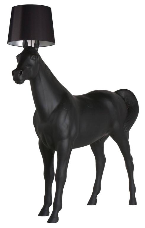
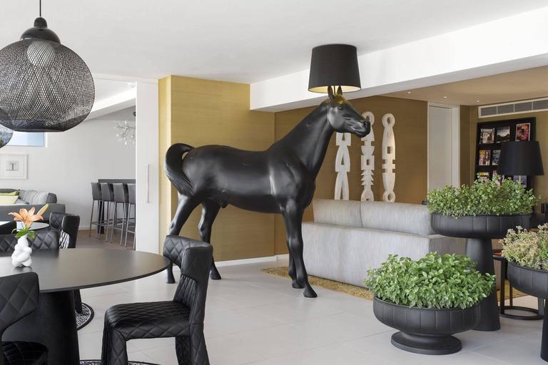
The piece that intrigued me the most was Horse Lamp (see figure 1 and 2), it immediately triggered a strong emotional response from me that took some time to unpack and understand what it was I was feeling. Horse Lamp 2006, is a true to scale sculptor of a horse with a cylindrical functioning lamp attachment sprouting from its head. The design was created by Stockholm based group Front Design, including designers Sofia Lagerkvist, Anna Lindgren, Charlotte von der Lancken and Katja Sävström. If you had forgotten the true size of a horse this lamp will remind you that they are very large indeed. The horse dwarfs the attached lampshade and everything around it. It was a popular product that sold well and has been featured in many exhibitions (Hobson 2016). As such it has been viewed by many people and interpreted in many different ways. Many that I’m sure Front Design never would have imagined. I believe that to truly understand this piece we must adopt Kirkham’s and Attfield’s multifaceted approach and analyse all possible meanings and themes. We must not let the focus of the exhibition be our only interpretation or we are in danger of reducing these works to the single dimension of gender.

Figure 1. Front Design. 2006. Horse Lamp.
PVC plastic, polycarbonate, steel, viscose,
E27 bulb and electricals. Accessed 12 April, 2019. https://www.1stdibs.com/furniture/lighting/floor-lamps/moooi-horse-lamp-front-design/id-f_7640833/.
Figure 2. Front Design. 2006. Horse Lamp.
PVC plastic, polycarbonate, steel, viscose,
E27 bulb and electricals. Accessed 12 April, 2019.
https://www.1stdibs.com/furniture/lighting/floor-lamps/moooi-horse-lamp-front-design/id-f_7640833/.

 With an exhibition focused on female designers it is easy to think of each piece through the lens of gender. To think of feminist theory and “was does this piece say?” in relation to that field. It is important that we do think about that. Horse Lamp in this context could easily be viewed as a feminist piece. This lamp struck me as having a very male energy. The work is made of a PVC viscose laminate shade, a metal frame structure and polyester horse. Metal and plastics are often viewed as “male” materials whereas wood and clay are seen as “female”. It was large, dark and imposing, qualities that are traditionally associated with masculinity. And yet it is a lamp with no gender. If I was to view this through a feminist lens I would say that women are traditionally taught to not take up too much space, to shrink themselves, to be smaller and quieter. This lamp is none of those things. Its enormity is overwhelming, it cannot help but draw attention to itself. The black of it frame is bold and dark, the complete opposite of what is expected from a female designer.

Had this piece been in an exhibition with a different focus I’m sure I would have interpreted it differently. Had this horse lamp been in an exhibition showing off the best of modern Scandinavian design my thoughts perhaps would have been on its rejection of minimalism and functionality. The typical characteristics of Scandinavian design being light muted colours, wide spaces and simplified functional forms (Contemporist 2016). Scandinavian interiors uses minimal décor and furniture to create a bright, cohesive and open feeling to a room (Lakzy 2018). Maximising the amount of space and minimising clutter (Smith Brother Construction 2016). Focusing on furniture that is functional without drawing attention to itself is best (Lakzy 2018). Traditionally industrial designers are trained to design objects that perform specific tasks. The shape, form and size of an object is designed to make that task easy (NGV 2018). Lamps would traditionally be designed to be small, non-intrusive and not take up too much space. This lamp is different, its enormous form fills the room and reminds every one of its presence. The black looming quality it possess won’t let it be forgotten and make it difficult to cohesively work into a room. Front Design by creating a piece so absurd and out-of-place seem to laugh at the serious, uniform design culture surrounding them in Stockholm. They instead encourage us to break free and laugh with them. Laugh at the visual of a horse with a lamp on its head. Their experimental design is pushing us to move forward, past our expectations of what new design coming out of Scandinavia should looks like.

In an exhibition focused on nature the focus could have been on Horse Lamps use of an animal as the base of the lamp. Possibly a reminder that we are so disconnected from nature that the true size of a horse is shocking to us. Or a critic of how we think about animals. We often only think of animals as existing for our use, for us to eat, to experiment on, to put to work (Grover 2011). Even in a kinder scenario we use them as pets, we treat them as our possessions rather than autonomous beings. The horse for hundreds of years has been used by humans. Horses ploughed our fields, pulled our carriages, charged with us into war, carried us around, we even use them for sport (Grover 2011). Here a horse, a creature that once widely roamed the fields, is turned into furniture. This could be symbolic of our relationship with horses. Our treatment of them as servants turns them from a living being into an unfeeling object that like furniture exists simply for our use.

Everybody interpretation of design will be different and each of these interpretations is valid. It is important that we don’t forget how complex the world we live in is and how our different experiences will shape how we see, interact with and understand an object. Exhibitions encourages us to focus on one way of seeing. This can be a very important tool as it is with NGV’s “Designing Women” as a female perceptive is often forgotten but it is not and should not be the only way. I encourage you to go and see this exhibition, celebrate female designers but do not forget that they are also just designers whose works span many themes and each of these themes should be remembered.

References

Contemporist. 2016. 10 Common Features Of Scandinavian Interior Design. Contemporist. July 14. Accessed April 13, 2019. http://www.contemporist.com/10-common-features-of-scandinavian-interior-design/.

Front Design. 2006. Horse Lamp. PVC plastic, polycarbonate, steel, viscose, E27 bulb and electricals. Accessed 12 April, 2019. https://www.1stdibs.com/furniture/lighting/floor-lamps/moooi-horse-lamp-front-design/id-f_7640833/.

Sami Grover. 2011. Are Working Animals our Partners or our Slaves. Tree Hugger. October 27. Accessed April 14, 2019. https://www.treehugger.com/culture/are-working-animals-our-partners-or-our-slaves.html.

Hansgrophe. Front Design – the Swedish “Avant-gardistes”. Accessed April 13, 2019. http://www.hansgrohe.com.au/21309.htm.

Ben Hobson. 2016. Front’s Lifesize Horse Lamp for Moooi was a Provocative Experiment.  Dezeen. August 17. Accessed April 13, 2019. https://www.dezeen.com/2016/08/17/video-interview-front-lifesize-horse-lamp-animal-collection-moooi-experiment-movie/

Kirkham, Patt and Judy Attfield. 1996. The Gendered Object. Manchester: Manchester University Press.

Mary Lakzy, blog. 2017. 8 Basics of Scandinavian Style Interior Design. Comelite Archirecture. April 14. Accessed April 15, 2019. https://comelite-arch.com/blog/scandinavian-style-interior-design/.

NGV. 2018. Designing Women: Artwork Labels. Accessed April 11, 2019. https://www.ngv.vic.gov.au/wp-content/uploads/2018/10/Designing-Women_Large-print-labels.pdf.

NGV. 2018. Designing Women: Modern-Day Trailblazers Defining the Future Through Design. NGV. Accessed April 11, 2019. https://www.ngv.vic.gov.au/exhibition/designing-women/.

Smith Brothers Construction. 2016. The Philosophy of Scandinavian Design. Smith Brothers Construction. May 5. Accessed April 15, 2019. https://smithbrothersconstruction.com/the-philosophy-of-scandinavian-design/.