How do you define beauty?

Everyone has different views and opinions that are informed by a multitude of factors including our education, up-bringing and morals. So it’s hardly surprising that we don’t all share the same view of what we consider as ‘beauty’.

Earlier this year, Zara, a Spanish fast fashion retailer released a campaign featuring Chinese model Li Jingwen which sparked outrage on Chinese social media. Many people were irritated at the campaign and vented on social media about it under the hashtag “Insult to China.” (May, Mou 2019) According to the New York Times, one commenter wrote, “Why are freckled faces misconstrued as high fashion?”, while another wrote, “just the West’s beauty standards for Asians, very different from ours. For those women to be called the most beautiful in Asia feels like discrimination to the rest of us.”(May, Mou 2019) It’s clear that many people believed Zara were being culturally insensitive by trying to push Western beauty standards onto the Chinese community. However, Zara posted a response on PearVideo saying that the campaign was for “global markets” and “our headquarters in Spain picked the model, they might have a different beauty standard… And we didn’t photoshop the photos”. (Chenyu 2019) Although it seems Zara never intended any harm with their photoshoot, it’s interesting to see how a seemingly small design decision created such an uproar.

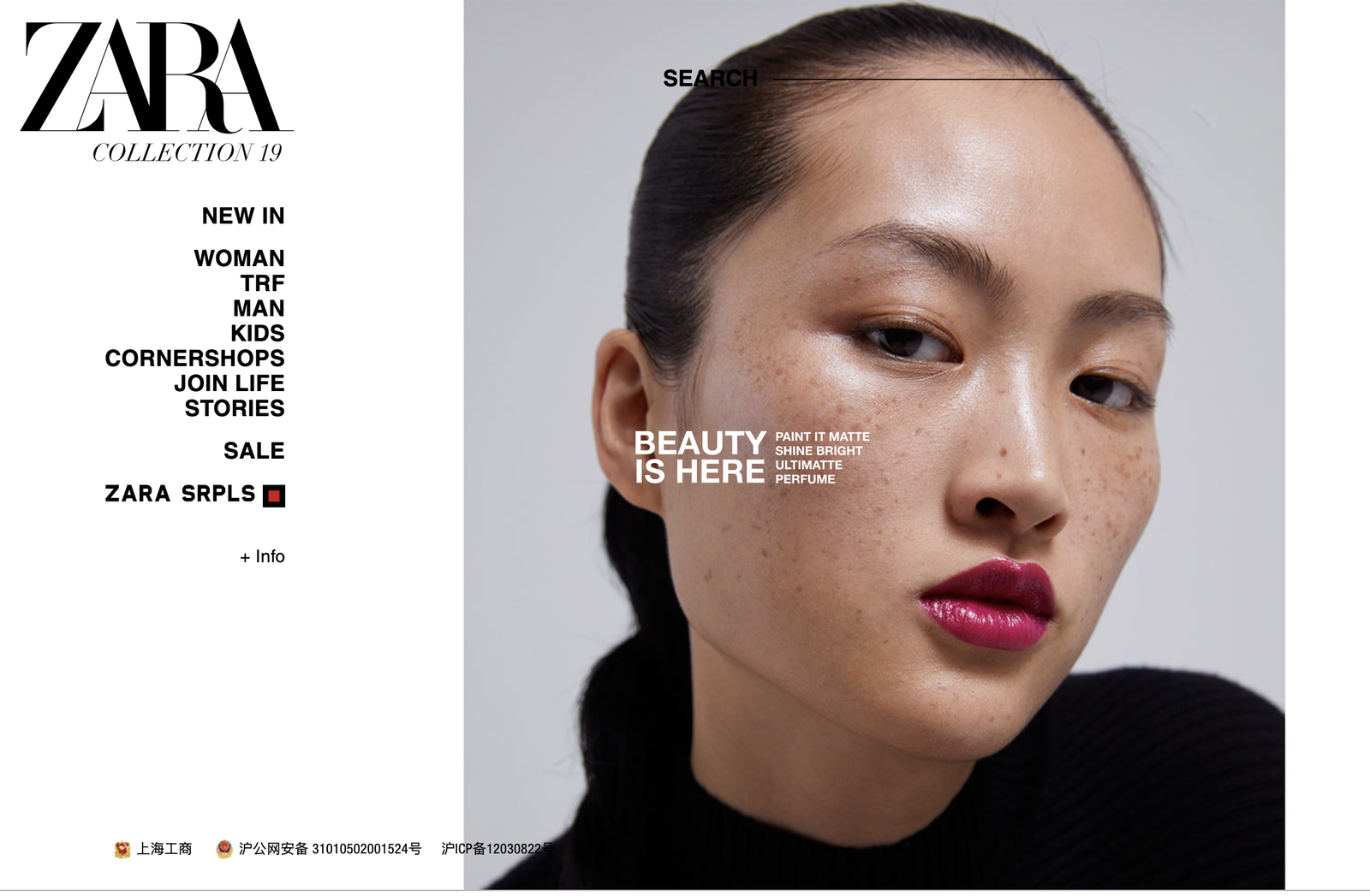
The image itself depicts the home screen of a Zara webpage advertising their beauty products. On the left is their usual set-up of the shopping categories as well as their logo. On the right two thirds is a close up portrait of Jing Wen. Her face is angled to the right and her expression is quite monotone, with her eyes gazing towards the camera. The background is empty, her hair has been slicked back from her face and her clothing is black which ensures that the viewers eyes are drawn to her face, in particular the dark pink lipstick that they are advertising and also -perhaps unintentionally- her freckles. As her freckles are so visible, it gives the campaign a ‘natural’, unedited and fresh feel. Situated on top of her cheek are the large words “Beauty is here”, accompanied by some smaller type that reads “paint it matte, shine bright, ultimate, perfume”, making it obvious that the photo is an accompaniment to their advertising of beauty products. (fig.1)

figure 1. Zara homepage, 2019

I found it very interesting to read about this campaign and people’s abhorrence to it because to me personally, if I saw this on the Zara website, my only thoughts would be that it’s cool that there is Asian representation. To me, her freckles aren’t ugly, and she simply looks fresh faced and digitally unaltered. However, this just further proves how different people’s standards of beauty are because for so many people in the Chinese community, the freckles are hideous. As someone who is Australian born Chinese, it makes me wonder how differently my perceptions of beauty would be had I not been born in regional Australia.

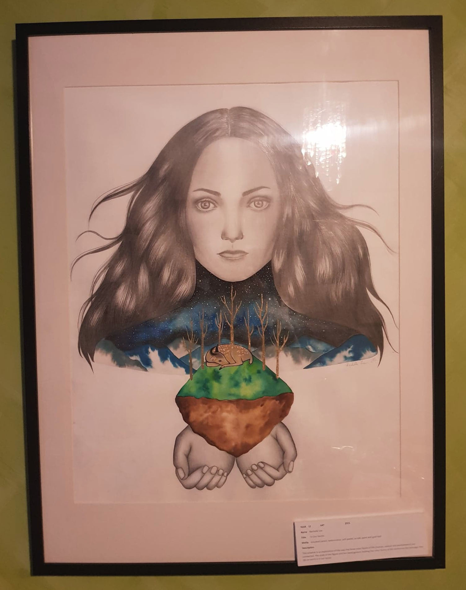
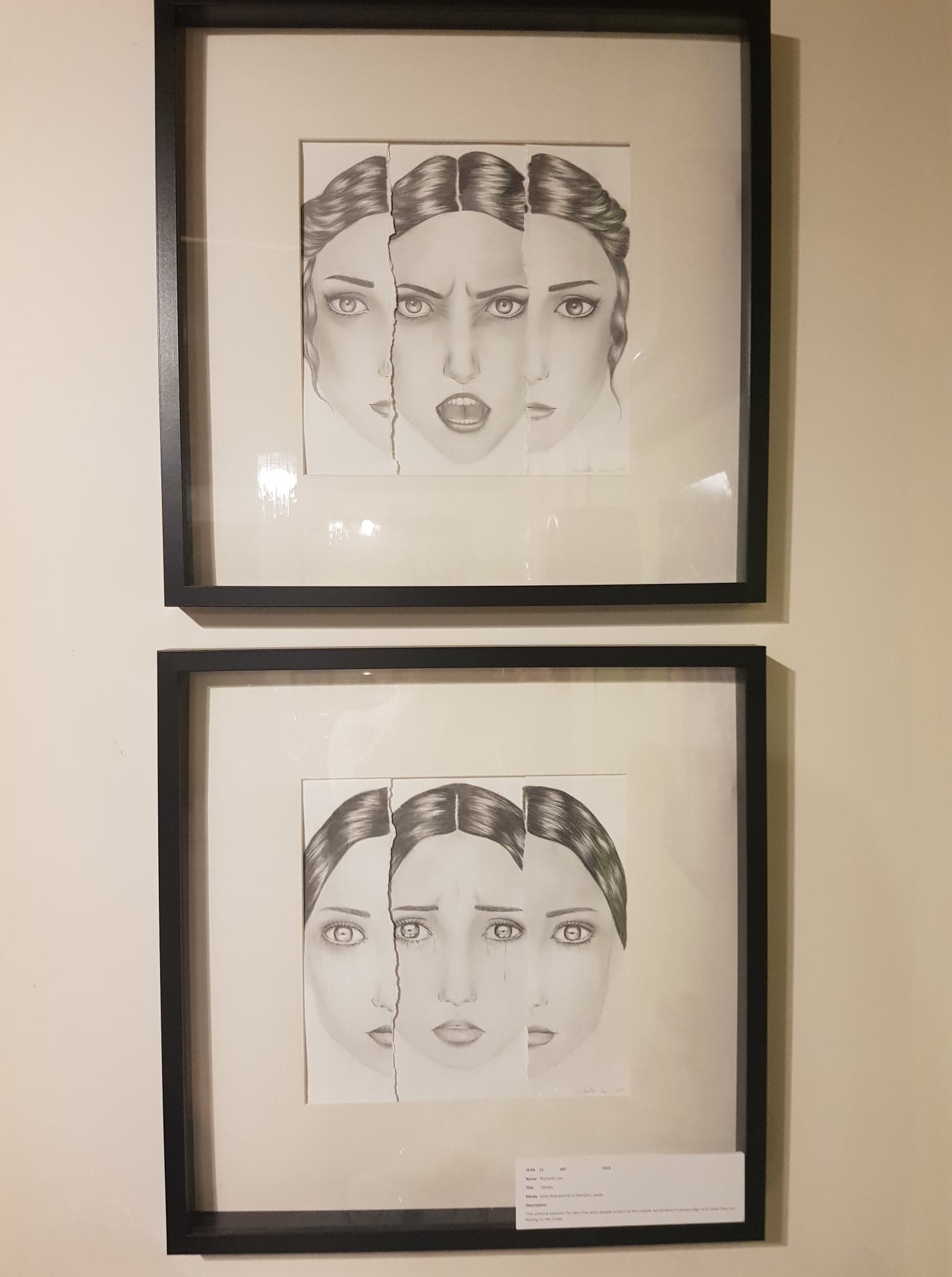
Growing up on the Mornington Peninsula, I was surrounded by Caucasian people. Not only that, the media around me, from movies, to books to advertisements also lacked in cultural diversity. Consequently, growing up, I always thought that Caucasian people were the most attractive group of people. This is very evident in the fashion illustrations I used to do, where I would draw skinny, white women with large eyes and pointed noses and it never occurred to me to draw people from other races. For my Year 12 VCE final pieces for art, I created three portraits of women, that were all Caucasian. The former artwork (fig.2), was based off a photo of a friend, so I do think it made sense that she is fair-skinned, with long wavy hair and large eyes, however for the two other faces (fig.3), I actually used a few different references of models and made up faces. And as you can see, they all have Caucasian features.

figure 2. Untitled, Rachelle Lee 2015
figure 3. Untitled, Rachelle Lee 2015

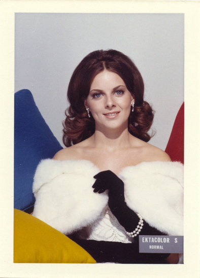
The way in which I unconsciously made these decisions aligns to the issues brought forward in Dimeji Onafuwa’s journal, “Allies and Decoloniality : A Review of the Intersectional Perspectives on Design, Politics, and Power Symposium” (Onafuwa, 2018) Onafuwa describes how the lack of awareness of designers can be discriminatory without them even realizing. (Onafuwa, 2018,). In the 1950s, there was an issue with the Kodak Shirley cards (fig.4) because for years, it was used by photo labs to calibrate skin tones, shadows and lighting during the printing process. (Del Barco, 2014) The film was flawed because it meant that if wasn’t suitable for people with darker skin and if a photo was taken featuring people with different skin tones, the shot would come out as partially under or over exposed. This goes to show how representing only one race is troublesome.

fig.4 Kodak Shirley card

While it is clear that standards of beauty differ from person to person, it’s important to be culturally aware and encourage diversity so we don’t relive the same mistakes of the past.

References

Chenyu, Liang. “Chinese Netizens Decry, Then Defend, Zara Model’S Freckles”. Sixth Tone, Last modified 2019. https://www.sixthtone.com/news/1003572/chinese-netizens-decry%2C-then-defend%2C-zara-models-freckles.

DEL BARCO, MANDALIT. “NPR Choice Page”. Npr.Org, Last modified 2019. https://www.npr.org/2014/11/13/363517842/for-decades-kodak-s-shirley-cards-set-photography-s-skin-tone-standard.

May, Tiffany, and Zoe Mou. “‘Insult To China’: A Model’S Freckles Spark An Online Storm”. Nytimes.Com, Last modified 2019. https://www.nytimes.com/2019/02/19/world/asia/china-freckles-zara-jing-wen.html.

Onafuwa, Dimeji. “Allies And Decoloniality: A Review Of The Intersectional Perspectives On Design, Politics, And Power Symposium”. Design And Culture 10, no. 1 (2018): 7-15. doi:10.1080/17547075.2018.1430995.

Art and knowledge

Currently showing at MUMA, is the knowledge-driven exhibition ‘Shapes of Knowledge’. Curated by Hannah Matthews, this exhibition features a diverse range of projects originating from Australia, Asia, Europe and Africa that invite the viewer to ponder how art and knowledge can inform each other and how it is shared. (MUMA, 2018)

The exhibition encompasses eight different projects that are quite different in their execution. Incorporating sculpture, audio, photography, video, clothing and print, the exhibition was an informative and sensory experience.

Upon entering the exhibition, the audience finds themselves in a room with an abundance of visual stimuli. All four walls are covered from top to bottom with a large print of a natural landscape that allow you to feel almost as if you’re in the middle of yolŋu country. Two of which depict a forest area, laden with green trees and grass, and a red dirt pathway in the centre. The other two walls portray a different landscape, this one being an ocean view, with soft gradient blues of the water which extend onto a collection of black rocks and then extend onto another area of greenery. In the centre of the room stands a display of seven screens all in a circle facing outwards and standing on a grey platform(fig.1). The displays all show different visuals such as video, video editing stills and sound editing programs, that the audience find out are part of ‘The Mulka Project’.

Figure 1. The Mulka Project room, 2018

According to the description accompanying the room, ‘The Mulka Project’, is a “digital library and production centre located in Yirrkala in north-east Arnhem Land”. (MUMA, 2018) Since 2008, The Mulka Project has existed in order to support and document Yolŋu cultural knowledge and language, and operates out of the Buku-Larrnggay Mulka Centre under the guidance of members of the community.

The first two screens I saw showed a video being played of a ceremony, next to another screen showing a screenshot of the videos in an editing program (fig.2). This signified the video making aspect of the project. Every year, Yolŋu filmmakers create over 100 new films which feature events such as bapurru ceremonies and films in the presence of senior law holders, as well as different aspects of their culture in general such as their food, art and dance. Importantly, there are films in the collection that have never been seen because they are waiting for senior elders to approve the films and allow them to go public with them.

Figure 2. The Mulka Project video, 2018

This directly links to the Australian Indigenous Design Charter: Communication Design’s (AIDC:CD, 2016) number two point – “Self-determined. Respect for the rights of Indigenous peoples to oversee representation creation of their culture in design practice”(AIDC:CD,2016). In response to the Australian Government’s call for people to be more considerate when creating artwork that involves Australian Aboriginal and Torres Strait Islander people’s cultures and national identity,  the AIDC:CD is a set of 10 protocols that designers are expected to follow when sharing Indigenous knowledge in their work. The AIDC:CD is extremely important because it holds all creatives in Australia to a high legal, ethical and professional standard and makes sure that Indigenous communities aren’t being exploited when they are being represented in artworks.

The next two screens I saw, featured what appeared to be sound waves on an editing program(fig.3). Upon reading the description, it became evident that it references how The Mulka Project has been archiving songs from thirteen clans to ensure that they aren’t forgotten in the future. According to the description, since 2015, the music studio has also allowed songwriters and musicians to work with Yolŋu sound engineers to create new styles of music that incorporate their traditional songs. This links to the AIDC:CD protocol number one point : “Indigenous led. Ensure Indigenous representation  creation in design practice is Indigenous led.”(AIDC:CD, 2016) This is an important point because it makes sure that Indigenous people are at the forefront of the practice and have a big say in how much their traditional song is transformed with the newer modern techniques. I think it’s great because the Indigenous people are the only ones that will know where to draw the line when it comes to how much their traditional song can be altered before it becomes too much.

Figure 3. The Mulka Project sound, 2018

The next screens display a slideshow of traditional photos, as well as a glimpse into the editing software that uses facial recognition software so that everyone in the  Yolŋu community can type in their name and find out who their ancestors are(fig.4). The Mulka Museum is home to over 400 bark paintings, sculptures, artefacts and a photographic archive that spans ninety years of ancestry. This relates to the AIDC:CD protocol number five point : “Impact of design. Always consider the reception and implications of all designs so that they are respectful to Indigenous culture” (AIDC:CD, 2016) I believe this point resonates with The Mulka Museum as the impact of it has been well considered and is actually a beneficial tool for the community to use.

Figure.4 The Mulka Museum, 2018

Overall, this exhibition was mind-opening and caused me to think about new ideas. The Mulka Project was executed in a concise but clever way that easily depicted to the audience the decisions and techniques behind the project.

References

Indigenous Architecture and Design Victoria, Design Institute of Australia, Deakin University. “Australian Indigenous Design Charter – Communication Design(AIDC:CD)”, 2016.

MUMA, “Shapes of Knowledge Media Release”, 2018