The idea of adding luxury to products and services has been around for a while, and there is always a market for the high end luxury product. People want the exclusivity of having something different, and at times are willing to pay the higher price tag for it, even if the product or service itself is not that much different from the mainstream. An example of this can be seen in Juliana Mora’s paper “The Yoga Industry: an conscious luxury experience in the transformation economy”, where she shows 3 different yoga studios aimed at different people or different wealths. This can also be seen in the snow sports industry, where many people in higher classes go to the snow as a lifestyle to show their wealth rather than actually enjoying the activity, an example of this is Courchevel in France, where it was originally planned to be a haven for skiers and to create jobs, but somehow it transformed into a luxury resort with 9 out of the 50 total 5-star hotels in France, and 3 Michelin starred restaurants (Harneis 2010) . Another industry where this is currently emerging is in wearable technologies, where companies, Apple in particular, is trying to move further up the market toward the high end and to produce products that are aimed squarely at the upper class, with its exclusivity and connection to the luxury brand, Hermes.

Source: Courchevel Tourist Office
In recent times, more recently with the release of the Apple Watch, Apple has slowly shown that it is no longer just a company that makes electronics, and is now more known as a brand and a status symbol. It is becoming more about the brand than the products itself, but it has been marketed towards the mainstream. At the top of all these design decisions is the Chief Design Officer Sir Jonathan Ive, where he has revolutionised the way we buy technology. As much as he would like to deny, the brand has become more about the aesthetic of the Apple experience, from its minimalistic store designs to its patented shopping bags, all the way to the experience of being there itself (The Fashion Law 2018). This is a similar approach to a yoga studio by HummingPuppy, where the design of the surroundings are able to change the experience of being there, with its space can be easily confused with that of a fashion boutique. (Mora 2018) With the introduction of the Apple Watch in collaboration with fashion brand Hermes, they have added a luxury element to the product without adding functionality, and the experience of using it isn’t any different, just the increase in the appearance.
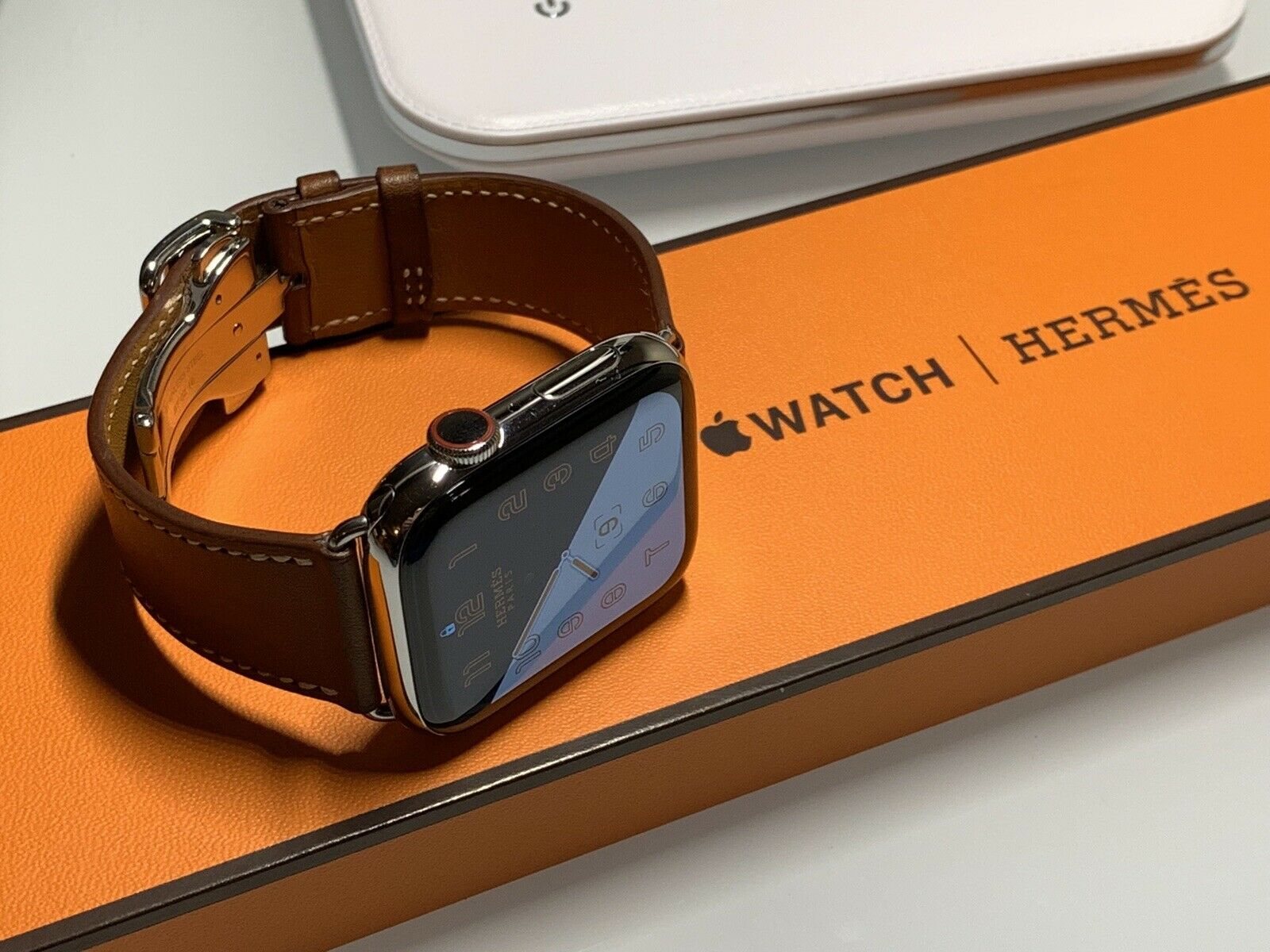
Source: Apple
The product that my group is currently working on is focused on the customisability of ski poles, where people can cater their poles for different uses, and one of the biggest markets that we have found through our research and interviewing store owners is the upper class, where they want something to stand out from the crowd. Currently on the market the difference between poles are mostly colour and design, with no change to its usability other than height adjustment in some models. We were thinking of adding features that may not only add to functionality to the product, but also features that increase comfort and allows its users to stand out. To execute the plan of allowing the user to stand out we sought to create an experience around the ski pole what sets it apart from others, this can be through colour, textures and also some technology to aid in comfort. This approach is similar to a reference in Juliana’s paper, where it states that it is based on an emotional experience rather than a rational experience (Featherstone 2014). We aim to use the customisability of our product to allow for consumers to add modules where they desire and this will increase the luxury experience for them, even if it means the ski poles themselves do not increase in its functionality. The biggest insight to our research was what the product suggested about the user, and what it can say about the user rather than what it can do for the user. The functionality of the ski pole can be basic similar to others in the market however the story of the product and how it makes people feel and how others perceive you with the product can make a big difference in the success of the product. This is in line with the ambience of HummingPuppy, where the surroundings, it studio layout and spatial distribution, along with its lighting and sound create an atmosphere in which the experience feels more upper class and exclusive. Another aspect of luxury comes from temperature control, where our ski pole seeks to include an attachment that can warm up the handle to help skiers escape the cold. When skiing, participants hardly notice the cold in their hands, focusing mainly on the activity, however the lifestyle travellers who go to the snow for leisure and don’t participate as much are able to feel the chill. In HummingPuppy’s situation, the ability to keep the room at a stable and comfortable temperature is expected (Mora 2018).
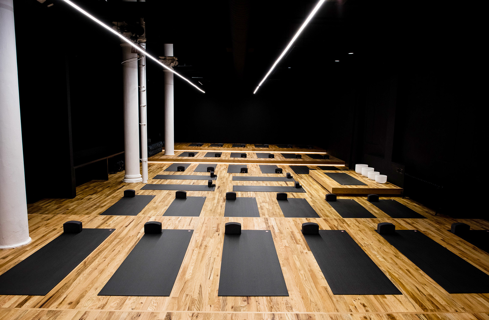
Source: Humming Puppy
The design practice shown through my design project is clearly aimed at finding out who the demographic of the market are, and finding a niche in the market that sets us apart from everybody else. We aim to add a bit of luxuriousness to the product that has a history of being simple and bland, and using materialistic properties in order to market the product. Similarly, the yoga studios in Juliana’s paper and Apple with its Watch are trying to set itself apart from the other by offering a service and product that appeals to all our sense as consumers, even if it doesn’t add any value to what they are selling, it adds value to how we and others perceive the brand, and to introduce new aspects to what we know as luxury.
References
[1] Featherstone, Mike. “Luxury, Consumer Culture and Sumptuary Dynamics.” Luxury 1, no. 1 (2014): 47–69
[2] Mora, Juliana Luna. The Yoga Industry: A Conscious Luxury Experience In The Transformation Economy, 2018.
[3] “Is Apple A Luxury Brand? That Depends On Your Definition Of Luxury.”. The Fashion Law, Last modified 2018. http://www.thefashionlaw.com/home/is-apple-a-luxury-brand-it-depends-on-who-you-ask-. (Accessed 7 April 2019)
[4] Harneis, Robert. “Courchevel: A Winter Playground For The Rich And Famous”, Last modified 2010. https://www.onthesnow.co.uk/news/a/11708/courchevel-a-winter-playground-for-the-rich-and-famous. (Accessed 7 April 2019)
