Inkahoots & I


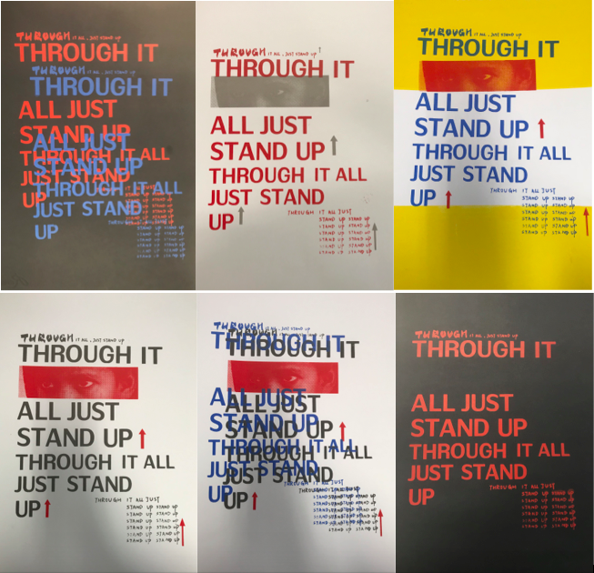
Figure 1: “A Poster to Change the World” — “THROUGH IT ALL, JUST STAND UP”

Describe my artwork of a series of poster uses the technique of the screen print, that concept is “A Poster to Change the World” (Figure 1). For this project, I choose a lyric to combined with the visuals of the poster to convey the influence and change that a song brings to people or the world.

I used the song was called《Just Stand Up》, it is a charity song promoting the fight against cancer sung by many famous singers such as Beyoncé, Rihanna, Carrie Underwood in 2008, while also obtained the good chart performance. In addition, the reason that I choose “THROUGH IT ALL, JUST STAND UP” of the lyric is because it tells people to be brave, not to be defeated by the disease and discouraged, although experienced it but also to be optimistic and overcome it. Meaning that no matter what kind of difficulty, be strong and stand up and live. And then I use an image, which I edited in Photoshop and focused on her firm eyes to convey the determination and perseverance that I want to show and to bring strength, hope, and confidence to the sick people. Finally, I chose to arrange the lyrics with simple letters and changing the order and layout many times allows people to visually and easily see the sentences of the lyrics. The neat font looks very serious and formal that can get people’s attention. When I was printing, I used different colors of the background to test and used some of the strong visual effects to reflect the energy and motivation of the color printed lyrics and images at different layers that make the poster look serious and powerful.


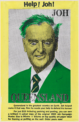
Figure 2: Help! Joh! by Inkahoots, screenprint, 1991

The graphic design studio that located in Brisbane’s Australia is Inkahoots. It’s established as a community access screen print studio/arts collective between 1990and 1995 (Ideas on design. 2019), that catered to community groups and causes such as the Tenant’s Union of Queensland, Land Rights for Aboriginals, International Women’s Day, Lesbian and Gay Pride Week and Reclaim the Night protests (Berry. J. p.192). Inkahoots has been working on the periphery of Australian design culture since 1990 and their history is a close relationship with the community, cultural, and arts sectors as creative advocates and activists (Ideas on design. 2019). The main features of its early posters adopted previous social and political aesthetics and continued the results of the former collective practice, including photomontage elements, typewritten letterforms, and fluorescent color. The techniques and affordability of the screen-printing medium encouraged this shared visual language and is demonstrated in the poster Help! Joh! (Figure 2) (Berry. J. p.192). They boldly used the bright yellow and green to screen print a poster based on the comically subverts a newspaper photograph of political character Joh Bjelke Petersen’s facial features. This contrast color can bring obvious visual experience to people and emphasize the expression of characters. Moreover, add the text to help the masses understand the content of the poster more easily. In this street poster, you can see that Inkahoots used the photomontage technology to rearrange and combine the images. This kind of editing makes the image look ferocious and loses the original solemn feeling of the political figure. The same point in my posters that also use the image expression to convey the main ideas and views. And then you can also see there does a long text below the image to explain and describe the concept and function of this poster, which may be to reflect social or political exist phenomenon. Of course, the lyrics in my poster are an important part, which is to bring people power. Finally, the most direct for the visual effect is the use of fluorescent color, which make the image more emotional and you will be attracted to it in many posters on the street. For my works, I use a variety of bright colors to make a different combination of printing or changing the background to make an impact on people’s vision and bring a sense of empathy, or perhaps red and yellow a feeling of enthusiasm, energy, and hope.

Compared with inkahoots’s works, my image editing program technology is much simpler, and the color application experience is not very rich. From my current social identity, I have no ability to evaluate a social or political radical issue, and the influence is not enough, even though my poster expresses a positive attitude. In the era of inkahoots posters could be used as a means of communication, it can appear on the streets, newspapers or magazines. Nowadays, due to the development of electronic technology the most people think Stacked up against digital technology and offset printing, manual screen printing seemed out-molded both as an art form and as an effective form of mass production (Design Observer. 2019). As a result, the frequency of posters decreased. Inkahoots also found that while the poster still retains undeniable appeal and a particular, unique application, we are finding that computer, video, film, radio and television are by far the more effective and relevant art forms of our day (Design Observer. 2019).

In my opinion, my posters are created to encourage patients to bring hope and energy to them, even although in today’s era of digital communication design is very popular, I think the artwork made by this craft is more meaningful. Perhaps we should consider whether it could convey the designer’s mood or have other values as it did at the beginning.

Reference

Ideas on design. (2019). Inkahoots. [online] Available at: http://ideasondesign.net/speakers/speakers/jason-grant/ [Accessed 6 Apr. 2019].

Berry. J. (2010). “Earthworks and Beyond”, Chapter Eleven. pp.182-197.

Design Observer. (2019). Inkahoots and Socially Concerned Design: Part 1. [online] Available at: http://designobserver.com/feature/inkahoots-and-socially-concerned-design-part-1/37948  [Accessed 6 Apr. 2019].

The Front Design-Horse Lamp


Figure 1: Sofia Lagerkvist and Anna Lindgren


Figure 2: Animal Collection by Front, 2006

The Font design studio was a design team from Switzerland that composed of a group of female industrial designers respectively are Sofia Lagerkvist, Charlotte von der Lancken, Anna Lindgren and Katja Svstrm (who has since left the group) with forwarding thinking were established in 2003. Their design style is like the name of their studio, has the front idea and focuses on product innovation, high-performance, and authenticity. Front is the most mature event in Australia, which carries out the activities guided by business and based on results. Demonstrate to partners’ ideologies that focus on solutions and ongoing innovation. Their studio around cleverly articulated ideas, an interesting twist on materials and an interest in the process of making things. (Package & Design).

Sofia Lagerkvist and Anna Lindgren (Figure 1) mainly design the Horse Lamp (Figure 2) produced in Dutch company Moooi. There are three basic elements that are obviously integrated into this work, which they insist and advocate, including the combination of animal, computer and machine technology to Developed products with female aesthetic characteristics. They created the Animal collection in 2006 that use the amazing life-sized of the animal to make the form like a sculptural as the base and combined with the light representing the functionality to create stunning furniture, which will surely become a central feature for whichever space it is placed. (Lamp, R. 2019). Furthermore, the designer admits that the unusual designs were challenge and experiment for the front, while they know that someone would react strongly to the collection, both positive and negative. In addition, they are not sure the people would really like it or hate it because of religion or beliefs or social factors when the customer saw the light at first sight. (Hobson, B. 2019). When I first saw the Horse Lamp its unique shape also shocked me. I never thought about such a combination and wondered why the designer had such innovative ideas. This may be a weird combination for some people. The Horse Lamp appearance and structure look a lot different from the ordinary lamps that make the people have a new visual experience of this lamp. It attracts customers because of its interesting features, which brought a touch of nature in fairytale style to the people. Since the Front design is based on the real dimensions and is constructed using a variety of methods and material. The shape of the horse corpus consists of black polyester at the bottom, and the lampshade that is closed towards the top consists have PVC viscose and metal frame. (Connox, 2. 2019). It enough to weigh an adult, and the people sent the photos of riding lamp to Moooi and Front from around the world and they think it’s an amazing design that seems to have come to life.

In addition, what Front is facing is not only the reaction to the design but also some comment and query about the women designers, which is a common prejudice against female industrial designers in society. In many cases, women worked freelance from home or joined special workshops and studios, which provided work for them. That it was unacceptable for women to do furniture design or wrought-iron work and ‘architecture was considered an all-male province’. Embroidery, lace making, miniature- painting, dressmaking and so on were the ‘proper’ domains for women. (Bruce, M. Lewis, J. 1999. p.116).  However, women still have three major obstacles in industrial design. The first hurdle is qualifications, it is more difficult for women to finish their studies and get a good school degree. The second hurdle is getting the first job; the recruitment companies will think that women are not good at technology. The third is promotion and awards, even if women enter the job, she may miss work time because of pregnancy and not able to socialize. (Bruce, M. Lewis, J. 1999. p.115-116). These views are unfair to women. Nevertheless, the two designers of the Horse Lamp, their success completely overturned these evaluations. Sofia and Anna graduated from university in Stockholm; it tries to use new technologies to subversion the design experience and creative ideas to do business with the future through a changing landscape of priorities and influence. (FRONT, 2019). Their work philosophy is to overthrow all the conventional design patterns to find and explore new forms of expression so that the design is experimental and uncertainty, while many international furniture industry companies have recognized their views. 

They work as a group where all members are involved in the design process from initial discussions and ideas to the final product. In my opinion, it is precise because of this design and production process that every piece of the present design is full of magic. To show their interesting attitude towards the object and unexpected surprise. (Yatzer. 2019).

I agree that this is a successful work both in design and concept, but I still have the question is, how long will be accepted and appreciated about this creative and breakthrough style of design? In the future, the design of the exploration and experiments will one day fail?

In my opinion, the concept of Front’s combination is magical, it can bring people different visual feelings, while it not only demonstrates the new artistic expressions generated through continuous innovation but also proves that women can also have successful achievements in industrial design. Of course, the ideological progress of modern society more and more women designers were a renewed focus.

References:

FRONT. (2019). FRONT – Design. Products. Knowledge. [Online] Available at: https://www.front.design/ [Accessed 28 March. 2019].

Package & Design. “FRONT” Available at: http://www.doc88.com/p-9793455701158.html [Accessed 28 March. 2019].

Lamp, R. (2019). Replica Moooi Horse Floor Lamp. Lucretiashop.com.au. Available at: https://lucretiashop.com.au/replica-moooi-horse-floor-lamp.html [Accessed 30 March. 2019].

Hobson, B. (2019). Video: Front’s lifesize Horse Lamp for Moooi was an experiment. [online] Dezeen. Available at: https://www.dezeen.com/2016/08/17/video-interview-front-lifesize-horse-lamp-animal-collection-moooi-experiment-movie/ [Accessed 30 March. 2019].

Connox, 2. (2019). Horse Lamp | Moooi | Shop. Connox.com. Available at: https://www.connox.com/categories/lighting/floor-lamps/moooi-horse-lamp.html [Accessed 1 Apr. 2019].

Yatzer. (2019). FRONT in Milan | Yatzer. Available at: https://www.yatzer.com/front-milan  [Accessed 1 Apr. 2019].

Bruce, M. Lewis, J. (1999). “Design studies”, Women designers – is there a gender trap? pp. 115-116.