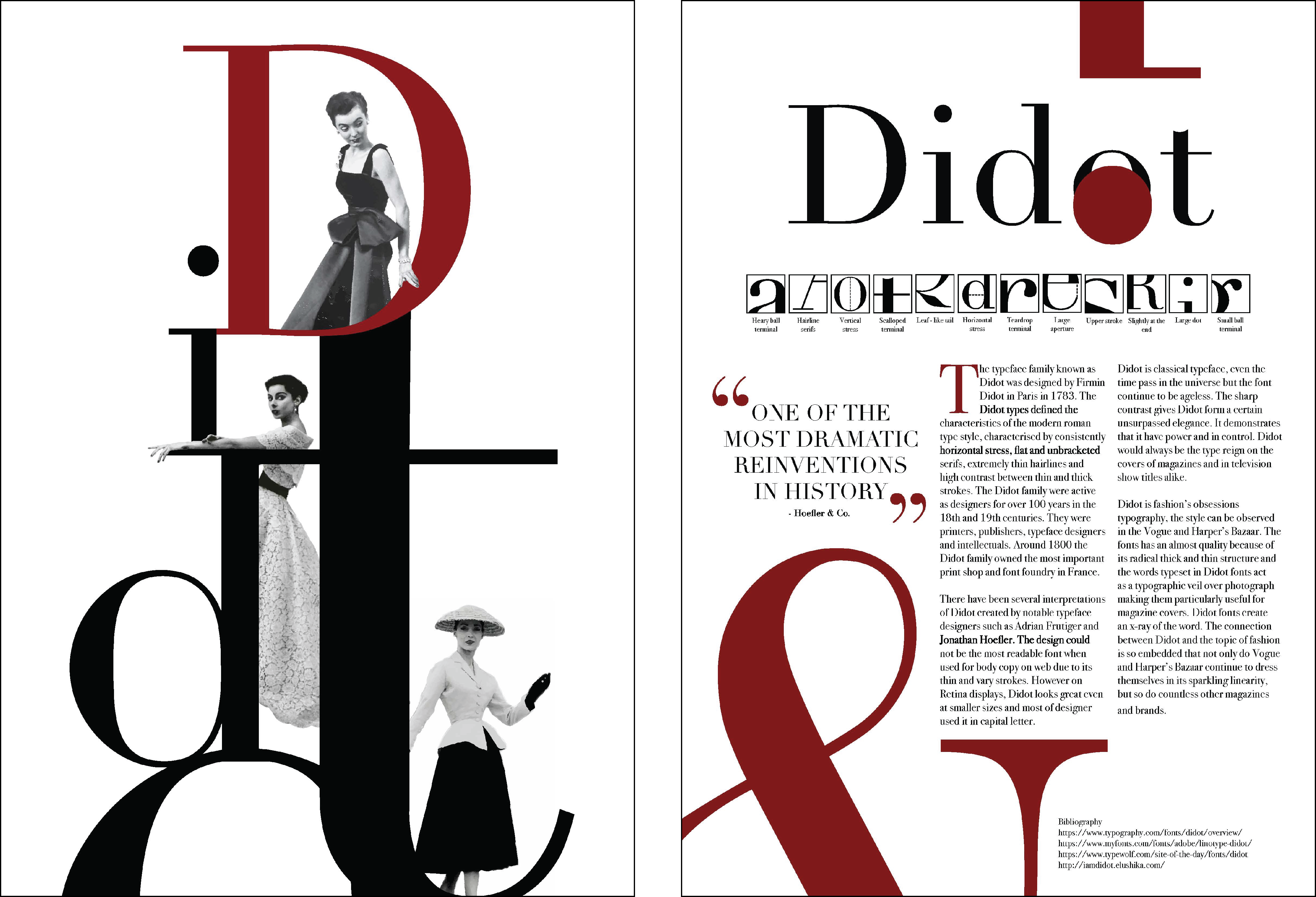
The Didot logo poster is the creative design of the Didot logo inspired by the works of Alexey Brodovitch. Brodovitch is a household name in the graphic design world. He is the brain behind the modern glossy magazine which focuses on style. During his time, Brodovitch also founded fashion and advertising photography. The works of Brodovitch was driven by the changes in complexity, size, and values which were effectively implemented in his works to provide the viewers of the resulting materials with a sequence of varying experiences that evoked positive energy and movement on the resulting works.
By Chommi Chainukulsila 2017
My Didot poster which features the Dior models makes use of the same principles which were implemented by Brodovitch and are still in use in the modern aesthetic arena and is also heavily implemented by the women in graphic design. Despite being rendered invisible by the largely male-dominated industry. Connory (2019), insinuates women in graphic design plays a key role in setting the trends of the industry. The women have been involved in the design work in a various way such as theorists, partitioners, historians, consumers, and as objects of representing (Buckley, 1986). In my opinion, the exploration of ideas in graphic design had been largely done through the collection references from other design work, collaboration with other individuals through a community copying the original design works of individuals such as Alexey Brodovitch and many more. In most cases, the exploration of the ideas is inspired by the curiosity and creativity of individuals. The exploration of these ideas makes use of various methods such as selection, classification, and prioritization of a given kind of design. The exploration is also affected by categorizing the designers in terms of their styles and movements which results in varied modes of graphic design production. According to Buckley (1986), women are believed to posses sex-specific skills which act as key determinants of their design abilities. These sex-specific determinants make the women dexterous, decorative, and meticulous thus driving their capabilities to explore ideas more than men. These skill exhibited by women enable them to naturally suit certain areas in the design industry of the decorative arts such as the embroidery, jewelry, weaving, graphic illustration, pottery, knitting, and many others. The resulting design works of these women are always used by both men and women making them universal.
Photograph by Richard Avedon
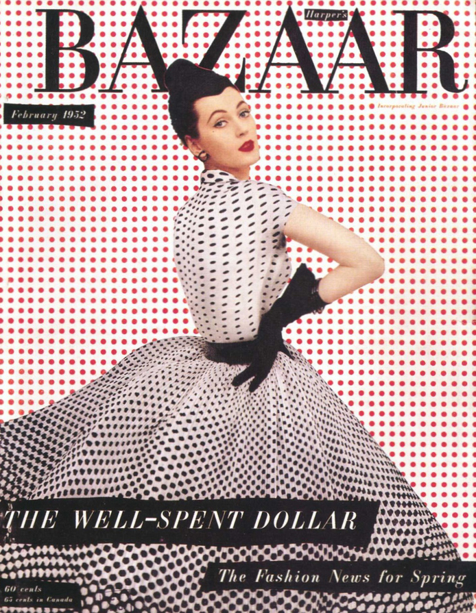
Alexey Brodovitch revolutionized the Harper’s Bazaar magazine by creating an iconic Didot logo which acted as an inspiration to some of the greatest visual artists of the 20th century (Purcell, 2002). The Brodovitch designs have a signature use of white space with a cinematic quality brought about by the obsessive cropping of the layouts, These qualities are seen in the Brodovitch’s design work resonates with the design principles which revolves around movement, balance, emphasis, hierarchy, repetition, contrast, rhythm, pattern, proportion, unity and variety. In essence, every design work implements these key design principles to create aesthetically things while optimizing the experiences of the user at the same time. These key design principles enabled Brodovitch to come up with pages that blend beautifully, typographies, cropped photographs as well as designs that were bold for Harper’s Bazaar magazine (Purcell, 2002). The implementation of these principles enables Brodovitch to revolutionize the design of the at the magazine inspiring visual artist of the 20th century as a result.
Article in Harper’s Bazaar, Photographs by
George Hoyningen-Huene
March 1938
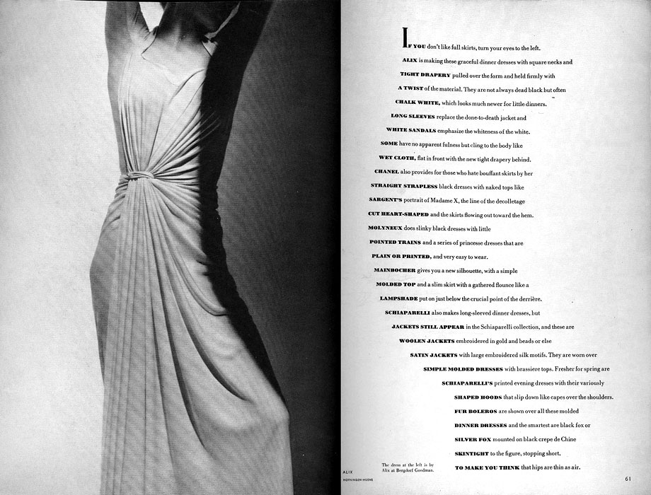
During his time at Harper’s Bazaar magazine, Brodovitch departed from static layouts as well as the conventional posed studio photographs to smoothing which was considered exciting and was latterly replicated in various magazines of the United States. The emphasis of his design was unique double-page spread where photography was exquisite with crisp Bodoni typeface, and elegant white space was laid out in a blend. In my opinion, every artwork is an expression. Artworks always represent the inner state of the artist. Thus, in the most cause, the artist may make use of various channels such as form, color, or the medium to expire or manifest their inner states. The artist often creates their artworks by beginning in various combinations of mediums such as paints on canvas. In some cases, the artists may create existing artwork using a different combination of materials bringing out a different perspective of the artwork. Thus, in the three classical branches of art which include sculpture, painting, and architecture, the ideas may be manifested differently depending on the inner state of the artist which influences his or her choices of color, form or the medium of expression. The expression of feelings by these artists hugely relies on the medium assisted by form and color. However, Buckley (1986) argues that in some cases that, the manifestation of ideas by the artists is always influenced by their gender, as women tend to give a feminine approach to their issues.
Artworks always represent the inner state of the artist. The workers are always done in accordance with the design principles. However, some of the best designers in history such as Alexey Brodovitch seemed to have disregarded the then existing principles of design to come up with revolutionary designs. Brodovitch’s design ideas were manifested through form, and medium, which made them unique. Nonetheless, today the exploration of ideas in graphic design has been done through the collection, references from other design work, collaboration with other individuals through a community and copying the original design works of individuals as opposed to Brodovitch era. The exploration of these ideas has made use of various methods such as selection, classification, and prioritization of a given kind of design.
References
Buckley, C. (1986). Made in patriarchy: Toward a feminist analysis of women and design. Design Issues, 3-14.
Connory, J. (2019). Plotting the Historical Pipeline of Women in Graphic Design. Retrieved 11 April 2019, from http://dharn.org.au/plotting-the-historical-pipeline-of-women-in-graphic-design/
Purcell, K. W. (2002). Alexey Brodovitch. Phaidon Press.