Forgotten superheroes of design–Corita Kent

Figure 1, the juiciest tomato of all, Corita Kent, 1964
Figure 2, Campbell’s Soup Cans, Andy Warhol, 1962

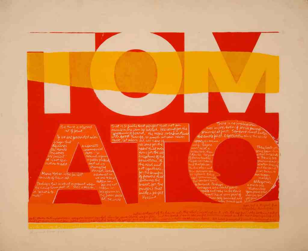
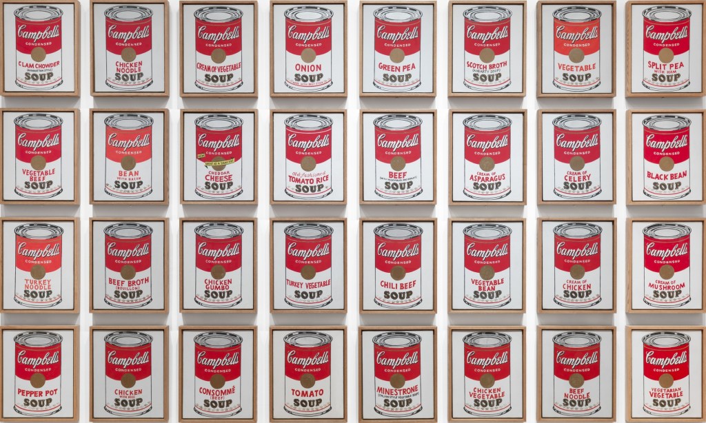
From the past to today’s design industry, female designers always challenge their status in a male-dominated society. If a woman designer wants to achieve their design career and remain an influential position in design history has been a struggle against the recognized social order and its gender issue.[1] One of an American female designer was born in 1918 called Corita Kent who had created numerous artworks in her life. She involves spiritual, pop cultural, literary, consumer culture and political thoughts in her works.[2] During the 1960s, Kent is seemed like a curiosity or a difference in the pop art movement. Undoubtedly you must know Andy Warhol, a screen printing The Juiciest Tomato of All (fig.1) developed by Kent in 1964 was inspired under Warhol’s Campbell’s Soup Cans (fig.2).

As for the print, it shows the text ‘tomato’ in bold, made in like an advertisement or logo. The colors are shown in orange, red and yellow which are analogous colors. Despite you see in a distance, it quite obvious to recognize the word “TOMATO”. Once you have drawn in, you could see a message in the footnote that indicated “Mary Mother is the Juiciest Tomato of All” which is an advertising jingle for Del Monte tomato sauce. Kent had used her humor way to present for imagining Mary as a huge juiciest tomato. I think Kent really simply use a powerful text to demonstrate her thought and when people see it will transfer to an image of the political message. Due to Kent was a Catholic nun and had a strong connection with religious culture, under the influence of her environment, “She was inspired by the efforts of the Vatican Council II in 1962 to modernize Catholic liturgy by incorporating vernacular language in the church.”[3] She took the view of church to modernize to the Virgin Mother Mary use the innovative way by looking at the every-day object and give a new meaning to it. Furthermore, it seems Kent made the concerns of Vatican II turns into a contemporary society to catch people’s attention. As Malpass indicated that, “its intention is to engage the audiences imagination and intellect to convey message”[4] Kent emphasis her role and opinions to let audiences raise their awareness. The work also represents divine not only exist in church or religion culture but relevant in people daily life. Kant recovered the spiritual in another language to promote that goal which is demonstrated that the kindness and generosity of Mother Mary and Christ can also be found in a modern day.[5]

In this way, we could see Kent takes advantage of advertising slogan for her own use to present friendlier of Catholicism instead of a formal impression. I think the way she designs it could be considered as “It liberates us from conventions and opens us up for creativity and a zest for life.”[6] Her artwork conveys about her personal idea, political message and background to audiences during pop movement. Once when you see the work in a different angle, you would realize how the texts transfer to an image in your mind could be such a powerful form.

However, some religious traditionalists were strongly against Kent’s action. They thought the way Kent described Mary Mother to juiciest tomato which is a scandal to the archdiocese.[7] It has shown the conflict between Kent’s religious and her design visual argument. According to Liene Jakobsone, design “it links with contemporary world conditions through its pluralistic stance, endorsing a public that is broad and multiple.”[8] Therefore, tradition religious people might criticize this work may threat to their position and harm to conservative divine ideology. Moreover, Norman claims that design beauty comes from audience’s conscious reflectionand experience influenced by knowledge, learning and culture.[9] It seems those people who have traditional religious culture may affect their taste on the work in the result of a critical way.

After exploring Kent’s work, I feel like she may have a significant status in design aspect, while not many people know her. In my opinion, it is hard to build a stable designer status in the mid 20th century that is male-dominated period. Furthermore, Kent was a nun, she has her political and spiritual message that affected in her work which could not make numerous people are in common and realize. Kent was not a part of the mainstream because she stands in conflict position between Catholic and normal society which is too radical to church and too religious for modern society. Additionally, she stood apart from the right people in the 1960s of the conflicts between social and political. In the result, she was not got married in her life so there is no generation to propagate her design ideology.

In conclusion, Kent had proved that she took a risk on her design expression to people understand that is an innovative way to present her political language and creativity. Also, she used her way to play around with language to promote her political and spiritual ideas in her work to become a pop artist and social activist during the pop art culture movement. Nowadays, we should realize not only her way to use powerful texts from advertising but also her works have meaningful. It inspired people their opinions for society’s behaviors, help people around us and against selfish action so to build a better society community. Those are the ideas of Kent may convey to people to think about her works.

Footnotes

[1] Jane Connory, Plotting the Historical Pipeline of women in graphic design, [online] Available at: http://dharn.org.au/dharn2017/plotting-the-historical-pipeline-of-women-in-graphic-design/

[2] harvardartmuseums.org. [online] Available at: https://www.harvardartmuseums.org/visit/exhibitions/4830/corita-kent-and-the-language-of-pop

[3] harvardmagazine.com. [online] Available at:  https://harvardmagazine.com/2015/08/corita-kent-nun-with-a-pop-art-habit

[4] Liene Jakobsone. “Critical design as approach to next thinking”, The Design Journal, 20, (2017): 4.

[5] Ibid.

[6] Despina Christoforidou, Elin Olander, Anders Warell, and Lisbeth Svengren Holm. “Good Taste Vs. Good Design: A Tug Of War In The Light Of Bling,” The Design Journal 15, no. 2 (2012): 197.

[7] theguardian.com/artanddesign. [online] Available at:  https://www.theguardian.com/artanddesign/2018/apr/22/corita-kent-the-pop-art-nun#img-2

[8] Carl DiSalvo. “Design and the construction of publics,” Design Issues, volume 25, no.1, Winter (2009): 48.

[9] Despina Christoforidou, Elin Olander, Anders Warell, and Lisbeth Svengren Holm. “Good Taste Vs. Good Design: A Tug Of War In The Light Of Bling,” The Design Journal 15, no. 2 (2012): 188.

What is the idea of Weaver convey to you?

Figure 1, Elliat Rich, Weaver, 2018, Suspended shelf, Synthetic fibre, aluminium, 1000×300×300mm
Figure 2, the scenario of The Matrix’s red pill/blue pill, 1999

The NGV’s designing women exhibition presents the role of female designers as significant in contemporary design. It demonstrated that female designers always be ignored in a male-dominated industry so they try to design something iconic and inspiring works to increase their status, recognize their skills and thinking in society.[1] Female designers have challenged gender prejudice from the past until today, its result is really clear to show many women have their important position and value in the design area nowadays.

One of the works included in designing women exhibition is Weaver(Fig.1) which is designed by Elliat Rich. When I first saw Weaver, I still could not recognize what is it but think as abstract art. The first impression is about the hair with extremely catching-eye light green color, I think there is a connection between women aesthetic and the sculpture. Rich said that “Weaver is a cylindrical shelf suspended from the ceiling that is covered in a curtain of turquoise synthetic fibre-the kind which is used in wigs. There are four shelves inside are coated in pearlescent chameleon paint that glitters, becoming iridescent as the light falls on it.”[2] The curtain hair and the synthetic material are so powerful and attractive. “Its magnetic qualities are strengthened by the practical utility of the piece.”[3] It also looks like a girl with the curtain hair being attached behind a metallic ‘ear’.[4] I feel like as Rich said that the gesture of pulling the hair behind the metallic ear is quite intimate and it is like an existing person that have personality and emotion of it. Also, we almost like having a relationship talking to each other.

Another information that Rich indicated that the whole shape of an oval is an inspiration from The Matrix’s red pill/blue pill(Fig.2). In my opinion, because taking a blue pill in that scenario means when you wake up in your bed and you just believe whatever you want to trust. I think the reason why Rich designed the form almost like a blue pill is that Rich has mentioned before her design is trying to inspire people to think and also let audiences to think about their thought of “what vision for the future”[5] they want to tell. Therefore, Rich has used the visual expression to suggest people think their own judgment towards the artwork and firmly believe in their design position. That is what I think about the communication that blue pill wants to indicate initially. Furthermore, Rich has demonstrated the blue pill in the film if people ingest it would “ensure a life of insensate complacency”.[6] Therefore, Rich suggests viewers consider the brighter and hopeful future involve the important people, places and events what matter the most in the design aspect.[7] Weaver is shown trying to find the path of being in the future.

Rich’s work is about telling her own story. She had experience traveled to Central Australia. She transferred the characteristic and landscape of the view to her design practice. “Elliat Rich’s work is about understanding and valuing places and revealing the material of landscape,” says Ewan McEoin, Senior Curator of the Contemporary Design and Architecture Department at the National Gallery of Victoria.[8] Weaver is one of Other Place series, it interprets the broad central Australian landscape by Rich had spent lots of times to investigate. Other Places have included long time observations, imagined myths and desired futures[9] to design thinking. Weaver is allowed audiences to be curious and feel joyful, inspire people to think more about the future because “the future is linked to now.”[10] According to Rich, Weaver is using design as a way of storytelling and means of navigating toward the future.”[11] It challenges people to think different variety of opinions towards the vision of the future, or could just be curious people to what is about the design story behind the work. In fact, Rich has no exact answers for it, but anyone who has potential in design creative field to decide unexpected propositions then can lead other people who have common in it, which means can lead to collective consensus.

From this view, I understand no matter the exact answer of the vision of future is, but the important part is Weaver offers an opportunity to people could be gathering around to think and discuss the same topic to present their own definition of the visions of future. Like the process of Rich constructing Weaver with the burlesque costume and set designer Bryn Meredith and the industrial designer George Gelagotis which are both Melbourne-based. The three designers are all contact through email and FaceTime, talking about their manufacturing ideas. Rich indicated that I want to inspire people, we don’t know what it looks like but it’s exciting to think about and we’re all going to get there together and it’s going to be great.[12] I think the process is part of the concept of Weaver, it could be explained that it provides a chance of gathering people around to have their considerations and feelings from a artwork or perhaps a design ideology behind the work.

Base on this point, I want to focus on people have different opinions of Weaver that conveys to them. Bourdieu claims that, “(Bling) liberates us from conventions and opens us up for creativity and a zest for life.”[13] I think Weaver could be the form that liberates us and open our thoughts of the visions of the future. What makes Weaver so drawn me to it, it because the story, the design ideology behind this work really inspiring me to think more. It relates to Plato’s thesis, a thought is what really counts and what preserves beauty, refinement, tastefulness.[14] Therefore, Weaver presents its own ideology aesthetic of design practice and becomes a success artwork not only is promoted by designer’s idea expressions but also focus more on what Weaver does for the audiences rather than what is Weaver itself.[15] By seeing through this way, maybe it could see Weaver provide us a broad space to think and also interact with each other.

Perhaps Weaver could be considered as a participatory design. It involves individuals to challenge their own thought in various way and the decisions may affect them.[16] Even though people could not join in the beginning of the design process but can encompass their different opinions from weaver which is no exact answer from those. Another message from Weaver is to attract people to produce their unique ideas and being together, this might be considered as a way of “redirective practice”[17].

Overall, Weaver has combined functional, women aesthetic, the material of landscape and the main ideology behind which is inspiring people to think the visions towards the future. Not only is a function furniture shelf but also is a strong idea that is emphasis on the beauty and how people communicate with the thoughts behind the object. Moreover, Weaver is provided an opportunity and considered as a participatory design to challenge people to think their own design propositions towards the visions of the future and gathering people together to share their different opinions. It also offers us open a broad design thinking to reach an innovative thought.

Footnotes

[1] ngv.vic.gov.au, (2018). Designing women exhibition at NGV.[online] Available at https://www.ngv.vic.gov.au/essay/designing-women/ [Accessed 27 Sep 18].

[2] grazia.com.au. [online] Available at: https://grazia.com.au/articles/elliat-rich-interview/

[3] Ibid.

[4] Ibid.

[5] Ibid.

[6] Ibid.

[7] Ibid.

[8] grazia.com.au. [online] Available at: https://grazia.com.au/articles/elliat-rich-interview/

[9] elliatrich.com [online] Available at: http://www.elliatrich.com/other-places

[10] grazia.com.au. [online] Available at: https://grazia.com.au/articles/elliat-rich-interview/

[11] Ibid.

[12] Ibid.

[13] Despina Christoforidou, Elin Olander, Anders Warell, and Lisbeth Svengren Holm. “Good Taste Vs. Good Design: A Tug Of War In The Light Of Bling,” The Design Journal 15, no. 2 (2012): 197.

[14] Ibid.,188.

[15] Ibid.,198.

[16] Matthew Holt, (2015) Tranformation of the Aesthetic: Art as Participatory Design, Design and Culture. 7:2. p.148.

[17] Ibid.,151.