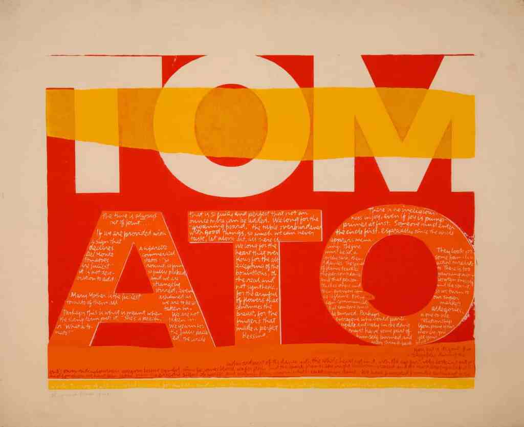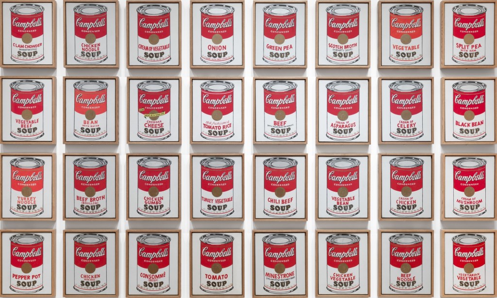

From the past to today’s design industry, female designers always challenge their status in a male-dominated society. If a woman designer wants to achieve their design career and remain an influential position in design history has been a struggle against the recognized social order and its gender issue.[1] One of an American female designer was born in 1918 called Corita Kent who had created numerous artworks in her life. She involves spiritual, pop cultural, literary, consumer culture and political thoughts in her works.[2] During the 1960s, Kent is seemed like a curiosity or a difference in the pop art movement. Undoubtedly you must know Andy Warhol, a screen printing The Juiciest Tomato of All (fig.1) developed by Kent in 1964 was inspired under Warhol’s Campbell’s Soup Cans (fig.2).
As for the print, it shows the text ‘tomato’ in bold, made in like an advertisement or logo. The colors are shown in orange, red and yellow which are analogous colors. Despite you see in a distance, it quite obvious to recognize the word “TOMATO”. Once you have drawn in, you could see a message in the footnote that indicated “Mary Mother is the Juiciest Tomato of All” which is an advertising jingle for Del Monte tomato sauce. Kent had used her humor way to present for imagining Mary as a huge juiciest tomato. I think Kent really simply use a powerful text to demonstrate her thought and when people see it will transfer to an image of the political message. Due to Kent was a Catholic nun and had a strong connection with religious culture, under the influence of her environment, “She was inspired by the efforts of the Vatican Council II in 1962 to modernize Catholic liturgy by incorporating vernacular language in the church.”[3] She took the view of church to modernize to the Virgin Mother Mary use the innovative way by looking at the every-day object and give a new meaning to it. Furthermore, it seems Kent made the concerns of Vatican II turns into a contemporary society to catch people’s attention. As Malpass indicated that, “its intention is to engage the audiences imagination and intellect to convey message”[4] Kent emphasis her role and opinions to let audiences raise their awareness. The work also represents divine not only exist in church or religion culture but relevant in people daily life. Kant recovered the spiritual in another language to promote that goal which is demonstrated that the kindness and generosity of Mother Mary and Christ can also be found in a modern day.[5]
In this way, we could see Kent takes advantage of advertising slogan for her own use to present friendlier of Catholicism instead of a formal impression. I think the way she designs it could be considered as “It liberates us from conventions and opens us up for creativity and a zest for life.”[6] Her artwork conveys about her personal idea, political message and background to audiences during pop movement. Once when you see the work in a different angle, you would realize how the texts transfer to an image in your mind could be such a powerful form.
However, some religious traditionalists were strongly against Kent’s action. They thought the way Kent described Mary Mother to juiciest tomato which is a scandal to the archdiocese.[7] It has shown the conflict between Kent’s religious and her design visual argument. According to Liene Jakobsone, design “it links with contemporary world conditions through its pluralistic stance, endorsing a public that is broad and multiple.”[8] Therefore, tradition religious people might criticize this work may threat to their position and harm to conservative divine ideology. Moreover, Norman claims that design beauty comes from audience’s conscious reflectionand experience influenced by knowledge, learning and culture.[9] It seems those people who have traditional religious culture may affect their taste on the work in the result of a critical way.
After exploring Kent’s work, I feel like she may have a significant status in design aspect, while not many people know her. In my opinion, it is hard to build a stable designer status in the mid 20th century that is male-dominated period. Furthermore, Kent was a nun, she has her political and spiritual message that affected in her work which could not make numerous people are in common and realize. Kent was not a part of the mainstream because she stands in conflict position between Catholic and normal society which is too radical to church and too religious for modern society. Additionally, she stood apart from the right people in the 1960s of the conflicts between social and political. In the result, she was not got married in her life so there is no generation to propagate her design ideology.
In conclusion, Kent had proved that she took a
risk on her design expression to people understand that is an innovative way to
present her political language and creativity. Also, she used her way to play
around with language to promote her political and spiritual ideas in her work to become a pop artist and
social activist during the pop art culture movement. Nowadays, we should
realize not only her way to use powerful texts from advertising but also her
works have meaningful. It inspired people their opinions for society’s behaviors,
help people around us and against selfish action so to build a better society
community. Those are the ideas of Kent may convey to people to think about her
works.
Footnotes
[1] Jane Connory, Plotting the Historical Pipeline of women in graphic design, [online] Available at: http://dharn.org.au/dharn2017/plotting-the-historical-pipeline-of-women-in-graphic-design/
[2] harvardartmuseums.org. [online] Available at: https://www.harvardartmuseums.org/visit/exhibitions/4830/corita-kent-and-the-language-of-pop
[3] harvardmagazine.com. [online] Available at: https://harvardmagazine.com/2015/08/corita-kent-nun-with-a-pop-art-habit
[4] Liene Jakobsone. “Critical design as approach to next thinking”, The Design Journal, 20, (2017): 4.
[5] Ibid.
[6] Despina Christoforidou, Elin Olander, Anders Warell, and Lisbeth Svengren Holm. “Good Taste Vs. Good Design: A Tug Of War In The Light Of Bling,” The Design Journal 15, no. 2 (2012): 197.
[7] theguardian.com/artanddesign. [online] Available at: https://www.theguardian.com/artanddesign/2018/apr/22/corita-kent-the-pop-art-nun#img-2
[8] Carl DiSalvo. “Design and the construction of publics,” Design Issues, volume 25, no.1, Winter (2009): 48.
[9] Despina Christoforidou, Elin Olander, Anders Warell, and Lisbeth Svengren Holm. “Good Taste Vs. Good Design: A Tug Of War In The Light Of Bling,” The Design Journal 15, no. 2 (2012): 188.