After considering this entire assignment as a whole, I decided it would be interesting to compare the roles and influences of Elena (1957-2014) and Massimo Vignelli (1931-2014). Although the pair were working collaboratively for decades after establishing their own Architecture and Design firm, I question why and how it came to be that Massimo was ultimately the face of the duo. Within this piece, I also attempt to describe my own design practice, direction and goals in comparison to Massimo’s.
Good taste and good design – a topic we discussed in class (3 April 2019) that provoked the most conversation and seemed to be the most interesting. After further reading into the topic, I found it made the subject both clearer and more complicated. The ‘line’ that separates supposedly ‘good’ and ‘bad’ design is much more of a squiggly and faded one. “We must remember that what is considered good taste is socially constructed… There is a process or system of people creating the criteria for determining what is to be considered as good taste” (Christoforidou 2012).
As a current Industrial Design student – one of many – at Monash University, I am surrounded by likeminded individuals. Because we are likeminded, do we not already have a subconscious standard of what we consider ‘good design’ based off our own design ethos? In that case, theoretically most of our ideas and projects that we put forth would be considered as good design by our classmates. I don’t believe this is the case. My belief is as follows: good design is a result of thoughtful thinking and conscious refinement. Thoughtful thinking comes from being educated in an array of areas. Conscious refinement is the ability to practice control.
Massimo Vignelli was a whole hearted Modernist. With a background in Architecture, he advanced through various design disciplines but most notably in graphics and brand identity. He believed that “cross fertilisation is what enriches everybody, every design” (Vignelli, An Interview with Massimo Vignelli 2011)and practiced clarity all throughout his work. When working in the United States, his agenda was to rid the world of ugliness and to “crusade for the rest of [his] life to fight vulgarity” (2011). When asked how to define vulgarity, Vignelli replied “a lack of intellectual elegance”. When further asked to define intellectual elegance, he replied “a lack of vulgarity”. He strongly believed his existence revolved around trying to raise the standard of design even if only an inch. Based on universal principles of rationality, Vignelli’s ethos was based on discipline in
Lisa Ly and Naomi Foo
2015
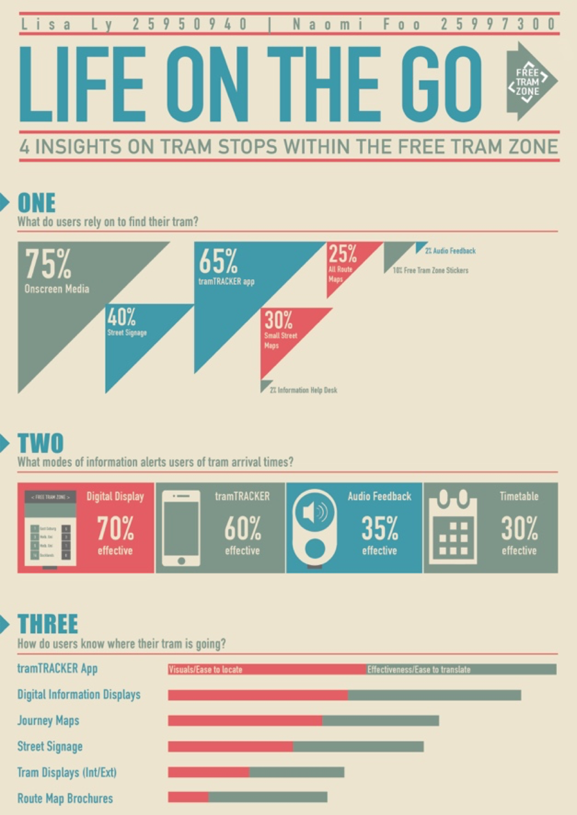
Having never previously known about the existence of Vignelli previous to this assignment, I found that there were already similarities between our design works. For an interface subject in 2015, I was asked to design a poster that delivered statistics in infographic form. The aim was to encourage readers to maintain a level of interest and engagement with the poster (as is the intent of any presentation poster). In this poster I focused on creating concise and clear graphics through the process of elimination. My design decisions ultimately came to asking questions like “does that really need to be included?”. “Well designed objects are easy to interpret and understand” (Norman 1988). It is the process of simplification that is the most difficult because it is always easier to add than it is to subtract. In the case of this poster, it was enormously difficult to identify the most crucial elements to keep and what could be forgone. I believe anybody who can do this right is a great designer.
Massimo Vignelli
1964
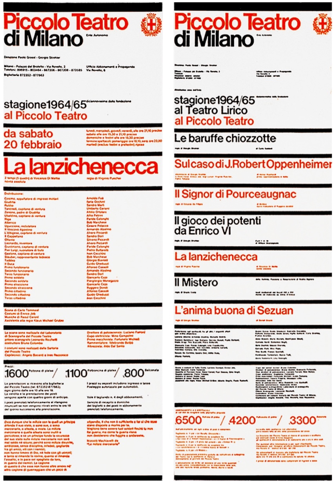
The posters Vignelli designed for Piccolo Teatro are regarded some of the best pieces of Italian graphic design. It displays “an excellent example of rhythm within order” (Vignelli, Massimo Vignelli 2013)and set design characteristics that have been followed even after all these years. The alternate colours indicated what show was playing at which theatre. The bright red also serves as a way to break up the large amount of information delivered. Vignelli was a strong promoter of the typeface Helvetica. He used the typeface for most of his designs due to its legibility and straightforwardness. The similarities between the two posters include a vertical format of information, clear boundaries for text, and immediate visual impact.
Where I may agree with his stance on the importance of applying intellectual elegance into each and every one of our designs, I don’t believe that I have enough of my own design material to support it yet. The environment created at university is not highly conducive to creating beautiful content just yet, especially not with the time pressures and financial restrictions. This doesn’t mean that I’m not already constantly critiquing the validity and direction of my work. Good design is always the end goal.
References
Christoforidou, Despina. “Good Taste vs. Good Design: A Tug of War in the Light of Bling.” The Design Journal15, no. 2 (2012): 185-202.
Norman, Donald. The Design of Everyday Things.New York: Doubleday, 1988.
Vignelli, Massimo, interview by Mija Riedel. An Interview with Massimo Vignelli(June 6, 2011).
Vignelli, Massimo, interview by Nicola-Matteo Munari. Massimo Vignelli(September 9, 2013).
